.NET MAUI DataGrid Defining Columns
The Telerik UI for .NET MAUI DataGrid provides three approaches that you can take to define different columns:
The Columns is part of Telerik UI for .NET MAUI, the most comprehensive UI suite for .NET MAUI! To try it out, sign up for a free 30-day trial and kickstart your cross-platform app development today.
-
Automatically—by setting
AutoGenerateColumnsproperty toTrue(default value). -
Manually—by adding columns to the DataGrid's
Columnscollection and setting theAutoGenerateColumnsproperty toFalse. -
Mixed—by adding columns to the
Columnscollection and also setting theAutoGenerateColumnstoTrue(default value).
Automatic Columns Generation
By default, the DataGrid will generate typed columns automatically based on the underlying data type. When, for example, you set the ItemsSource of the RadDataGrid to a collection of clubs (see the sample code below), the control will create a separate column for each public property of the Club object.
For example, let's have a sample Club object:
With the automatic columns generation DataGrid will create the following columns:
-
DataGridTextColumnfor theNameproperty. -
DataGridDateColumnfor theEstablishedproperty. -
DataGridBooleanColumnfor theIsChampionproperty.
Manual Columns Definition
Using the built-in auto generation of columns does not fit all scenarios. In such cases you can manually define the needed columns. When defining a column you can choose between several column types:
- Text Column—Represents a column that converts the content of each associated cell to a System.String object.
-
Numerical Column—Represents an extended
DataGridTextColumnthat presents numerical data (intanddoubletypes). -
Boolean Column—An extended
DataGridTextColumnimplementation that presents Boolean data. -
Date Column—An extended
DataGridTextColumnthat presents data of typeDateTime. -
Time Column—Represents an extended
DataGridTextColumnthat presents theTimeOfDayof aDateTimetype. -
ComboBox Column—Represents an extended
DataGridTextColumnwhich cell value editor is a Telerik.Maui.Controls.RadComboBox control. -
Template Column—Represents a column that uses a
DataTemplateto describe the content of each associated grid cell. - ToggleRowDetails Column—Represents a column that allows the user to show and hide the row details for an item.
For the typed columns (Text, Numerical, Boolean, Date, Time and ComboBox) you can define which property of the underlying data object the column represents in the following ways:
-
PropertyName—Specifies the name of the property of the data object being displayed in the column's cells. -
DataMemberBinding—Defines the binding which points to the data member of the underlying object being displayed in the column's cell. WithDataMemberBinding, you have control over the way data is formatted and displayed in the DataGrid cells, for example you can add a string formatter or a value converter.
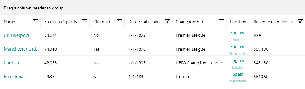
The example below demonstrates RadDataGrid with various types of columns. In addition both PropertyName and DataMemberBinding are used for the different columns to set the property each column represents.
1. Use the following snippet to declare a RadDataGrid in XAML:
2. Where the telerik namespace is the following:
3. The ViewModel class is declared as following:
4. And the namespace used for NotifyPropertyChangedBase:
Club custom object:
6. Add the BoolToValueConverter to the page's resources:
Check the result in the image below:
For a runnable example with the DataGrid columns, see the SDKBrowser Demo Application and go to the DataGrid > Columns category.
Columns Features
Find below a quick overview of the DataGrid's Columns features.
Column Headers
The top cell of a column is called Header. Its purpose is to set a caption for the column, which describes the data displayed in it. The .NET MAUI DataGrid provides fully customizable column headers, check Column Headers for detailed information.
Columns Cell Templates
The DataGrid provides a set of predefined column types such as Text Column, Numerical Column, etc. In case you need to extend the functionality of a column, for example customize the default appearance or add more UI elements, use the exposed templates - CellContentTemplate and CellEditTemplate. For detailed information, see the Columns Cells Templates topic.
Column Footers
The DataGrid allows you to display additional information which applies to the columns in a specific row placed at the bottom of the control. This row consists of individual footer cells for each column. Take a look at the Column Footers for detailed information.
Column Resizing
Columns inside the Telerik .NET MAUI DataGrid are resizable by default. The feature is available only on Desktop - WinUI and MacCatalyst. For more details see the Column Resizing topic.
Columns Width
The DataGrid provides a flexible mechanism for setting columns' width through columns' SizeMode and Width properties. For more details see the Columns Width topic.
Frozen Columns
You can pin a column on the left side of the DataGrid by setting the IsFrozen property to the column. By default the value is False. When setting it to True to a concrete column, it makes the column frozen. For detailed information, see the Frozen Columns topic.
Columns Reordering
The DataGrid exposes a reordering feature allowing the user to drag and drop columns and change their order. For more details, see the Columns Reordering topic.
For an outline of all DataGrid features review the .NET MAUI DataGrid Overview article.