.NET MAUI DataGrid ComboBoxColumn
The DataGridComboBoxColumn uses the Telerik UI for .NET MAUI ComboBox control in Edit mode to select a value from a list.
Important Properties
Here are the specific properties defined for DataGridPickerColumn:
-
ItemsSource(IEnumerable<object>)—This property is used when the source of the Picker items is not part of the data and is the same for all items in the grid. -
ItemsSourcePath(string)—Specifies a property of your data class that will be used as a source for the Picker control. -
ItemDisplayBindingPath(string)—Sets the display path of the items in the Picker selector. It points to a field in the items from theItemsSourcecollection of the Picker. -
PropertyName—Defines the name of the property of the object type that represents each row within the grid. -
DataMemberBinding—Defines the binding which points to the data member of the underlying object being displayed in the column's cell. -
HeaderText—Defines the content that will be displayed in the Header UI that represents the column. -
CellContentStyle(DataGridTextCellStyle)—Defines the appearance of each cell associated with this column. -
CellContentStyleSelector—Defines theStyleSelectorinstance that allows for the dynamic appearance on a per-cell basis. -
CellContentFormat—Defines the custom format for each cell value. TheString.Formatroutine is used and the format passed has to be in the form required by this method. -
CellContentTemplate(DataTemplate)—Defines the appearance of each cell associated with the concrete column.CellContenTemplateenables you to customize the default look of the cell. -
CellEditTemplate(DataTemplate)—Defines the editor associated with the concrete column. TheCellEditTemplateis displayed when the cell is in edit mode. -
FilterControlTemplate(DataTemplate)—Specifies the user defined template used for the Filtering UI. The template must contain an instance of theTelerik.Maui.Controls.DataGrid.DataGridFilterControlBaseclass. -
FooterText—Defines the content that will be displayed in the Footer UI that represents the column. -
FooterStyle(DataGridColumnFooterStyle)—Defines theStyleobject that sets the appearance of each footer cell associated with this column. -
FooterContentTemplate(DataTemplate)—Defines the appearance of the footer. -
IsResizable(bool)—Specifies whether the user can resize the DataGrid Column. The default value isTrue.This is only supported inWinUIandMacCatalyst. -
IsFrozen(bool)—Specifies whether the column is frozen. The default value isFalse. -
DataGrid(RadDataGrid)—Gets the correspondingRadDataGridcontrol.
For more information about
CellDecorationStyleandCellDecorationStyleSelector, refer to the Columns Styling topic.
CellContentFormatuses the format string provided by the framework. For more details, refer to the String.Format article.
Example
<telerik:DataGridComboBoxColumn PropertyName="Country"
                                HeaderText="Country"
                                CellContentFormat="Picked: {0}"
                                ItemsSourcePath="Countries">
    <telerik:DataGridComboBoxColumn.CellContentStyle>
        <telerik:DataGridTextCellStyle SelectedTextColor="DarkGreen"
                                       TextColor="Black"
                                       FontSize="15" />
    </telerik:DataGridComboBoxColumn.CellContentStyle>
</telerik:DataGridComboBoxColumn>
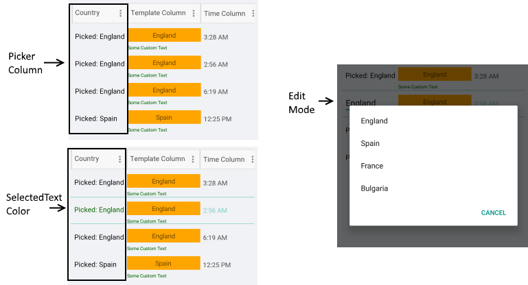
Example with CellContentTemplate and CellEditTemplate
 <telerik:DataGridComboBoxColumn PropertyName="Country"
                                 HeaderText="Country"
                                 ItemsSourcePath="Countries">
    <telerik:DataGridColumn.CellContentTemplate>
        <DataTemplate>
            <Grid>
                <VerticalStackLayout InputTransparent="True">
                    <Grid BackgroundColor="Orange"
                          Margin="0, 10, 0, 0">
                        <Label Text="{Binding Country}"
                               Margin="0, 5, 0, 5"
                               HorizontalOptions="Center"
                               VerticalTextAlignment="Center" />
                    </Grid>
                    <Label Text="Some Custom Text"
                           TextColor="DarkGreen"
                           FontSize="10" />
                </VerticalStackLayout>
            </Grid>
        </DataTemplate>
    </telerik:DataGridColumn.CellContentTemplate>
    <telerik:DataGridColumn.CellEditTemplate>
        <DataTemplate>
           <!-- add the control here for example: <Picker/> <telerik:RadComboBox/>-->
        </DataTemplate>
    </telerik:DataGridColumn.CellEditTemplate>
</telerik:DataGridComboBoxColumn>