.NET MAUI DataGrid Overview
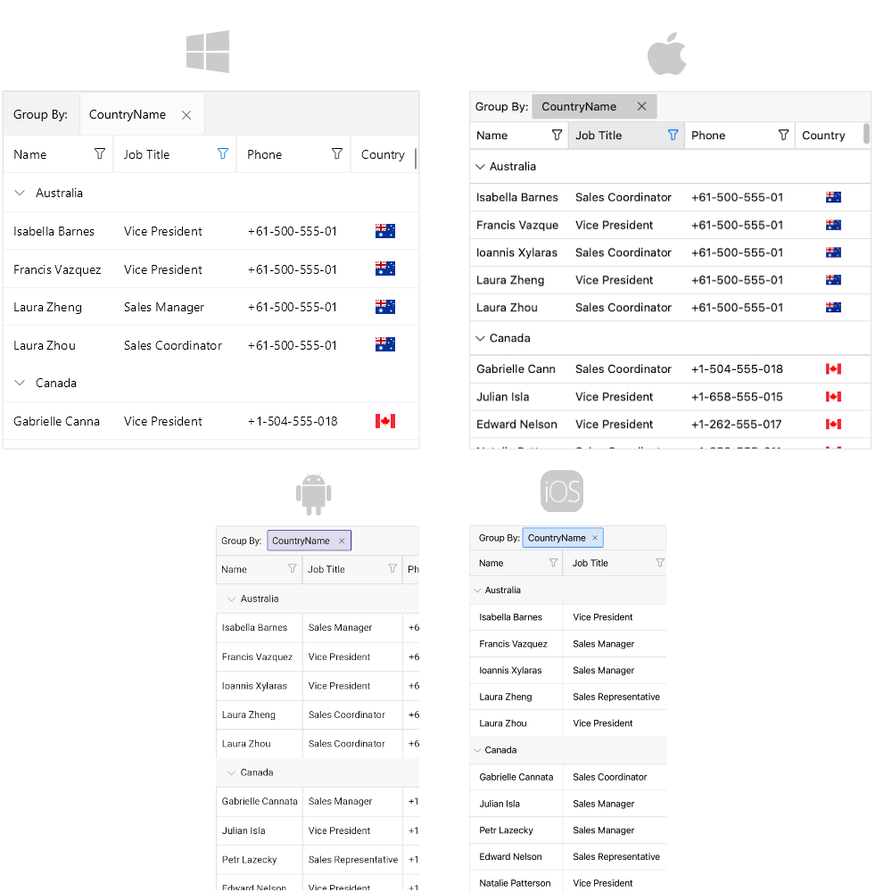
The Telerik UI for .NET MAUI DataGrid is a powerful control that allows you to visualize and edit tabular represented data in your .NET MAUI applications.
Most of the data on the Internet is stored in tables within a database. The Telerik UI for .NET MAUI DataGrid provides the same abstraction over the data—It has columns and rows, and the intersection of a row and a column is called a cell.
When the data from a database is sent to the client, usually converted to a Business object (or the so-called ViewModel) where each instance represents a table row and each property of the object represents a column within the original table. The DataGrid also supports alternating row colors so that your users can distinguish one row from another.
The optimized data layer of the DataGrid enables fast grouping, sorting, and filtering operations. The user interface uses virtualization for its row and cell elements, which means that visual elements are created only when needed and only for the currently visible cells.
The DataGrid is part of Telerik UI for .NET MAUI, the most comprehensive UI suite for .NET MAUI! To try it out, sign up for a free 30-day trial and kickstart your cross-platform app development today.

MAUI DataGrid Video Tutorial
If you prefer video instructions, watch the Getting Started with the MAUI DataGrid video tutorial. It covers the following topics:
- Introduction to Telerik MAUI DataGrid and its features.
- Setup the DataGrid in a .NET MAUI app.
- Configure the columns and use custom templates.
- Use sorting, filtering and selection features.
Built-in Columns
The MAUI DataGrid provides a set of built-in columns such as Text, Boolean, Numeric, ComboBox, Date, Time, and Template. These predefined templates allow you to handle different data types and user scenarios, each with its specific editor.
Reorder and Resize Columns
The .NET MAUI DataGrid provides a number of features and configuration options related to its columns to provide a flexible and usable user experience. For example, you can enable column reordering and resizing. If you want to prevent a column from resizing, you can lock the column and keep the important information always on top.
Sort, Filter, and Group Data
Perform SORT, FILTER, and GROUP operations on your data by using the convenient API of the control. Apply the sorting, filtering, and grouping operations per column.
Editing
You can enable users to edit the data presented in the .NET MAUI DataGrid. Depending on the column data type, a relevant editor allows end users to edit content in a friendly environment. For example, if one of the columns is a date, a date-picker will be used to offer a change in the date field.
Single and Multiple Selection
The DataGrid features a single or a multiple-item selection and provides options for controlling the cell or row selection unit, thus enabling any selection scenario you want your MAUI application users to have.
Load Data On Demand
In some cases, you may need to load data in the .NET MAUI DataGrid when the control is already displayed as this can improve the performance of your application. The DataGrid offers automatic data loading once the user scrolls to the last available record, or by displaying a customizable button which will initiate the loading of more data items.
Row Details
The MAUI DataGrid allows you to represent additional information for the data in the row by using the row details feature.
Aggregates Support
You can use the exposed API for applying aggregates functions. You can use the predefined aggregates functions like Sum, Count, Min, Max, Average, etc, or implement a custom function.
Search As You Type
The DataGrid provides the ability to search for specific data within its ItemsSource by using its built-in search functionality.
Paging Support
You can page the data of the DataGrid using the Telerik UI for .NET MAUI DataPager control.
Keyboard Navigation Support
Use keyboard keys for navigation in the MAUI DataGrid control. This feature is available on WinUI and MacCatalyst.
Row Height
By default, the row height is calculated according to the cell content. You can override this behavior by setting a height for the rows.
Column Footer
The Telerik UI for .NET MAUI DataGrid allows you to display additional information which applies to the columns in a specific row placed at the bottom of the control. This row consists of individual footer cells for each column.
Empty Template
When the .NET MAUI DataGrid does not have any data (ItemsSource is null or the collection is empty), an empty template is displayed in the DataGrid.
Commands
The MAUI DataGrid allows you to add commands to the commands collection, in case you want to execute an additional logic when certain actions occur. You can execute the commands when cell is tapped, double tapped, begins the editing operation, when tapping on the column header, filter the data and more.
Theming and Style
You can apply a theme to the MAUI DataGrid. If you prefer to use your own styling, then you can use the flexible styling API of the .NET MAUI DataGrid. The styling API allows you to style the DataGrid rows and columns, the cell content inside the columns, the group header, the aggregates inside the group header and the group footer, etc. In addition, you can apply a style selector.
Localization
The Telerik UI for .NET MAUI DataGrid provides localization support. You can translate the text displayed in the Filtering UI, Grouping panel, etc. to other languages, so that your application can be adapted to different cultures.