.NET MAUI DataGrid NumericalColumn
The DataGridNumericalColumn is used to represent only numerical values. It uses the Telerik UI for .NET MAUI NumericInput control to edit the value in EditMode. The difference between this column and the text one is that it will directly invoke the numeric keyboard on the mobile devices.
Important Properties
-
PropertyName—Specifies the name of the property of the object type that represents each row within the grid. -
DataMemberBinding—Defines the binding which points to the data member of the underlying object being displayed in the column's cell. -
HeaderText—Defines the content that will be displayed in the Header UI that represents the column. -
CellContentStyle(DataGridTextCellStyle)—Defines the appearance of each cell associated with this column. -
CellContentStyleSelector—Defines theStyleSelectorinstance that allows for the dynamic appearance on a per-cell basis. -
CellContentFormat—Defines the custom format for each cell value. TheString.Formatroutine is used and the format passed has to be in the form required by this method. -
CellContentTemplate(DataTemplate)—Defines the appearance of each cell associated with the concrete column.CellContenTemplateenables you to customize the default look of the cell. -
CellEditTemplate(DataTemplate)—Defines the editor associated with the concrete column. TheCellEditTemplateis displayed when the cell is in edit mode. -
FooterText—Defines the content that will be displayed in the Footer UI that represents the column. -
FooterStyle(DataGridColumnFooterStyle)—Defines theStyleobject that sets the appearance of each footer cell associated with this column. -
FooterContentTemplate(DataTemplate)—Defines the appearance of the footer. -
IsResizable(bool)—Specifies whether the user can resize the DataGrid Column. The default value isTrue.This is only supported inWinUIandMacCatalyst. -
IsFrozen(bool)—Specifies whether the column is frozen. The default value isFalse.
For more information about
CellDecorationStyleandCellDecorationStyleSelector, refer to the Columns Styling topic.
CellContentFormatuses the format string provided by the framework. For more details, refer to the Standard Numeric Formatting and Custom Numeric Formatting articles.
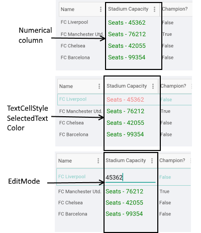
Example
<telerik:DataGridNumericalColumn PropertyName="StadiumCapacity"
                                     HeaderText="Stadium Capacity"
                                     CellContentFormat=" Seats - {0:D}">
    <telerik:DataGridNumericalColumn.CellContentStyle>
        <telerik:DataGridTextCellStyle TextColor="Green"
                                           FontSize="18"
                                           SelectedTextColor="LightCoral" />
    </telerik:DataGridNumericalColumn.CellContentStyle>
</telerik:DataGridNumericalColumn>
Example with CellContenTemplate and CellEditTemplate
<telerik:DataGridNumericalColumn PropertyName="StadiumCapacity">
    <telerik:DataGridColumn.CellContenTemplate>
        <DataTemplate>
            <Label Text="{Binding StadiumCapacity}"/>
        </DataTemplate>
    </telerik:DataGridColumn.CellContenTemplate>
    <telerik:DataGridColumn.CellEditTemplate>
        <DataTemplate>
            <telerik:RadDockLayout>
                <Button Text="OK" Command="{Binding CommitEditCommand}" telerik:RadDockLayout.Dock="Right" />
                <Button Text="X" Command="{Binding CancelEditCommand}"  telerik:RadDockLayout.Dock="Right"/>
                <Slider Maximum="80000" Minimum="30000"
                        Value="{Binding Item.StadiumCapacity}"
                        HorizontalOptions="FillAndExpand" />
            </telerik:RadDockLayout>
        </DataTemplate>
    </telerik:DataGridColumn.CellEditTemplate>
</telerik:DataGridNumericalColumn>