.NET MAUI DataGrid TextColumn
A DataGridTextColumn converts the content of each associated cell to a System.String object.
A
DataGridTextColumnperforms better than aDataGridTemplateColumn.
Important Properties
Here are the specific properties for the Text Columns:
-
PropertyName—Specifies the name of the property of the object type that represents each row within the grid. -
DataMemberBinding—Defines the binding which points to the data member of the underlying object being displayed in the column's cell. -
HeaderText—Defines the content that will be displayed in the Header UI that represents the column. -
CellContentFormat—Defines the custom format for each cell value. TheString.Formatroutine is used and the format passed has to be in the form required by this method. -
CellContentStyle(DataGridTextCellStyle)—Defines the appearance of each cell associated with this column. -
CellContentStyleSelector—Defines theStyleSelectorinstance that allows for the dynamic appearance on a per-cell basis. -
CellContentTemplate(DataTemplate)—Defines the appearance of each cell associated with the concrete column.CellContenTemplateenables you to customize the default content of the cell. -
CellEditTemplate(DataTemplate)—Defines the editor associated with the concrete column. TheCellEditTemplateis displayed when the cell is in edit mode. -
FooterText—Defines the content that will be displayed in the Footer UI that represents the column. -
FooterStyle(DataGridColumnFooterStyle)—Defines theStyleobject that sets the appearance of each footer cell associated with this column. -
FooterContentTemplate(DataTemplate)—Defines the appearance of the footer. -
IsResizable(bool)—Specifies whether the user can resize the DataGrid Column. The default value isTrue.This is only supported inWinUIandMacCatalyst. -
IsFrozen(bool)—Specifies whether the column is frozen. The default value isFalse.
For more information about
CellDecorationStyleandCellDecorationStyleSelector, refer to the Columns Styling topic.
CellContentFormatuses the format string provided by the framework. For more details, refer to theString.Formatarticle.
Example
Here is an example how the Text Column properties can be used:
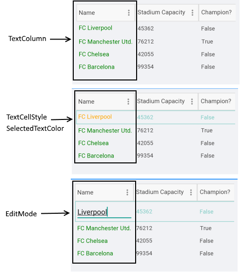
<telerik:DataGridTextColumn PropertyName="Name"
                            HeaderText="Name"
                            CellContentFormat="FC {0}">
    <telerik:DataGridTextColumn.CellContentStyle>
        <telerik:DataGridTextCellStyle TextColor="Green"
                                       FontSize="15"
                                       SelectedTextColor="Orange"/>
    </telerik:DataGridTextColumn.CellContentStyle>
 </telerik:DataGridTextColumn>
Example with CellContentTemplate and CellEditTemplate
<telerik:DataGridTextColumn PropertyName="Name"
                            HeaderText="Name">
    <telerik:DataGridColumn.CellContentTemplate>
        <DataTemplate>
            <Label Text="{Binding Name}"
                   LineBreakMode="TailTruncation"
                   VerticalOptions="Center"/>
        </DataTemplate>
    </telerik:DataGridColumn.CellContentTemplate>
    <telerik:DataGridColumn.CellEditTemplate>
        <DataTemplate>
            <Entry Text="{Binding Item.Name, Mode=TwoWay}" Margin="5"/>
        </DataTemplate>
    </telerik:DataGridColumn.CellEditTemplate>
</telerik:DataGridTextColumn>