.NET MAUI DataGrid Column Headers
This article will guide you through the usage of the column headers, their customization as well through performing different data operations. Column headers are always visible by default. You can further customize the headers by using the HeaderStyle property.

Changing the Text in the Header
To customize text inside the header you have to use the HeaderText property. The property is per column. If HeaderText is not set, the text inside the PropertyName is displayed.
Sorting
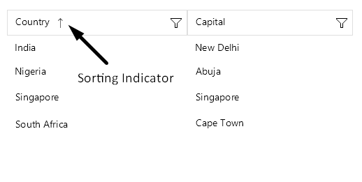
The user of the application can sort a particular column when tapping on its header. When the data is sorted by a column, the sort indicator shows in the header.
To learn more about the sorting functionality of the .NET MAUI DataGrid take a look at the Sorting article.
Filtering
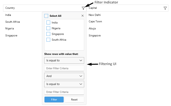
The header of the column hosts the built-in filtering mechanism (the filter indicator which opens the Filtering UI), which allows the user to filter the data by the columns' values.
To learn more about the filtering functionality take a look at the Filtering article.
Styling
Use the HeaderStyle property to style the DataGridColumn header.
Check the .NET MAUI DataGrid Column Header Styling topic for more information about the styling options you can use.
For more details how to hide the column headers from the DataGrid visualization, review the following article: How to Hide Column Headers in a DataGrid for MAUI.
Header Content Customization
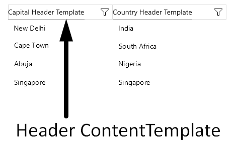
You can customize the content of the Header using the HeaderContentTemplate(DataTemplate) property.
Define the DataTemplate for the header:
Define the HeaderContentTemplate in the DataGrid column:
Color on Hover
You can change the hover state background color of the column header by setting the BackgroundColor property.
The following example demonstrates how to apply the BackgroundColor property to the DataGrid HeaderContentTemplate for its hover visual state:
This is the result:
Customize the Column
Customize the column header by using the HeaderContentTemplate(of type DataTemplate) to achieve the desired full customization of the column. The property demonstrates the ability of the DataGrid to specify and show custom appearance for the column headers.