.NET MAUI DataGrid Columns Styling
The Telerik UI for .NET MAUI DataGrid component provides styling mechanism for customizing the look of the columns and their cells.
The styling mechanism is represented by the following properties:
-
HeaderStyle(of typeStylewith target typeDataGridColumnHeaderAppearance)—Sets the style to the columns' headers. -
FooterStyle(of typeStylewith target typeDataGridColumnFooterAppearance)—Defines the appearance of the column footer. -
CellDecorationStyle(of typeStylewith target typeDataGridCellDecorationAppearance)—Defines the style of the border of each cell associated with the column. -
CellContentStyle(Stylewith target type depending on the column type)—Defines the appearance of each cell associated with the column. -
CellEditorStyle(Stylewith target type depending on the editor type)—Defines the style that will be applied to the cell editor.
Header Style
HeaderStyle defines the appearance of the column header. The HeaderStyle is of type Style and targets the DataGridColumnHeaderAppearance class. The DataGridColumnHeaderAppearance exposes properties for styling its header and data operations indicators (filter indicator and sort indicator or universal indicator).
Header Styling
To style the DataGridColumnHeaderAppearance use the following properties:
-
TextColorandBackgroundColor—Define the colors of the text part/background respectively. -
HoverBackgroundColor—(Desktop-only) Defines the background color when the mouse is over the column header. -
BorderColorandBorderThickness—Define the style of the border around the column header. -
Font Options(TextFontAttributes,TextFontFamily,TextFontSize)—Define the font options to the text part of theColumnHeader. -
Text Alignment(TextMargin,HorizontalTextAlignment,VerticalTextAlignment)—Define the positioning for the text part of theColumnHeader. -
TextHorizontalOptions(LayoutOptions)—Defines the horizontal options of the text part of the header. -
TextVerticalOptions(LayoutOptions)—Defines the vertical options of the text part of the header.
When you set the TextHorizontalOptions of the text part of the header, consider the current position of the sort indicator. Both elements are ordered in a defined way and modifying the position of any of them affects the other one.
For example, to position the column header text to Center, you have to set the SortDescriptor position to Center as well:
For more details how to hide the column headers from the DataGrid visualization, review the following article: How to Hide Column Headers in a DataGrid for MAUI.
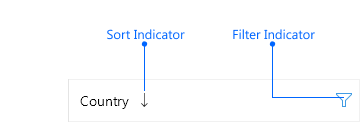
In addition to the column header text, the column header can contain the following indicators for sorting and filtering operations upon the DataGrid data: filter indicator, sort indicator and universal indicator. Use the RadDataGrid's DataOperationIndicationMode property to define what indicators to appear in the columns' headers:
-
DataOperationIndicationMode(Telerik.Maui.Controls.DataGrid.DataOperationIndicationMode)—Defines what indicators will be used in the columns' headers when sorting and filtering are applied. The valid options are:-
Individual—(default) An individual indicator with a unique appearance will be used when a data operation is applied. If sorting is applied, a sort indicator will appear. If filtering is applied, the filter indicator takes its active color (the active color can be modified through theDataGridColumnHeaderStyle'sFilterIndicatorActiveTextColorproperty).
You can check how the individual indicators look on Windows below:
-
Universal—A single indicator will be used when any data operation (filtering, sorting or grouping) is applied. If sorting is applied, the sort indicator won't be displayed, only the universal indicator. If filtering is applied, in addition to the universal indicator, the filter indicator takes its active color (the active color can be modified through theDataGridColumnHeaderStyle'sFilterIndicatorActiveTextColorproperty).
Check below how the indicators are displayed in
DataOperationIndicationMode.Universal: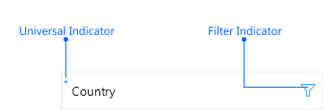
-
Filter Indicator Styling
The FilterIndicator enables users to show the Filtering UI and filter the data. Style the FilterIndicator using the following properties:
-
FilterIndicatorTextColor—Defines the color for the filter indicator part of theColumnHeader.
-
FilterIndicatorActiveTextColor—Defines the color of the filter symbol when filtering is applied. -
FilterIndicatorText—Defines the text for the filter indicator part of theColumnHeader. For theFilterIndicatorTextto appear, set theFilterIndicatorFontFamilyproperty. -
FilterIndicatorMargin—Defines the margin of the filter indicator part of theColumnHeader. -
Font Options(FilterIndicatorFontAttributes,FilterIndicatorFontFamily,FilterIndicatorFontSize)—Define the font options to the filter indicator text.
By default, the filter indicator is represented by a string symbol that can be changed by using the
FilterIndicatorTextandFilterIndicatorFontFamilyproperties.
Sort Indicator Styling
The SortIndicator appears once the RadDataGridColumnHeader is sorted (tapped/clicked on the ColumnHeader cell) and can be styled with the following properties:
-
SortIndicatorColor—Defines the color for the sort indicator part of theColumnHeader.
-
SortIndicatorMargin—Defines the margin of the sort indicator part of theColumnHeader. -
SortIndicatorAscendingText—Defines the text of the sort indicator when the sorting is ascending. -
SortIndicatorDescendingText—Defines the text of the sort indicator when the sorting is descending. -
SortIndicatorHorizontalOptions—Defines the horizontal options of the sort indicator.
Universal Indicator Styling
Style the universal indicator using the following properties:
-
IndicatorColor—Defines the color for the universal indicator part of theColumnHeader. -
IndicatorText—Defines the text for the universal indicator part of theColumnHeader.
-
IndicatorMargin—Defines the margin of the universal indicator part of theColumnHeader. -
Font Options(IndicatorFontAttributes,IndicatorFontFamily,IndicatorFontSize)—Define the font options to the universal indicator text.
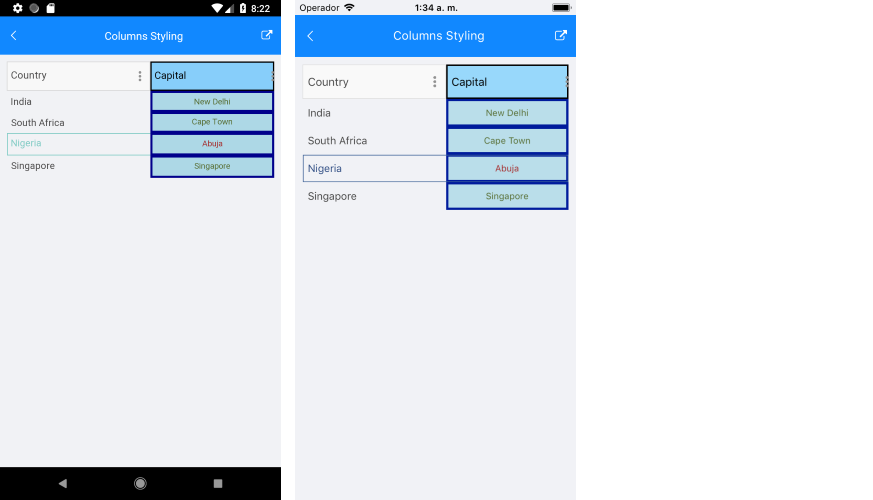
Check below a quick example of a DataGrid with a HeaderStyle:
CellContentStyle
The CellContentStyle property defines the appearance of each cell associated with the column. CellContentStyle is of type Style which can target:
- The
DataGridTextCellAppearanceclass for typed DataGridColumns (Text, Numerical, Boolean, Date, Time and ComboBox). - The
DataGridToggleRowDetailsCellAppearanceclass for theDataGridToggleRowDetailsColumn.
The DataGridTextCellAppearance class provides the following properties for styling the cell text:
-
Fontoptions (FontAttributes,FontFamily,FontSize)—Define the font of the cell text. -
TextColor/SelectedTextColor—Define the color of the cells text. You can set a different value for the selected cell. -
HoverTextColor—Sets the color of the cells text when the mouse hovers over it. Applicable only on Desktop. -
TextMargin/HorizontalTextAlignment/VerticalTextAlignment)—Define the positioning of the text inside the cell. -
SearchMatchTextColor—Defines the color that is used for the parts of the text that are search matches.
The
CellContentStyledoes not apply forTemplateColumn. Also, the property is not applied to the built-in columns when they have a customCellContentTemplate.
Here is an example how to set the CellContentStyle property to a DataGridTextColumn:
The DataGridToggleRowDetailsCellAppearance exposes the following properties for styling:
-
ButtonFontFamily—Defines the font family for the toggle symbol. -
ExpandButtonText—Defines the text for the expanded state. -
CollapseButtonText—Defines the text for the collapsed state. -
ButtonTextColor—Defines the color for the toggle symbol. -
SelectedButtonTextColor—Defines the color for the toggle symbol when the item is selected. -
HoverButtonTextColor—Defines the color for the toggle symbol when the item is being hovered over. -
ButtonFontSize—Defines the font size for the toggle symbol. -
ButtonFontAttributes—DefinesMicrosoft.Maui.Controls.FontAttributesfor the toggle symbol. -
ButtonMargin(typeThickness)—Defines the margin for the toggle symbol.
CellDecorationStyle
To style the border of each cell associated with the column the CellDecorationStyle property is used. CellDecorationStyle is of type Style and targets the DataGridCellDecorationAppearance class. The DataGridCellDecorationAppearance provides the following properties—BackgroundColor, BorderColor, BorderTickness.
In addition, the DataGridCellDecorationAppearance provides the SearchMatchBackgroundColor property used to apply a separate background color to the border when the cell contains a search-match.
Here is an example how to set those properties on a column:
CellEditorStyle
CellEditorStyle defines the style that will be applied to the cell editor.
Here is an example how to set this property:
And this is how the column style looks when the properties for customizing the column are applied:
The
CellEditorStyleis not applied to the built-in columns when they have a customCellEditTemplate.
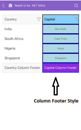
FooterStyle
FooterStyle defines the appearance of the column footer. The FooterStyle is of type Style and targets the DataGridColumnFooterAppearance class. The DataGridColumnFooterAppearance class provides the following styling properties:
-
TextColorandBackgroundColor—Define the colors of the text part/background respectively. -
BorderColorandBorderThickness—Define the style of the border around the column footer. -
Font Options(TextFontFamily,TextFontAttributes,TextFontSize)—Define the font options to the text part of theColumnFooter. -
Text Alignment(TextMargin,HorizontalTextAlignment,VerticalTextAlignment)—Define the positioning for the text part of theColumnFooter.