.NET MAUI CollectionView LoadOnDemand Automatic and Manual Templates
You can customize the appearance of the automatic and manual elements by using the following templates:
-
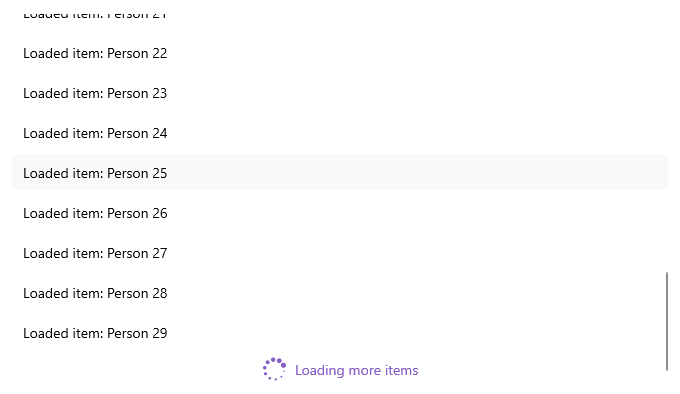
AutomaticLoadOnDemandTemplate
(DataTemplate
)—Specifies the template of the view visualized forAutomatic
loading. -
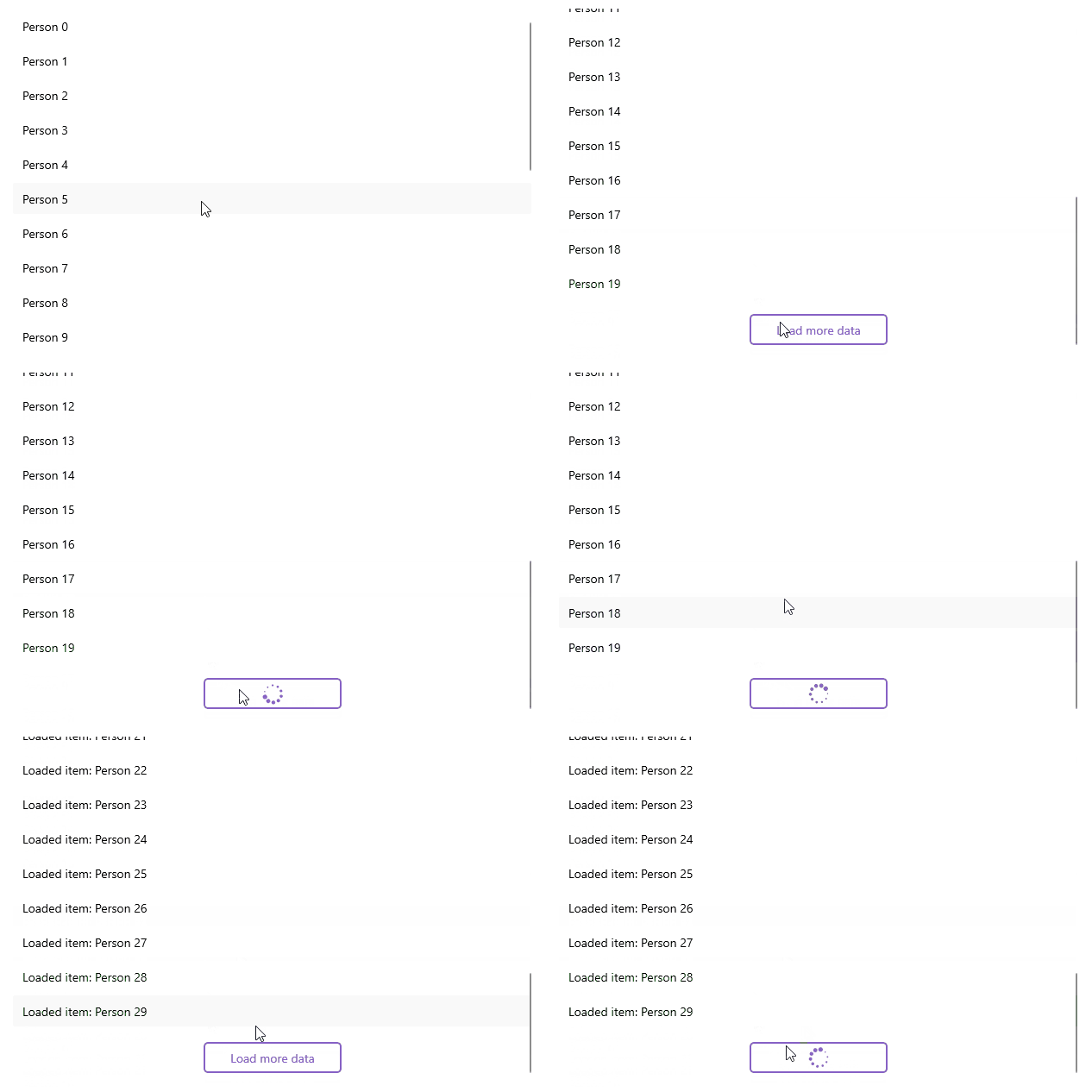
ManualLoadOnDemandTemplate
(DataTemplate
)—Specifies the template of the view visualized forManual
loading.
Example with Automatic Template
Here is an example how to customize the automatic indicator:
1. Create a sample model:
public class Person
{
public string Name { get; set; }
public int Age { get; set; }
public Gender Gender { get; set; }
}
2. Define the CollectionView control and set the AutomaticLoadOnDemandTemplate
:
<telerik:RadCollectionView ItemsSource="{Binding Items}"
DisplayMemberPath="Name"
IsLoadOnDemandEnabled="True"
AutomaticLoadOnDemandTemplate="{StaticResource CustomAutomaticLoadOnDemandTemplate}">
<telerik:RadCollectionView.BindingContext>
<local:LoadOnDemandCollectionViewModel />
</telerik:RadCollectionView.BindingContext>
</telerik:RadCollectionView>
3. Define the AutomaticLoadOnDemandTemplate
in the page's resources:
<DataTemplate x:Key="CustomAutomaticLoadOnDemandTemplate">
<HorizontalStackLayout Spacing="8"
Padding="0, 5"
HorizontalOptions="Center">
<telerik:RadBusyIndicator AnimationType="Animation4"
AnimationContentColor="#8660C5"
IsBusy="True"
IsVisible="{Binding Source={RelativeSource AncestorType={x:Type telerik:RadCollectionView}}, Path=IsLoadOnDemandActive}" />
<Label Text="Loading more items"
TextColor="#8660C5"
VerticalTextAlignment="Center" />
</HorizontalStackLayout>
</DataTemplate>
4. Add the telerik
namespace:
xmlns:telerik="http://schemas.telerik.com/2022/xaml/maui"
5. Create a ViewModel
and use the LoadOnDemandCollection
as a type of the property bound to the RadCollectionView.ItemsSource
:
public class LoadOnDemandCollectionViewModel : NotifyPropertyChangedBase
{
public LoadOnDemandCollectionViewModel()
{
this.Items = new LoadOnDemandCollection<Person>(this.LoadMoreItems);
for (int i = 0; i < 20; i++)
{
this.Items.Add(new Person { Name = "Person " + i, Age = i + 10 });
}
}
public LoadOnDemandCollection<Person> Items { get; set; }
private IEnumerable LoadMoreItems(CancellationToken cancellationToken)
{
List<Person> newItems = new List<Person>();
int count = this.Items.Count;
try
{
Thread.Sleep(2500);
for (int i = 0; i < 10; i++)
{
newItems.Add(new Person { Name = $"Loaded item: Person {count + i}", Age = count + i + 10 });
}
return newItems;
}
catch (Exception)
{
return null;
}
}
}
This is the result:
For a runnable example demonstrating the CollectionView LoadOnDemand Automatic Template, see the SDKBrowser Demo Application and go to CollectionView > Load On Demand category.
Example with Manual Template
Here is an example how to customize the manual button:
1. Create a sample model:
public class Person
{
public string Name { get; set; }
public int Age { get; set; }
public Gender Gender { get; set; }
}
2. Define the CollectionView control and set the ManualLoadOnDemandTemplate
:
<telerik:RadCollectionView x:Name="listView"
ItemsSource="{Binding Items}"
DisplayMemberPath="Name"
LoadOnDemandMode="Manual"
IsLoadOnDemandEnabled="True"
ManualLoadOnDemandTemplate="{StaticResource CustomManualLoadOnDemandTemplate}">
<telerik:RadCollectionView.BindingContext>
<local:LoadOnDemandCollectionViewModel />
</telerik:RadCollectionView.BindingContext>
</telerik:RadCollectionView>
3. Define the ManualLoadOnDemandTemplate
in the page's resources:
<telerik:InvertedBooleanConverter x:Key="InvertedBooleanConverter" />
<DataTemplate x:Key="CustomManualLoadOnDemandTemplate">
<telerik:RadBorder BorderColor="#8660C5"
BorderThickness="2"
CornerRadius="4"
MinimumWidthRequest="{OnPlatform MacCatalyst=160, WinUI=160}"
HeightRequest="36"
Padding="24, 0"
Margin="16"
HorizontalOptions="{OnPlatform MacCatalyst=Center, WinUI=Center}">
<Grid>
<telerik:RadBusyIndicator AnimationType="Animation4"
AnimationContentColor="#8660C5"
IsBusy="True"
IsVisible="{Binding Source={RelativeSource AncestorType={x:Type telerik:RadCollectionView}}, Path=IsLoadOnDemandActive}" />
<Label Text="Load more data"
TextColor="#8660C5"
HorizontalTextAlignment="Center"
VerticalTextAlignment="Center"
IsVisible="{Binding Source={RelativeSource AncestorType={x:Type telerik:RadCollectionView}}, Path=IsLoadOnDemandActive, Converter={StaticResource InvertedBooleanConverter}}" />
</Grid>
</telerik:RadBorder>
</DataTemplate>
4. Add the telerik
namespace:
xmlns:telerik="http://schemas.telerik.com/2022/xaml/maui"
5. Create a ViewModel
and use the LoadOnDemandCollection
as a type of the property bound to the RadCollectionView.ItemsSource
:
public class LoadOnDemandCollectionViewModel : NotifyPropertyChangedBase
{
public LoadOnDemandCollectionViewModel()
{
this.Items = new LoadOnDemandCollection<Person>(this.LoadMoreItems);
for (int i = 0; i < 20; i++)
{
this.Items.Add(new Person { Name = "Person " + i, Age = i + 10 });
}
}
public LoadOnDemandCollection<Person> Items { get; set; }
private IEnumerable LoadMoreItems(CancellationToken cancellationToken)
{
List<Person> newItems = new List<Person>();
int count = this.Items.Count;
try
{
Thread.Sleep(2500);
for (int i = 0; i < 10; i++)
{
newItems.Add(new Person { Name = $"Loaded item: Person {count + i}", Age = count + i + 10 });
}
return newItems;
}
catch (Exception)
{
return null;
}
}
}
This is the result:
For a runnable example demonstrating the CollectionView LoadOnDemand Manual Template, see the SDKBrowser Demo Application and go to CollectionView > Load On Demand category.