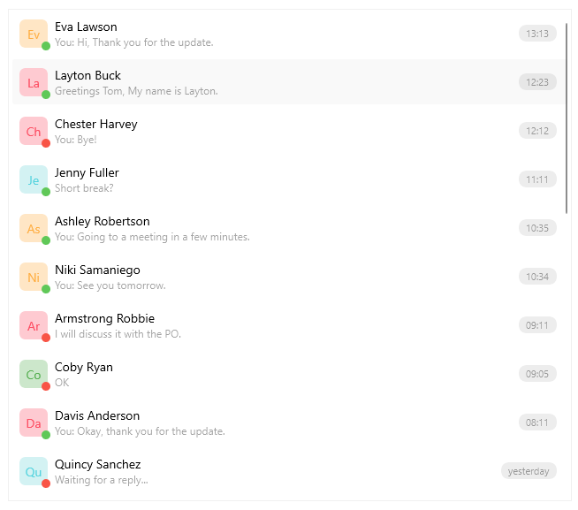
.NET MAUI CollectionView Overview
The Telerik .NET MAUI CollectionView is a virtualizing view component that provides features associated with scenarios where a list of items is used. The control gives you the option to filter, sort and group the items. Also you can take advantage of the flexible styling API and the exposed templates for customization.
The CollectionView is part of Telerik UI for .NET MAUI, the most comprehensive UI suite for .NET MAUI! To try it out, sign up for a free 30-day trial and kickstart your cross-platform app development today.

Key Features of the .NET MAUI CollectionView
Selection—The .NET MAUI CollectionView supports both single and multiple selections. It also allows you to select items by using the tap gesture.
Data Binding— The CollectionView for .NET MAUI component supports data binding in the form of a path property.
Item Appearance—CollectionView allows you to adjust the appearance of its items. You can also apply different appearances to each item based on a specific condition.
Various layouts and orientations—You can choose between the linear and grid layouts. In addition, the CollectionView supports vertical and horizontal orientation for the exposed layouts. The orientation of the control allows you to scroll the items vertically or horizontally.
Grouping—You can group the items by using the exposed properties. In addition, you can apply multi-level (nested) grouping.
Group headers—While grouping the items in the CollectionView, group header is visualized. In addition, you can customize its appearance by using a template.
Sorting—CollectionView allows you to sort the data based on your criteria.
Filtering—You can filter the items in the CollectionView by using the exposed filter descriptors.
Item Swipe—When users swipe, the CollectionView can reveal a designated custom view with actionable content.
Drag & Drop—The .NET MAUI CollectionView provides drag-and-drop functionality which allows the end user to reorder its items as well as drag and drop items between two CollectionViews.
Load on Demand—In addition to the built-in UI virtualization, the CollectionView supports a load-on-demand functionality, which optimizes the initial loading of the application. As a result, the new items are loaded either by a Button (manual) or by scrolling towards the end of the CollectionView (automatic).
Refresh Data—Allows the user to manually trigger an update of the list through an integration with the .NET MAUI RefreshView control.
Header and Footer—Add content above and below the list with the items. Both header and footer content are scrolled along with the CollectionView items.
Events—The CollectionView exposes events that are invoked when scrolling, tapping on item or group item.
Programmatic scrolling—CollectionView provides an API that allows you to scroll to a specific item.
Style properties—The available styling properties allow you to customize the CollectionView items and groups. To take advantage of the conditional styling feature provided by the CollectionView, you can use the style selector.
Empty template—When the
ItemsSourceis null or the collection is empty, you can specify a template that provides user feedback.Commands support—The CollectionView exposes commands that execute when tapping on an item or on a group header.