The
RadListViewcontrol is now obsolete and will be removed in the future. Use the RadCollectionView control instead. TheRadCollectionViewis a complete, ground-up rewrite of the ListView. TheRadCollectionViewoffers improved performance, enhanced features, and a modernized approach to managing lists of data. TheRadCollectionViewincorporates all of the ListView's key features. More about the differences between both components and how to migrate to the newRadCollectionViewis available in the Migrating the Telerik .NET MAUI RadListView to RadCollectionView article.
.NET MAUI ListView Overview
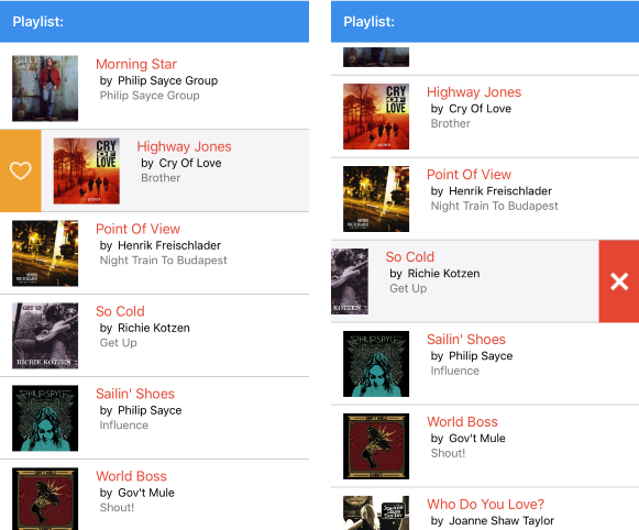
The Telerik .NET MAUI ListView is a virtualizing list component that provides the most popular features associated with scenarios where a list of items is used. All these features are embedded in a single control for saving developers' time and providing better experience.
The ListView (Obsolete) is part of Telerik UI for .NET MAUI, the most comprehensive UI suite for .NET MAUI! To try it out, sign up for a free 30-day trial and kickstart your cross-platform app development today.

Key Features of the .NET MAUI ListView
Selection—The .NET MAUI ListView supports both single and multiple selections and you can also select items on tap and hold gestures.
Different layouts and orientation—You can choose between the linear and grid layout as well as define the scroll direction of the MAUI ListView layout.
Items template selector—The .NET MAUI ListView control expose properties for applying different templates to each item based on a specific condition.
Reorder Items—The ListView allows end users to reorder MAUI ListView items through dragging and dropping.
Grouping, sorting, and filtering—You can visualize your items in groups, and also sort and filter them per with your criteria.
Load on demand—In addition to the built-in UI virtualization, the ListView supports a load-on-demand functionality, which optimizes the initial loading of the application. As a result, the new items are loaded before the user reaches the bottom of the ListView.
Item swipe—The item swipe feature enables end users to swipe an item to reveal its actionable content.
Pull to refresh—In case when data needs to be refreshed use the pull to refresh feature. Refresh the list by swiping finger down when the content is scrolled up to the top.
Scroll bar visibility—You can define whether the vertical scrollbar will be visible while scrolling through the items.
Scroll to item—Allow the users of the application to scroll to a specific item from the ListView.
Customizable Items—The ListView provides styling options for customizing its items and groups.
Header and footer—Add content above and below the list with the items. Both header and footer content are scrolled along with the ListView items.