The
RadListViewcontrol is obsolete and will be removed in Q2 2026. Use the RadCollectionView control instead. TheRadCollectionViewis a complete, ground-up rewrite of the ListView. TheRadCollectionViewoffers improved performance, enhanced features, and a modernized approach to managing lists of data. TheRadCollectionViewincorporates all of the ListView's key features. More about the differences between both components and how to migrate to the newRadCollectionViewis available in the Migrating the Telerik .NET MAUI RadListView to RadCollectionView article.
.NET MAUI ListView ItemTemplateSelector
The ListView control exposes an ItemTemplateSelector property which you can use to apply different template to each item depending on a specific condition.
This article will show you how you can use this property to achieve divergent appearance for the different items within your Telerik UI for .NET MAUI ListView control.
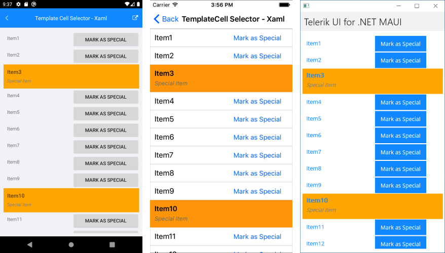
Template Selector Implementation
You have a RadListView bound to a collection of multiple DataItem objects and the appearance of each item depends on a specific property of the business object.
1. Add the DataItem class:
public class DataItem : NotifyPropertyChangedBase
{
    private string name;
    private bool isSpecial;

    public string Name
    {
        get { return this.name; }
        set { this.UpdateValue(ref this.name, value); }
    }

    public bool IsSpecial
    {
        get { return this.isSpecial; }
        set { this.UpdateValue(ref this.isSpecial, value); }
    }
}
2. Create a sample ViewModel class with a collection of DataItem objects. The collection will later be applied to the ItemsSource property of the ListView:
public class ViewModel
{
    public ViewModel()
    {
        this.Source = new ObservableCollection<DataItem>{
            new DataItem{ Name = "Item1"},
            new DataItem{ Name = "Item2"},
            new DataItem{ Name = "Item3", IsSpecial = true },
            new DataItem{ Name = "Item4"},
            new DataItem{ Name = "Item5"},
            new DataItem{ Name = "Item6"},
            new DataItem{ Name = "Item7"},
            new DataItem{ Name = "Item8"},
            new DataItem{ Name = "Item9"},
            new DataItem{ Name = "Item10", IsSpecial = true },
            new DataItem{ Name = "Item11"},
            new DataItem{ Name = "Item12"},
            new DataItem{ Name = "Item13"},
            new DataItem{ Name = "Item14", IsSpecial = true },
            new DataItem{ Name = "Item15"},
            new DataItem{ Name = "Item16"}
        };
    }

    public ObservableCollection<DataItem> Source { get; private set; }
}
3. You need to apply different template to the item based on the value of the IsSpecial property, you have to create a custom class that inherits from DataTemplateSelector. This class will return different DataTemplate according to whether the value is true or false:
public class CustomItemTemplateSelector : DataTemplateSelector
{
    public DataTemplate Template1 { get; set; }
    public DataTemplate Template2 { get; set; }

    protected override DataTemplate OnSelectTemplate(object item, BindableObject container)
    {
        var book = item as DataItem;
        if (book.IsSpecial)
        {
            return this.Template2;
        }

        return this.Template1;
    }
}
4. Set this custom class as the ItemTemplateSelector property of the RadListView and customize the templates within it:
<telerik:RadListView x:Name="listView" ItemsSource="{Binding Source}" >
    <telerik:RadListView.BindingContext>
        <local:ViewModel />
    </telerik:RadListView.BindingContext>
    <telerik:RadListView.ItemTemplateSelector>
        <local:CustomItemTemplateSelector>
            <local:CustomItemTemplateSelector.Template1>
                <DataTemplate>
                    <telerik:ListViewTemplateCell>
                        <telerik:ListViewTemplateCell.View>
                            <Grid>
                                <Grid.ColumnDefinitions>
                                    <ColumnDefinition/>
                                    <ColumnDefinition/>
                                </Grid.ColumnDefinitions>
                                <Label Grid.Column="0" Margin="10" Text="{Binding Name}" />
                                <Button Grid.Column="1" Text="Mark as Special" Clicked="Button_Clicked"/>
                            </Grid>
                        </telerik:ListViewTemplateCell.View>
                    </telerik:ListViewTemplateCell>
                </DataTemplate>
            </local:CustomItemTemplateSelector.Template1>
            <local:CustomItemTemplateSelector.Template2>
                <DataTemplate>
                    <telerik:ListViewTemplateCell>
                        <telerik:ListViewTemplateCell.View>
                            <Grid BackgroundColor="Orange">
                                <Grid.RowDefinitions>
                                    <RowDefinition />
                                    <RowDefinition />
                                </Grid.RowDefinitions>
                                <Label Text="{Binding Name}" FontSize="16" FontAttributes="Bold" VerticalOptions="Center" Margin="10, 10, 10, 0"/>
                                <Label Text="Special Item" FontSize="13" FontAttributes="Italic" TextColor="Gray" Grid.Row="1" Margin="10, 0, 10, 10" />
                            </Grid>
                        </telerik:ListViewTemplateCell.View>
                    </telerik:ListViewTemplateCell>
                </DataTemplate>
            </local:CustomItemTemplateSelector.Template2>
        </local:CustomItemTemplateSelector>
    </telerik:RadListView.ItemTemplateSelector>
</telerik:RadListView>
5. Add the needed namespaces:
xmlns:telerik="http://schemas.telerik.com/2022/xaml/maui"
Running the sample will lead to the following appearance of the control: