The
RadListViewcontrol is now obsolete and will be removed in the future. Use the RadCollectionView control instead. TheRadCollectionViewis a complete, ground-up rewrite of the ListView. TheRadCollectionViewoffers improved performance, enhanced features, and a modernized approach to managing lists of data. TheRadCollectionViewincorporates all of the ListView's key features. More about the differences between both components and how to migrate to the newRadCollectionViewis available in the Migrating the Telerik .NET MAUI RadListView to RadCollectionView article.
.NET MAUI ListView Selection
The ListView component exposes selection feature. It allows single or multiple selection of the ListView items. This feature provides both visual and programmatic feedback for the actions of the user. Also you can disable the selection.
Selection Mode
The ListView provides three selection modes, which allow you to manipulate the type of selection. This is controlled by the SelectionMode (Telerik.Maui.Controls.Compatibility.DataControls.ListView.SelectionMode) property which has the following entries:
-
None—This mode doesn't allow users to select an item. -
Single—This is the default selection mode. It allows users to select only one item. -
Multiple—This mode allows users to select more than one item.
Check below how you can set SelectionMode in XAML and code-behind:
Selection Gestures
You can also configure how the selection to be triggered by the end users through the SelectionGesture (Telerik.Maui.Controls.Compatibility.DataControls.ListView.SelectionGesture) property:
-
Tap—Tap on an item to select it. This is the defaultSelectionGesturevalue. -
Hold—Tap and hold an item to select it.
Selected Item
The ListView provides the SelectedItem (object) property, which specifies the last selected item of the ListView.
Selected Items Collection
The ListView provides the SelectedItems (ObservableCollection<object>) property, which is a read-only collection used to get the currently selected items.
Selection Events
The ListView provides the SelectionChanged event, which is triggered whenever the SelectedItems collection is changed. The SelectionChanged event handler receives two parameters:
- The sender argument which is of type object, but can be cast to the
RadListViewtype. - A
NotifyCollectionChangedEventArgsobject which provides information on the collection changed event. For more details, refer to the NotifyCollectionChangedEventArgs Class topic.
Styling the Selected Item(s)
You can customize the way selected items look by applying SelectedItemStyle property to the RadListView instance. For detailed information on the approach, go to the Items Styles topic in ListView documentation.
Example
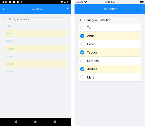
The example below shows how to use ListView selection feature and demonstrates how to set multiple selection, apply a selected item style, and retrieve the selected items in a ViewModel class.
1. Create a ViewModel class with two collections—One for the ItemsSource of the ListView and one that will hold the SelectedItems. For the example, the ListView is bound to a collection of strings:
2. Add a RadListView instance to your page with selection properties applied:
3. Add the telerik namespace:
4. Set the ViewModel class as a BindingContext and call the InitializePickers() method:
The following image shows how the ListView looks like on different platforms when multiple items are selected:

For the ListView Selection example, go to the SDKBrowser Demo Application and navigate to ListView -> Selection category.