The
RadListViewcontrol is obsolete and will be removed in Q2 2026. Use the RadCollectionView control instead. TheRadCollectionViewis a complete, ground-up rewrite of the ListView. TheRadCollectionViewoffers improved performance, enhanced features, and a modernized approach to managing lists of data. TheRadCollectionViewincorporates all of the ListView's key features. More about the differences between both components and how to migrate to the newRadCollectionViewis available in the Migrating the Telerik .NET MAUI RadListView to RadCollectionView article.
.NET MAUI ListView Item Styles
The ListView component provides styling mechanism for customizing the look of its items.
This mechanism consists of the following properties of type ListViewItemStyle:
ItemStyleSelectedItemStylePressedItemStyleReorderItemStyle
ListViewItemStyle
The properties of this object are respectively applied to the native components. The supported ones are the following:
-
BackgroundColor(Color)—Sets the background of the item(s). -
BorderColor(Color)—Sets the color of the border. -
BorderWidth(double)—Defines the width of the borer. -
BorderLocation(Location)—Describes an enumeration describing where the border will be visible. -
TextCellTextColor(Color)—Defines the text color of the ListViewTextCell.
Location
This enumeration contains the following members:
-
None—The border will not be visualized. -
Top—The border will be visualized only at the top side. -
Bottom—The border will be visualized only at the bottom side. -
Left—The border will be visualized only at the left side. -
Right—The border will be visualized only at the right side. - (Default)
All—The border will be visualized all around the item.
Example
<telerik:RadListView x:Name="listView"
                                 ItemsSource="{Binding Source}"
                                 IsItemsReorderEnabled="True">
    <telerik:RadListView.BindingContext>
        <local:ViewModel />
    </telerik:RadListView.BindingContext>
    <telerik:RadListView.ItemTemplate>
        <DataTemplate>
            <telerik:ListViewTextCell Text="{Binding Name}" />
        </DataTemplate>
    </telerik:RadListView.ItemTemplate>
    <telerik:RadListView.ItemStyle>
        <telerik:ListViewItemStyle BackgroundColor="#1263E5"
                                TextCellTextColor="#AAC7F6"
                                BorderColor="#0A3A82"
                                BorderWidth="2"
                                BorderLocation="All" />
    </telerik:RadListView.ItemStyle>
    <telerik:RadListView.SelectedItemStyle>
        <telerik:ListViewItemStyle BackgroundColor="#83A9E2"
                                TextCellTextColor="#AAC7F6"
                                BorderColor="#0A3A82"
                                BorderWidth="2"
                                BorderLocation="Bottom"/>
    </telerik:RadListView.SelectedItemStyle>
    <telerik:RadListView.PressedItemStyle>
        <telerik:ListViewItemStyle BackgroundColor="#C1C1C1"
                                TextCellTextColor="#AAC7F6"
                                BorderColor="#0B3D89"
                                BorderWidth="2"
                                BorderLocation="Bottom"/>
    </telerik:RadListView.PressedItemStyle>
    <telerik:RadListView.ReorderItemStyle>
        <telerik:ListViewItemStyle BackgroundColor="#0B3D89"
                                TextCellTextColor="#AAC7F6"
                                BorderColor="Black"
                                BorderWidth="2"
                                BorderLocation="All" />
    </telerik:RadListView.ReorderItemStyle>
</telerik:RadListView>
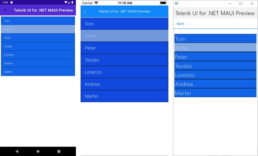
The following image shows a ListView with its ItemStyle and SelectedItemStyle applied.
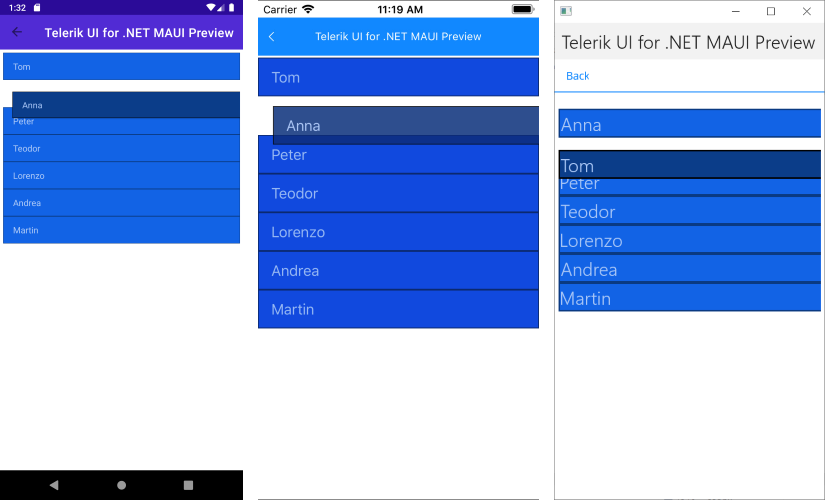
The following image shows a ListView with its ReorderItemStyle applied.
For a Item Styles example, go to the SDKBrowser Demo Application and navigate to ListView -> Styling category.