The
RadListViewcontrol is now obsolete and will be removed in the future. Use the RadCollectionView control instead. TheRadCollectionViewis a complete, ground-up rewrite of the ListView. TheRadCollectionViewoffers improved performance, enhanced features, and a modernized approach to managing lists of data. TheRadCollectionViewincorporates all of the ListView's key features. More about the differences between both components and how to migrate to the newRadCollectionViewis available in the Migrating the Telerik .NET MAUI RadListView to RadCollectionView article.
.NET MAUI ListView Cell Swipe
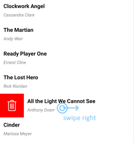
Cell swipe allows end-users to use swipe gestures on cells. When users swipe, they reveal a designated custom view with buttons, images etc.
The image below shows how swiping right can reveal a Delete button on the left:

You can reveal another custom view if the user swipes left. In this case, Cell Swipe displays the custom view on the right. As soon as the user taps the swiped item or anywhere on the ListView, the item returns to its original position.
Properties
You can use the following RadListView properties to configure the Cell Swipe feature:
-
IsItemSwipeEnabled(bool)—Enables or disables the Cell Swipe feature. The default value is False. -
SwipeThreshold(double)—Defines the length (in pixels) of the swipe gesture that is required to trigger the feature. Shorter swipe gestures are not respected. The default value is 0. -
SwipeOffset(Thickness)—Specifies how to move the swiped cell to the side and stick it there. The default value is 100. -
ItemSwipeContentTemplate(DataTemplate)—Defines the content that will be visualized when users swipe a cell.
The
SwipeThresholdvalue must be lower than theSwipeOffsetvalue. This is required because theSwipeThresholddefines the minimum swipe gesture length that triggers the Cell Swipe feature and reveals a custom view.
Methods
The following RadListView methods are related to the cell swiping feature:
- void
EndItemSwipe(boolisAnimated)—Moves the swiped item to its default position.
Events
The following RadListView events are related to the cell swiping feature:
-
ItemSwipeStarting—Occurs when the user initiates the swipe gesture. The event arguments are of theItemSwipeStartingEventArgstype that provides the following properties:-
Item(object)—The item that will be swiped. -
Cancel(bool)—If you set this value tofalse, the swiping will be canceled.
-
-
ItemSwiping—Occurs while the user is swiping the item. The event arguments are of theItemSwipingEventArgstype that provides the following properties:-
Item(object)—The item that is being swiped. -
Offset(double)—The current swipe offset.
-
-
ItemSwipeCompleted—Occurs when the user finishes the swipe gesture. The event arguments are of theItemSwipeCompletedEventArgstype that provides the following properties:-
Item(object)—The item that has been swiped. -
Offset(double)—The swipe offset at which the item has been dropped.
-
Commands
In addition to the swipe events, RadListView provides the following commands related to swipe actions:
ItemSwipeStartingItemSwipingItemSwipeCompleted
For more details on how to use the ListView commands, see Commands.
Examples
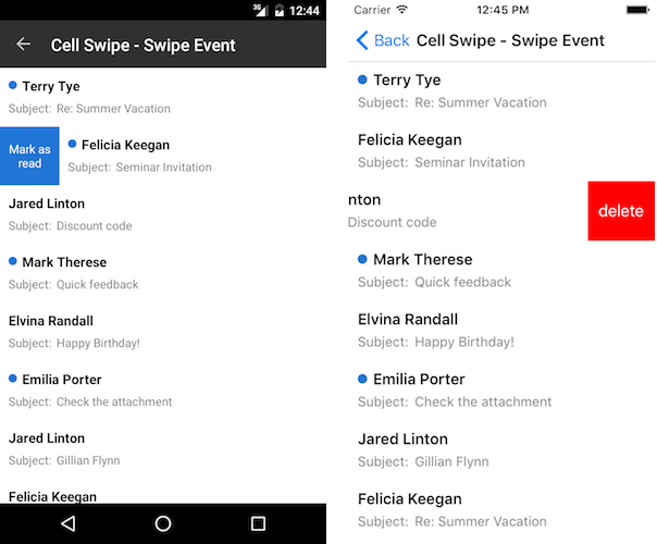
The RadListView swipe events allow you to configure custom actions that depend on the swipe direction, the swipe gesture length or the data item.
Alternatively, you can add interactive elements to the swipe content and use the swipe gesture only to reveal this content. The user can then choose how to interact with the revealed content.
Example with Swipe Events
The following example demonstrates how to use the ItemSwipeCompleted event. Depending on the swipe gesture length, we will modify the data item or remove it from the source.

1. Add the ViewModel for the ListView:
public class Mail : NotifyPropertyChangedBase
{
    bool isUnread;

    public string Sender { get; set; }

    public string Subject { get; set; }

    public bool IsUnread
    {
        get { return isUnread; }
        set { this.UpdateValue(ref this.isUnread, value); }
    }
}

public class ViewModel
{
    public ViewModel()
    {
        this.Source = new ObservableCollection<Mail> {
            new Mail{ Sender = "Terry Tye",  Subject = "Re: Summer Vacation" , IsUnread = true},
            new Mail{ Sender = "Felicia Keegan",  Subject = "Seminar Invitation", IsUnread = true},
            new Mail{ Sender = "Jared Linton",  Subject = "Discount code"},
            new Mail{ Sender = "Mark Therese",  Subject = "Quick feedback", IsUnread = true},
            new Mail{ Sender = "Elvina Randall",  Subject = "Happy Birthday!"},
            new Mail{ Sender = "Emilia Porter",  Subject = "Check the attachment", IsUnread = true},
            new Mail{ Sender = "Jared Linton",  Subject = "Gillian Flynn"},
            new Mail{ Sender = "Felicia Keegan",  Subject = "Re: Summer Vacation"},
            new Mail{ Sender = "Felicia Keegan",  Subject = "Pictures"},
        };
    }

    public ObservableCollection<Mail> Source { get; set; }
}
2. Set up ListView. Swiping left or right will reveal content with a hint for what will happen if the user completes the swipe action.
<telerik:RadListView x:Name="listView"
                                 IsItemSwipeEnabled="True"
                                 ItemSwipeCompleted="OnItemSwipeCompleted"
                                 ItemsSource="{Binding Source}"
                                 SelectionMode="None"
                                 SwipeOffset="70, 0, 70, 0"
                                 SwipeThreshold="10">
    <telerik:RadListView.BindingContext>
        <local:ViewModel/>
    </telerik:RadListView.BindingContext>
    <telerik:RadListView.ItemTemplate>
        <DataTemplate>
            <telerik:ListViewTemplateCell>
                <telerik:ListViewTemplateCell.View>
                    <Grid BackgroundColor="White" RowDefinitions="Auto,Auto">
                        <HorizontalStackLayout Margin="10,10,10,0">
                            <Image IsVisible="{Binding IsUnread}"
                                   Source="unread.png"
                                   HorizontalOptions="Center"
                                   VerticalOptions="Center"
                                   Aspect="Fill"
                                   WidthRequest="10"
                                   HeightRequest="10"/>
                            <Label FontAttributes="Bold"
                                   FontSize="16"
                                   Text="{Binding Sender}"
                                   TextColor="Black" />
                        </HorizontalStackLayout>
                        <HorizontalStackLayout Grid.Row="1"
                                               Margin="10,0,10,10">
                            <Label FontSize="14"
                                   Text="Subject:"
                                   TextColor="Gray" />
                            <Label FontSize="14"
                                   Text="{Binding Subject}"
                                   TextColor="Gray" />
                        </HorizontalStackLayout>
                    </Grid>
                </telerik:ListViewTemplateCell.View>
            </telerik:ListViewTemplateCell>
        </DataTemplate>
    </telerik:RadListView.ItemTemplate>
    <telerik:RadListView.ItemSwipeContentTemplate>
        <DataTemplate>
            <Grid Margin="0"
                  Padding="0"
                  ColumnSpacing="0"
                  ColumnDefinitions="70,*,70"
                  RowSpacing="0">
                <Label BackgroundColor="#2474d2"
                       HorizontalTextAlignment="Center"
                       Text="Mark as read"
                       TextColor="White"
                       VerticalTextAlignment="Center"
                       WidthRequest="70" />
                <Label Grid.Column="2"
                       BackgroundColor="Red"
                       HorizontalTextAlignment="Center"
                       Text="Delete"
                       TextColor="White"
                       VerticalTextAlignment="Center"
                       WidthRequest="70" />
            </Grid>
        </DataTemplate>
    </telerik:RadListView.ItemSwipeContentTemplate>
</telerik:RadListView>
3. Define the telerik namespace:
xmlns:telerik="http://schemas.telerik.com/2022/xaml/maui"
4. Configure what happens when the user completes the swipe gesture:
void OnItemSwipeCompleted(object sender, ItemSwipeCompletedEventArgs e)
{
    var listView = sender as RadListView;
    var item = e.Item as Mail;

    listView.EndItemSwipe();

    if (e.Offset >= 70)
    {
        item.IsUnread = false;
    }
    else if (e.Offset <= -70)
    {
        (listView.ItemsSource as ObservableCollection<Mail>).Remove(item);
    }
}
We call the EndItemSwipe() method to force the item to go to its default position since the scenario does not require any interaction with the swipe content itself.
Example with Interactive Content
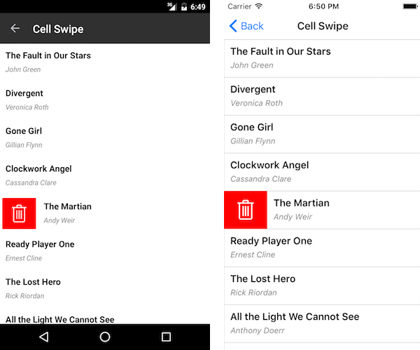
The following example demonstrates how to add a delete button to the swipe content. We use the button's Clicked event handler to delete an item from the ListView source.

1. Add the view model for the ListView:
public class Book
{
    public string Title { get; set; }
    public string Author { get; set; }
}

public class ViewModel
{
    public ViewModel()
    {
        this.Source = new ObservableCollection<Book> {
            new Book{ Title = "The Fault in Our Stars ",  Author = "John Green"},
            new Book{ Title = "Divergent",  Author = "Veronica Roth"},
            new Book{ Title = "Gone Girl",  Author = "Gillian Flynn"},
            new Book{ Title = "Clockwork Angel",  Author = "Cassandra Clare" },
            new Book{ Title = "The Martian",  Author = "Andy Weir"},
            new Book{ Title = "Ready Player One",  Author = "Ernest Cline"},
            new Book{ Title = "The Lost Hero",  Author = "Rick Riordan" },
            new Book{ Title = "All the Light We Cannot See",  Author = "Anthony Doerr"},
            new Book{ Title = "Cinder",  Author = "Marissa Meyer"},
            new Book{ Title = "Me Before You",  Author = "Jojo Moyes"},
            new Book{ Title = "The Night Circus",  Author = "Erin Morgenstern"},
        };
    }

    public ObservableCollection<Book> Source { get; set; }
}
2. Set up ListView. Note that the SwipeOffset is equal to the width of the button in the swipe content. Thus, when the swipe is complete, the revealed content will be the whole button.
<telerik:RadListView x:Name="listView"
                             BackgroundColor="White"
                             IsItemSwipeEnabled="True"
                             ItemsSource="{Binding Source}"
                             SelectionMode="None"
                             SwipeOffset="70, 0, 0, 0"
                             SwipeThreshold="10">
    <telerik:RadListView.BindingContext>
        <local:ViewModel/>
    </telerik:RadListView.BindingContext>
    <telerik:RadListView.ItemTemplate>
        <DataTemplate>
            <telerik:ListViewTemplateCell>
                <telerik:ListViewTemplateCell.View>
                    <Grid>
                        <Grid.RowDefinitions>
                            <RowDefinition Height="Auto" />
                            <RowDefinition Height="Auto" />
                        </Grid.RowDefinitions>
                        <Label Margin="10,10,10,0"
                               FontAttributes="Bold"
                               FontSize="16"
                               Text="{Binding Title}"
                               TextColor="Black" />
                        <Label Grid.Row="1"
                               Margin="10,0,10,10"
                               FontAttributes="Italic"
                               FontSize="13"
                               Text="{Binding Author}"
                               TextColor="Gray" />
                    </Grid>
                </telerik:ListViewTemplateCell.View>
            </telerik:ListViewTemplateCell>
        </DataTemplate>
    </telerik:RadListView.ItemTemplate>
    <telerik:RadListView.ItemStyle>
        <telerik:ListViewItemStyle BackgroundColor="White" />
    </telerik:RadListView.ItemStyle>
    <telerik:RadListView.ItemSwipeContentTemplate>
        <DataTemplate>
            <Grid Margin="0"
                  Padding="0"
                  ColumnSpacing="0"
                  ColumnDefinitions="70,*"
                  RowSpacing="0">
                <Button Margin="0"
                        Padding="0"
                        BackgroundColor="Red"
                        CornerRadius="0"
                        Clicked="RemoveBook"
                        Text="Delete"
                        WidthRequest="70" />
            </Grid>
        </DataTemplate>
    </telerik:RadListView.ItemSwipeContentTemplate>
</telerik:RadListView>
3. Define the telerik namespace:
xmlns:telerik="http://schemas.telerik.com/2022/xaml/maui"
4. Configure what happens when the user completes the swipe gesture. The BindingContext of the swipe content is the data item. This can be used to perform operations on the data. In this case, we will delete the item from the source.
void RemoveBook(object sender, EventArgs e)
{
    var item = (sender as BindableObject).BindingContext as Book;
    (this.listView.BindingContext as ViewModel).Source.Remove(item);
}
For sample Cell Swipe examples, go to the SDKBrowser Demo Application and navigate to ListView -> Cell Swipe category.