The
RadListViewcontrol is obsolete and will be removed in Q2 2026. Use the RadCollectionView control instead. TheRadCollectionViewis a complete, ground-up rewrite of the ListView. TheRadCollectionViewoffers improved performance, enhanced features, and a modernized approach to managing lists of data. TheRadCollectionViewincorporates all of the ListView's key features. More about the differences between both components and how to migrate to the newRadCollectionViewis available in the Migrating the Telerik .NET MAUI RadListView to RadCollectionView article.
.NET MAUI ListView Layouts
The ListView control supports two layouts: linear and grid through its LayoutDefinition property. It accepts values of type ListViewLayoutBase which is a base class for all list view layouts.
Here are the properties exposed by the ListViewLayoutBase class:
-
VerticalItemSpacing(double)—Gets or sets the vertical space between two items. -
HorizontalItemSpacing(double)—Gets or sets the horizontal space between two items. -
ItemLength(double)—Gets or sets the width or height (depending on the layout orientation) of the items. The default value is-1, which means that the items will be sized according to the targeted platform default behavior. -
GroupHeaderLength(double)—Gets or sets the width or height (depending on the layout orientation) of the group headers. The default value is -1 which means that the items will be sized according to the targeted platform default behavior. -
Orientation(Orientation)—Gets or sets the orientation (scroll direction) of the layout.
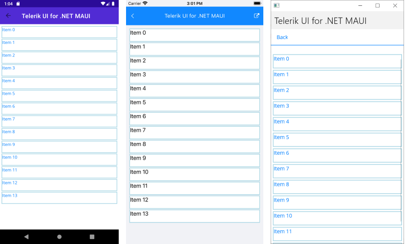
Linear Layout
Linear layout is the default layout of the control. It can be explicitly set by creating an instance of the ListViewLinearLayout class and assigning it to the RadListView.LayoutDefinition property.
The following example demonstrates how to use the RadListViewLinearLayout.
1. Define the list view in XAML:
<telerik:RadListView x:Name="listView" ItemsSource="{Binding Items}">
    <telerik:RadListView.BindingContext>
        <local:ViewModel/>
    </telerik:RadListView.BindingContext>
    <telerik:RadListView.ItemTemplate>
        <DataTemplate>
            <telerik:ListViewTemplateCell>
                <telerik:ListViewTemplateCell.View>
                    <telerik:RadBorder BorderColor="LightBlue" BorderThickness="2">
                        <Label Text="{Binding Name}"/>
                    </telerik:RadBorder>
                </telerik:ListViewTemplateCell.View>
            </telerik:ListViewTemplateCell>
        </DataTemplate>
    </telerik:RadListView.ItemTemplate>
    <telerik:RadListView.LayoutDefinition>
        <telerik:ListViewLinearLayout ItemLength="40" VerticalItemSpacing="2" />
    </telerik:RadListView.LayoutDefinition>
</telerik:RadListView>
2. Add the telerik namespace:
xmlns:telerik="http://schemas.telerik.com/2022/xaml/maui"
ViewModel class with the ItemsSource collection:
public class ViewModel
{
    public ViewModel()
    {
        this.Items = new ObservableCollection<Item>();
        for (int i = 0; i < 14; i++)
        {
            var c = 200 - 10 * i;
            this.Items.Add(new Item() { Name = "Item " + i, });
        }
    }
    public ObservableCollection<Item> Items { get; set; }
}
The following image shows the result:
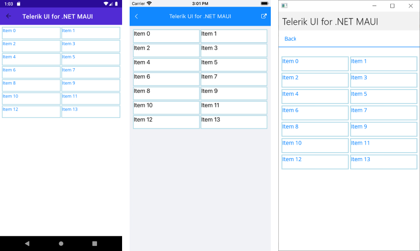
Grid Layout
The Grid Layout allows distributing cells in a fixed number of columns/rows. To the basic layout properties, it exposes the SpanCount (int) property, which gets or sets the count of the columns/rows (depending on the orientation) of the list.
The grid layout can be utilized by setting the RadListView.LayoutDefinition property to a new instance of the ListViewGridLayout class.
The following example demonstrates how to use the RadListViewGridLayout.
1. Define the list view in XAML:
<telerik:RadListView x:Name="listView" ItemsSource="{Binding Items}">
    <telerik:RadListView.BindingContext>
        <local:ViewModel/>
    </telerik:RadListView.BindingContext>
    <telerik:RadListView.ItemTemplate>
        <DataTemplate>
            <telerik:ListViewTemplateCell>
                <telerik:ListViewTemplateCell.View>
                    <telerik:RadBorder BorderColor="LightBlue" BorderThickness="2">
                        <Label Text="{Binding Name}"/>
                    </telerik:RadBorder>
                </telerik:ListViewTemplateCell.View>
            </telerik:ListViewTemplateCell>
        </DataTemplate>
    </telerik:RadListView.ItemTemplate>
    <telerik:RadListView.LayoutDefinition>
        <telerik:ListViewGridLayout ItemLength="40"
                                            HorizontalItemSpacing="2"
                                            VerticalItemSpacing="2" />
    </telerik:RadListView.LayoutDefinition>
</telerik:RadListView>
2. Add the ViewModel class with the ItemsSource collection:
public class ViewModel
{
    public ViewModel()
    {
        this.Items = new ObservableCollection<Item>();
        for (int i = 0; i < 14; i++)
        {
            var c = 200 - 10 * i;
            this.Items.Add(new Item() { Name = "Item " + i, });
        }
    }
    public ObservableCollection<Item> Items { get; set; }
}
The following image shows the result: