The
RadListViewcontrol is obsolete and will be removed in Q2 2026. Use the RadCollectionView control instead. TheRadCollectionViewis a complete, ground-up rewrite of the ListView. TheRadCollectionViewoffers improved performance, enhanced features, and a modernized approach to managing lists of data. TheRadCollectionViewincorporates all of the ListView's key features. More about the differences between both components and how to migrate to the newRadCollectionViewis available in the Migrating the Telerik .NET MAUI RadListView to RadCollectionView article.
.NET MAUI ListView Header and Footer
The ListView provides the option to add - Header and Footer, which will allow you to position content of your choice above and below the list with the items. Both header and footer templates are scrolled along with the ListView items.
-
HeaderTemplate(DataTemplate)—Defines the Header of the ListView before all items. -
FooterTemplate(DataTemplate)—Defines the Footer of the ListView after all items.
The following example shows how to add a Header and a Footer to the ListView control.
1. Create a ViewModel:
public class HeaderAndFooterViewModel
{
    public HeaderAndFooterViewModel()
    {
        this.Items = GetItems(20);
    }

    public ObservableCollection<string> Items { get; set; }

    private static ObservableCollection<string> GetItems(int count)
    {
        var items = new ObservableCollection<string>();
        for (int i = 0; i < count; i++)
        {
            items.Add(string.Format("item {0}", i));
        }

        return items;
    }
}
2. Add the following sample DataTemplates to the resources of the page that will be used as:
2.1 Example how to define the Header Template
<DataTemplate x:Key="HeaderTemplate">
    <Label Text="The Available Items are: "
           TextColor="Black"
           FontAttributes="Bold"
           FontSize="25"/>
</DataTemplate>
2.2 Example how to define the Footer Template
<DataTemplate x:Key="FooterTemplate">
    <Label Text="All Items!"
           TextColor="Black"
           FontAttributes="Bold"
           FontSize="25"/>
</DataTemplate>
3. Use the following snippet to declare the ListView in XAML:
<telerik:RadListView x:Name="listView"
                             ItemsSource="{Binding Items}"
                             HeaderTemplate="{StaticResource HeaderTemplate}"
                             FooterTemplate="{StaticResource FooterTemplate}"/>
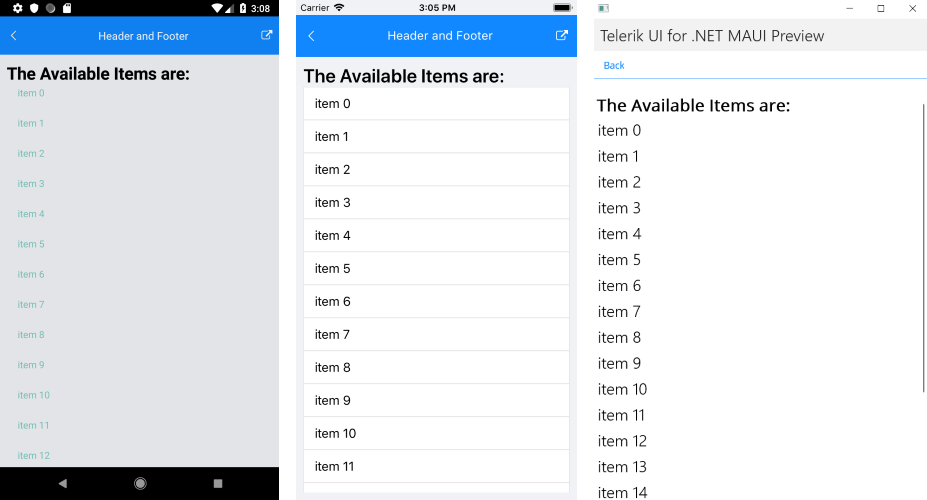
The following image shows how the ListView Header looks.

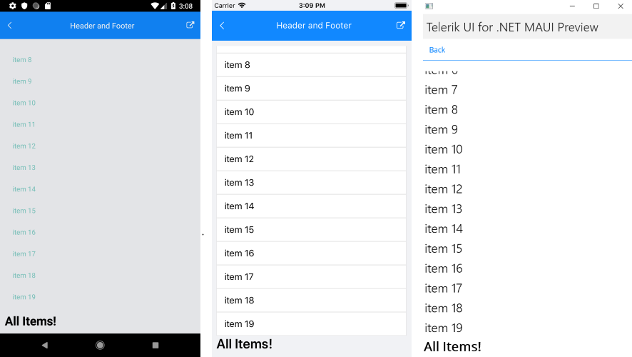
The following image shows how the ListView Footer looks.

For a sample Header and Footer example, refer to the SDKBrowser MAUI application.