New to Telerik UI for .NET MAUI? Start a free 30-day trial

.NET MAUI CollectionView DragVisual & DropIndicator Templates

The CollectionView provides the following templates for customizing the drag cue during a drag-and-drop operation as well as the indicator where the dragged item will be dropped:

  • DragVisualTemplate(DataTemplate)—Represents the drag visual of the dragged item during a drag-and-drop operation.
  • DropIndicatorTemplate(DataTemplate)—Represents the indicator shown between the CollectionView items during a drag-and-drop operation which shows where the dragged item will be dropped.

Telerik .NET MAUI CollectionView DragVisual and DropIndicator Visual Structure

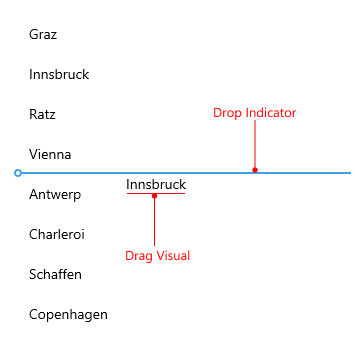
Check an example of the CollectionView with sample DragVisualTemplate and DropIndicatorTemplate:

1. Add a sample DataTemplate for the drop indicator to the page's resources:

<DataTemplate x:Key="CustomDropIndicatorTemplate">
    <Grid ColumnDefinitions="Auto, *">
        <Label FontFamily="TelerikFontExamples"
               FontSize="20"
               Text="&#xe806;"
               TextColor="#00897B" />
        <Line Grid.Column="1"
              X2="100"
              Aspect="UniformToFill"
              Stroke="#00897B"
              StrokeThickness="2"
              StrokeDashArray="4, 2"
              StrokeDashOffset="1"
              VerticalOptions="Center" />
    </Grid>
</DataTemplate>

2. Add a sample DataTemplate for the drag visual to the page's resources:

<DataTemplate x:Key="CustomDragVisualTemplate">
    <telerik:RadBorder BackgroundColor="#FAFAFA"
                       BorderColor="#00897B"
                       BorderThickness="1">
        <Grid ColumnDefinitions="Auto, Auto, *"
              ColumnSpacing="2"
              Padding="4">
            <Label Text="{Binding City, StringFormat='{0},'}"
                   TextColor="#00897B"
                   TextTransform="Uppercase"
                   FontAttributes="Bold"
                   VerticalTextAlignment="Center" />
            <Label Grid.Column="1"
                   Text="{Binding Country}"
                   TextColor="#00897B"
                   VerticalTextAlignment="Center" />
        </Grid>
    </telerik:RadBorder>
</DataTemplate>

3. Add the RadCollectionView definition with the DragVisualTemplate and DropIndicatorTemplate set to the previously defined templates:

<telerik:RadCollectionView x:Name="collectionView"
                           ItemsSource="{Binding Locations}"
                           DisplayMemberPath="City"
                           IsDragDropEnabled="True"
                           SelectionMode="Single"
                           DropIndicatorTemplate="{StaticResource CustomDropIndicatorTemplate}"
                           DragVisualTemplate="{StaticResource CustomDragVisualTemplate}">
    <telerik:RadCollectionView.BindingContext>
        <local:ViewModel />
    </telerik:RadCollectionView.BindingContext>
</telerik:RadCollectionView>

For the purpose of the example, use the ViewModel and DataModel classes from the Drag and Drop Overview page.

Check the result below:

.NET MAUI CollectionView DragVisual and DropIndicator Templates

See Also

In this article