.NET MAUI DataGrid Row Details Overview
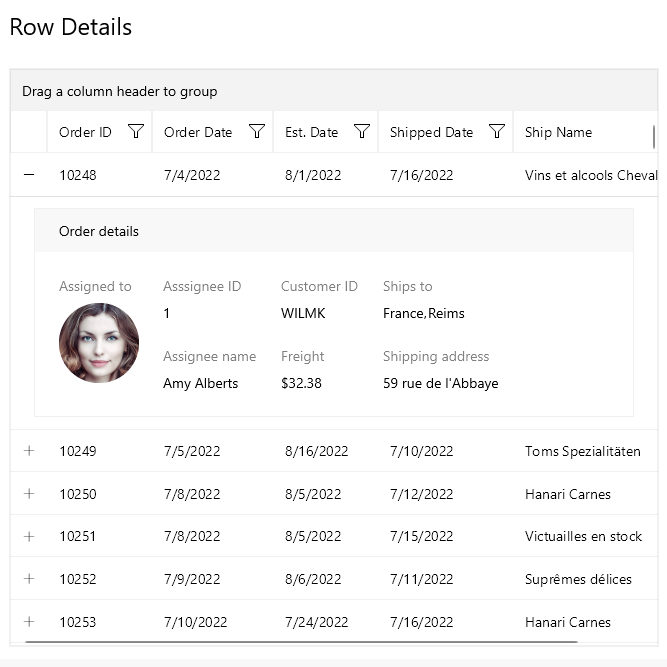
The Telerik UI for .NET MAUI DataGrid control is capable of presenting additional information through the Row Details functionality. The Row Details is a Data Template defined on the grid or row level and is used for displaying data without affecting the dimensions of the row and the cells within it.
To show the Row Details, you can use the following exposed options:
The default
DataGridToggleRowDetailsColumncolumn —Allows showing and hiding the row details for an item. For additional information, refer to the DataGrid Toggle Row Details ColumnFor example, on a selection without using the default column. For this case you need a custom implementation.
Here is a sample implementation inside the DataGrid SelectionChanged event:
The DataGrid exposes the following properties that control the row details functionality:
AreRowDetailsFrozen(typebool)—The property indicates whether the row details keep their position during horizontal scroll.ExpandedRowDetails(typeIList)—Defines the collection of items that have expanded row details.CanUserExpandMultipleRowDetails(typebool)—The property indicates whether multiple row details can be expanded.
For an outline of all DataGrid features review the .NET MAUI DataGrid Overview article.