.NET MAUI DataGrid Grouping
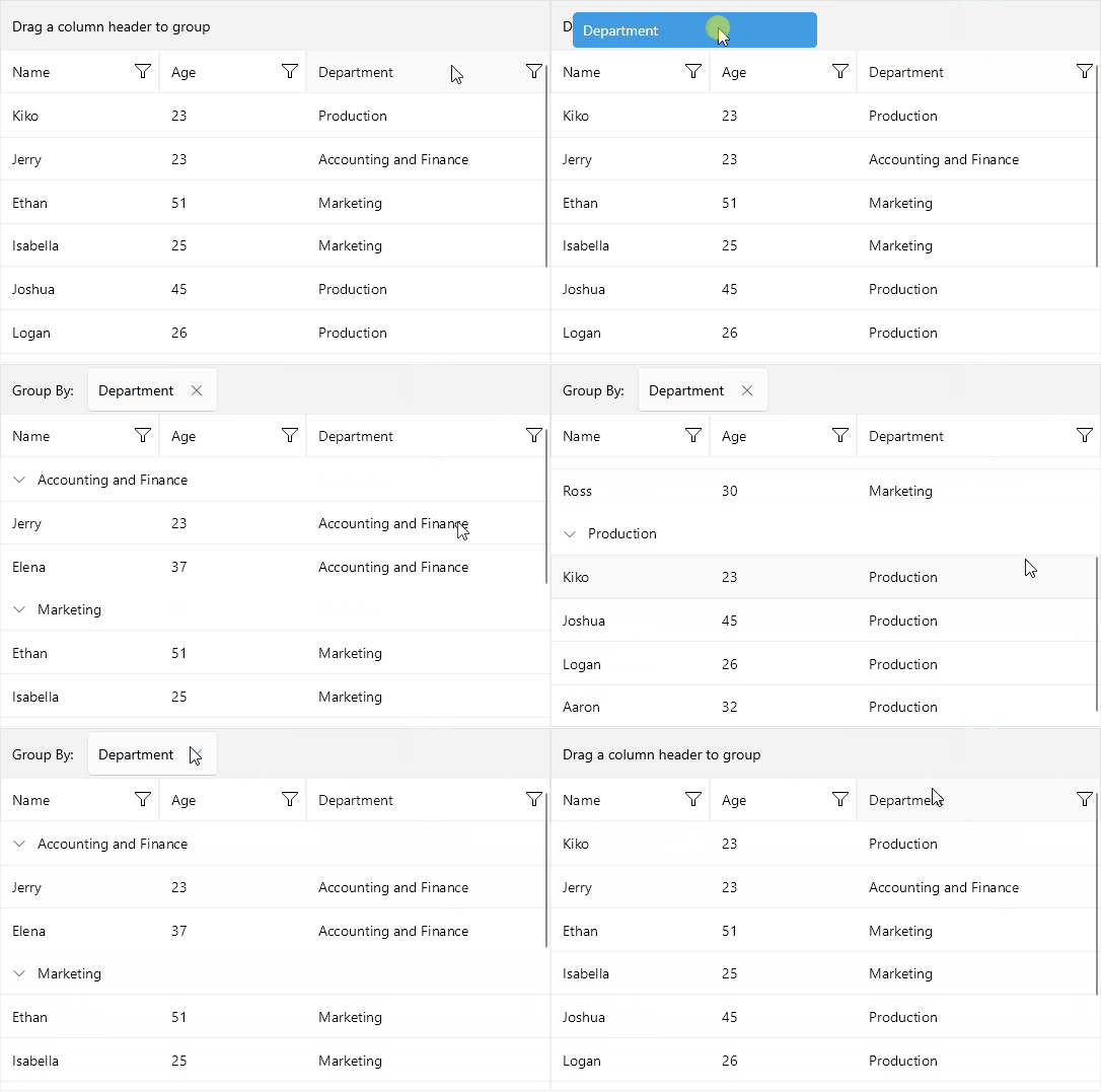
The Telerik UI for .NET MAUI DataGrid supports grouping operations either through the UI - using the Grouping UI or programmatically through Property and Delegate group descriptors.
The Grouping is part of Telerik UI for .NET MAUI, the most comprehensive UI suite for .NET MAUI! To try it out, sign up for a free 30-day trial and kickstart your cross-platform app development today.
Grouping UI

The DataGrid Grouping UI is enabled by design on desktop and disabled on mobile, it allows the user to group the DataGrid by dragging and dropping the column headers to the DataGridGroupingPanel.
The UI is represented by the DataGridGroupingPanel. The panel is part of the DataGrid and it's visualized at the top.
For more information about Grouping UI review the Grouping UI article of the DataGrid.
Customize the appearance of the items inside the grouping panel by using the GroupingPanelItemTemplate (DataTemplate) property.
Programmatic Grouping
Programmatic grouping can be done by adding descriptors to the GroupDescriptors collection. There are two types of descriptors:
-
PropertyGroupDescriptor—Uses a property from the model as a group key. -
DelegateGroupDescriptor—Creates a custom group key which you can use.
Expand and Collapse Groups
The DataGrid supports group expand and collapse operations either through the UI by tapping on the group headers, or programmatically. By default, all the groups are expanded.
Group Headers Customization
The DataGrid provides the ability to fully customize its group headers in order to achieve the desired look when the data is grouped. Go to Group Header Template topic for detailed information on this.
For an outline of all DataGrid features review the .NET MAUI DataGrid Overview article.