Getting Started with WinUI RibbonView
This tutorial will walk you through the creation of a sample application that contains RadRibbonView.
Before reading this tutorial you should get familiar with the Visual Structure of the control.
Assembly References
In order to use the RadRibbonView control, you will need to add references to the following assemblies:
Telerik.WinUI.Controls.dllTelerik.Licensing.Runtime.dll
Defining a RadRibbonView
You can add a RadRibbonView manually in XAML as demonstrated in Example 1.
You can access the RadRibbonView control through an alias pointing to the Telerik.UI.Xaml.Controls namespace:
xmlns:telerik="using:Telerik.UI.Xaml.Controls"
Example 1: Adding a RadRibbonView in XAML
<telerik:RadRibbonView />
At this state, the ribbonview is empty. The following section we will demonstrate how to populate the control with RadRibbonTabs.
Adding Ribbon Tabs
The RadRibbonView helps users to quickly find the tools and options they need in order to complete a task. Tools and options are organized in logical groups that are collected together under specific tabs. The ribbon tabs allows you to categorize the commands to be displayed to the users. The class that represents the ribbon tab is the RadRibbonTab.
For more information about the RadRibbonTab, check out the Ribbon Tab help article in the Ribbon Controls section. Also, keep in mind that you can use contextual tabs. You can read more about this in the Contextual Tabs topic.
The tabs can be added in the Items collection of RadRibbonView. The RadRibbonTab class exposes a Header property that is used to define the content of its header. Example 2 and Example 3 demonstrate how to do this in XAML and code-behind.
Example 2: Adding RadRibbonTabs in XAML
<telerik:RadRibbonView>
    <telerik:RadRibbonView.Items>
        <telerik:RadRibbonTab Header="Home" />
        <telerik:RadRibbonTab Header="View" />
        <telerik:RadRibbonTab Header="Insert" />
        <telerik:RadRibbonTab Header="References" />
    </telerik:RadRibbonView.Items>
</telerik:RadRibbonView>
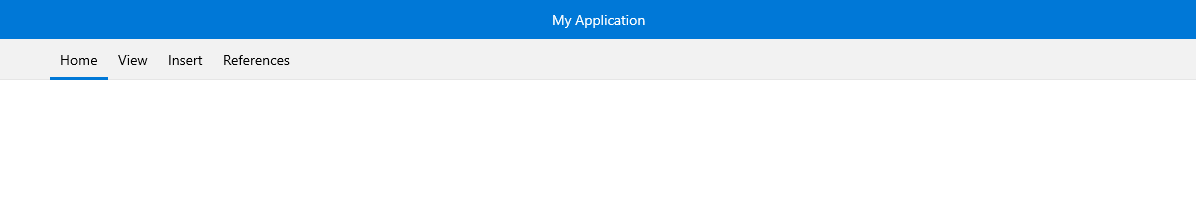
Figure 2: RadRibbonView with several RadRibbonTabs defined in its Items collection
Adding Content in the Ribbon Tabs
RadRibbonTab is a HeaderedItemsControl, which means that it can contain a collection of items. The children of the ribbon tab should be objects of type RadRibbonGroup. They expose a Header property that is used to define the content of their header.
The Items collection of RadRibbonTab can contain any UIElement. However, if you do not wrap it manually into a RadRibbonGroup control, the ribbonview will do it automatically.
You can find more information about RadRibbonGroup in the Ribbon Group help article.
Example 3: Adding RadRibbonGroups
<telerik:RadRibbonView>
    <telerik:RadRibbonView.Items>
        <telerik:RadRibbonTab Header="Home">
            <telerik:RadRibbonGroup Header="Clipboard" />
            <telerik:RadRibbonGroup Header="Font" />
        </telerik:RadRibbonTab>
        <telerik:RadRibbonTab Header="View" />
    </telerik:RadRibbonView.Items>
</telerik:RadRibbonView>
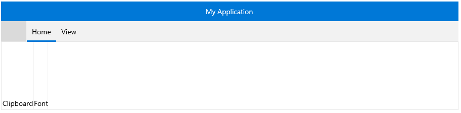
Figure 3: A RadRibbonTab with a couple RadRibbonGroups defined in its Items collection
RadRibbonGroup is also a HeaderedItemsControl and it can have child elements on its own.
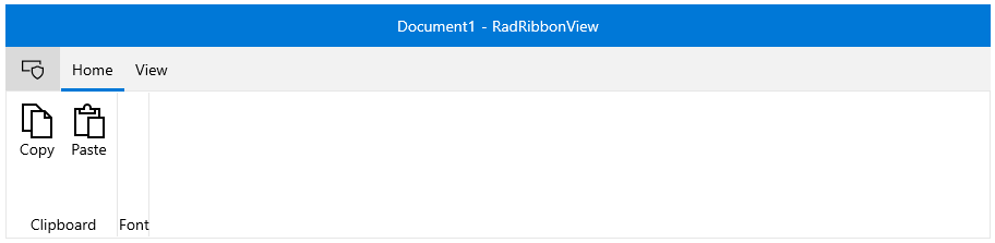
Example 4: Adding RadRibbonGroup content
<telerik:RadRibbonView>
    <telerik:RadRibbonView.Items>
        <telerik:RadRibbonTab Header="Home">
            <telerik:RadRibbonGroup Header="Clipboard">
                <telerik:RadRibbonButton Text="Copy" Size="Large" >
                    <telerik:RadRibbonButton.LargeIcon>
                        <SymbolIcon Symbol="Copy"/>
                    </telerik:RadRibbonButton.LargeIcon>
                </telerik:RadRibbonButton>
                <telerik:RadRibbonButton Text="Paste" Size="Large">
                    <telerik:RadRibbonButton.LargeIcon>
                        <SymbolIcon Symbol="Paste"/>
                    </telerik:RadRibbonButton.LargeIcon>
                </telerik:RadRibbonButton>
            </telerik:RadRibbonGroup>
            <telerik:RadRibbonGroup Header="Font"/>
        </telerik:RadRibbonTab>
        <telerik:RadRibbonTab Header="View" />
    </telerik:RadRibbonView.Items>
</telerik:RadRibbonView>
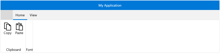
Figure 4: A RadRibbonGroup with a couple ribbon buttons defined in its Items collection
Resizing
One of the most important features of RadRibbonView is the dynamic layout resizing. It refers to the RadRibbonView's ability to optimize its layout depending on how much space is available. This process can't be automated; however, the RadRibbonView's API gives you the ability to specify how you would like the resizing to occur.
Check out the following topics, which are tightly connected to the resizing behavior:
Setting up the Application Button Icon
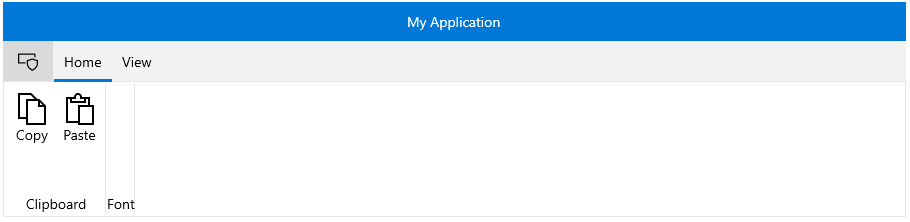
You can set the icon of the ribbonview's application button through the ApplicationButtonIcon property, which is of type IconElement.
Example 6: Setting the RadRibbonView application button image source in XAML
<telerik:RadRibbonView Margin="20">
    <telerik:RadRibbonView.ApplicationButtonIcon>
        <SymbolIcon Symbol="Admin" />
    </telerik:RadRibbonView.ApplicationButtonIcon>
    <telerik:RadRibbonView.Items>
        <telerik:RadRibbonTab Header="Home">
            <telerik:RadRibbonGroup Header="Clipboard">
                <telerik:RadRibbonButton Text="Copy" Size="Large" >
                    <telerik:RadRibbonButton.LargeIcon>
                        <SymbolIcon Symbol="Copy"/>
                    </telerik:RadRibbonButton.LargeIcon>
                </telerik:RadRibbonButton>
                <telerik:RadRibbonButton Text="Paste" Size="Large">
                    <telerik:RadRibbonButton.LargeIcon>
                        <SymbolIcon Symbol="Paste"/>
                    </telerik:RadRibbonButton.LargeIcon>
                </telerik:RadRibbonButton>
            </telerik:RadRibbonGroup>
            <telerik:RadRibbonGroup Header="Font"/>
        </telerik:RadRibbonTab>
        <telerik:RadRibbonTab Header="View" />
    </telerik:RadRibbonView.Items>
</telerik:RadRibbonView>
Figure 5: RadRibbonView application button image
Setting up the Application Title and Name
The header displayed at the title bar of RadRibbonView is constructed by its Title and ApplicationName properties with a dash separator between them. You can take a peek at the Visual Structure article to see how it looks.
Example 7: Setting the RadRibbonView application title and name
<telerik:RadRibbonView ApplicationName="RadRibbonView" Title="Document 1">
    <telerik:RadRibbonView.ApplicationButtonIcon>
        <SymbolIcon Symbol="Admin" />
    </telerik:RadRibbonView.ApplicationButtonIcon>
    <telerik:RadRibbonView.Items>
        <telerik:RadRibbonTab Header="Home">
            <telerik:RadRibbonGroup Header="Clipboard">
                <telerik:RadRibbonButton Text="Copy" />
                <telerik:RadRibbonButton Text="Paste"/>
            </telerik:RadRibbonGroup>
            <telerik:RadRibbonGroup Header="Font"/>
        </telerik:RadRibbonTab>
        <telerik:RadRibbonTab Header="View" />
    </telerik:RadRibbonView.Items>
</telerik:RadRibbonView>
Figure 6: Title and ApplicationName properties reflected in the UI
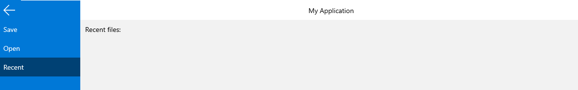
Setting up the Ribbon Backstage
The backstage menu is equivalent to the File menu of the traditional menu UIs. It is represented by the rectangular button (the application button) in the upper-left corner of the RadRibbonView control. The backstage menu appears when a user clicks the application button. This menu can be used to display controls used to perform actions on the entire document like save, print and send.
To declare a backstage menu in RadRibbonView you can set its Backstage property to an object of type RadRibbonBackstage.
You can learn more about the backstage control in the Ribbon Backstage help article.
Example 8: Sample backstage definition with several child RadRibbonBackstageItems in its Items collection.
<telerik:RadRibbonView>
    <telerik:RadRibbonView.Backstage>
        <telerik:RadRibbonBackstage>
            <telerik:RadRibbonBackstageItem Header="Save" IsSelectable="False" />
            <telerik:RadRibbonBackstageItem Header="Open" IsSelectable="False" />
            <telerik:RadRibbonBackstageItem Header="Recent">
                <StackPanel Margin="10">
                    <TextBlock Text="Recent files: " Margin="0 0 0 5" />
                </StackPanel>
            </telerik:RadRibbonBackstageItem>
        </telerik:RadRibbonBackstage>
    </telerik:RadRibbonView.Backstage>
</telerik:RadRibbonView>
Figure 7: RadRibbon Backstage example
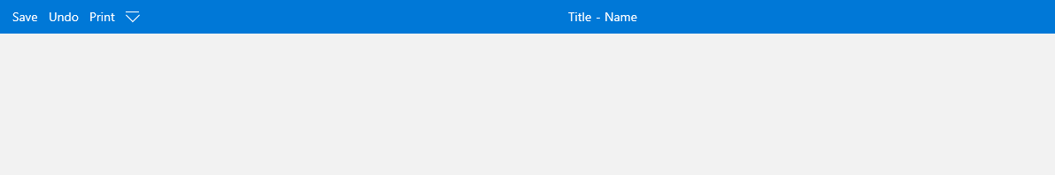
Setting up the Quick Access Toolbar
The Quick Access Toolbar is used to render a set of RadRibbonView controls (commands) that are most commonly used in the application. It is rendered right above the ApplicationButton to make it easily accessible to users. To declare the Quick Access ToolBar, you need to set the QuickAccessToolBar property.
Example 10: Sample setup of QuickAccessToolBar
<telerik:RadRibbonView ApplicationName="Name" Title="Title">
    <telerik:RadRibbonView.QuickAccessToolBar>
        <telerik:QuickAccessToolBar>
            <telerik:RadRibbonButton Content="Save"/>
            <telerik:RadRibbonButton Content="Undo"/>
            <telerik:RadRibbonButton Content="Print"/>
        </telerik:QuickAccessToolBar>
    </telerik:RadRibbonView.QuickAccessToolBar>
</telerik:RadRibbonView>
Figure 8: QuickAccessToolBar visualization with one of its buttons hovered
For more information and a practical example you can see the Quick Access Toolbar topic.
Telerik UI for WinUI Learning Resources
- Telerik UI for WinUI RibbonView Component
- Getting Started with Telerik UI for WinUI Components
- Telerik UI for WinUI Installation
- Telerik UI for WinUI Examples
- Telerik UI for WinUI Accessibility
- Telerik UI for WinUI License Agreement