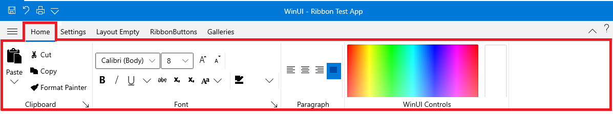
Ribbon Tab
Telerik RadRibbonView provides a simple and consistent way for building interfaces similar to the ribbon control used in Microsoft Office. The RadRibbonView consists of various elements, one of which is the Ribbon Tab. This topic discusses concepts fundamental to the Ribbon Tab at first and then goes into the usage of the RadRibbonTab class and its features.
Before proceeding with this tutorial, it is recommended to get familiar with the Visual Structure of the RadRibbonView control.
Fundamentals
You can access the RadRibbonTab control through an alias pointing to the Telerik.UI.Xaml.Controls namespace:
xmlns:telerik="using:Telerik.UI.Xaml.Controls"
The RadRibbonView helps end-users to quickly find the tools and options they need in order to complete a task. Tools and options are organized in logical groups that are collected together under specific tabs. Or in other words: the Ribbon Tab lets you categorize the commands to be displayed for the end-users.
Adding RadRibbonTabs to the RadRibbonView
When you are designing a new RadRibbonView, one of your first tasks will be to add tabs. In order to add RibbonTabs to your RadRibbonView control, you need to populate the RadRibbonView's Items collection.
The next example demonstrates how to add several RadRibbonTab to your ribbon and how to set their Header property.
Example 1: Adding RadRibbonTabs
<telerik:RadRibbonView x:Name="radRibbonView">
    <telerik:RadRibbonTab Header="Home">
    </telerik:RadRibbonTab>
    <telerik:RadRibbonTab Header="Insert">
    </telerik:RadRibbonTab>
    <telerik:RadRibbonTab Header="Page Layout">
    </telerik:RadRibbonTab>
    <telerik:RadRibbonTab Header="References">
    </telerik:RadRibbonTab>
    <telerik:RadRibbonTab Header="Mailings">
    </telerik:RadRibbonTab>
    <telerik:RadRibbonTab Header="Review">
    </telerik:RadRibbonTab>
    <telerik:RadRibbonTab Header="View">
    </telerik:RadRibbonTab>
</telerik:RadRibbonView>
RadRibbonTab Properties
The RadRibbonTab exposes the following properties that allow you to further customize it:
IsSelected: A boolean property that specify whether a tab is selected. The first item in the Items collection is the default selected RadRibbonTab. However, you have the ability to change the default selected RibbonTab, by setting the RadRibbonTab's IsSelected property.
HeaderVisibility: A property of type Visibility that gets or sets visibility state of the RadTabItem's header.
MinimizedBackground: A property of type Brush that gets or set the background of the RadRibbonTab in minimized state.
ContextualGroupName: A property of type string that gets or sets the name of the associated contextual group.
IsContextualTabVisible: A boolean property that indicates whether the ContextualTab is visible or not.
Events
The RadRibbonView exposes two events related to the RadRibbonTab element:
-
PreviewSelectionChanged: Occurs when a tab selection is about to be done. The event arguments are of type RadSelectionChangedEventArgs and expose the following members:
- AddedItems: An IList collection which contains selected item.
- RemovedItems: An IList collection which contains unselected item.
You can cancel the selection by setting the RadSelectionChangedEventArgs's Handled property to True.
Example 2: Subscribing to PreviewSelectionChanged event
    <telerik:RadRibbonView x:Name="radRibbonView" PreviewSelectionChanged="radRibbonView_PreviewSelectionChanged">
     ...
    </telerik:RadRibbonView>
Example 3: PreviewSelectionChanged event handler
private void radRibbonView_PreviewSelectionChanged(object sender, RadSelectionChangedEventArgs e) { // Get the ribbonView RadRibbonView ribbonView = sender as RadRibbonView; //Get the selected items IList selectedItems = e.AddedItems; //Get the unselected items IList unselectedItems = e.RemovedItems; // Cancel the selection e.Handled = true; } -
SelectionChanged: Occurs RadRibbonTab is selected. The event arguments are of type RadSelectionChangedEventArgs and expose the following members:
- AddedItems: An IList collection which contains selected item.
-
RemovedItems: An IList collection which contains unselected item.
Example 2: Subscribing to SelectionChanged event
    <telerik:RadRibbonView x:Name="radRibbonView" SelectionChanged="radRibbonView_SelectionChanged">
     ...
    </telerik:RadRibbonView>
Example 3: SelectionChanged Event Handler
    private void radRibbonView_SelectionChanged(object sender, RadSelectionChangedEventArgs e)
    {
     // Get the ribbonView
     RadRibbonView ribbonView = sender as RadRibbonView;
     //Get the selected items
     IList selectedItems = e.AddedItems;
     //Get the unselected items
     IList unselectedItems = e.RemovedItems;
    }
See Also