WinUI Badge Overview
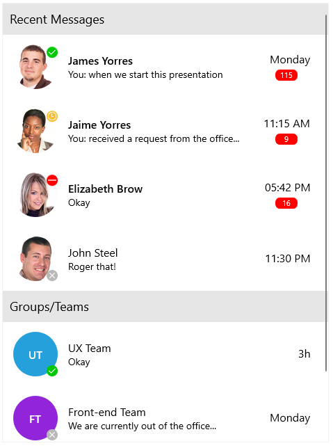
The Telerik UI for WinUI Badge component is a visual indicator for UI elements. It enables you to easily show statuses, notifications, and short messages in your application. Badges provide additional contextual information for other elements on the page.
The RadBadge is part of Telerik UI for WinUI, a
professional grade UI component library for building modern and feature-rich applications. To try it out sign up for a free 30-day trial.

Key Features
View settings—The Badge enables you to specify the Badge position based on its content through the
RadBadgeViewwrapper class. To control the relative Badge position to the content object of theRadBadgeView, use theBadgePositionproperty.Types—You can choose between various predefined Badge types and apply a custom geometry to the component if none of the predefined types works for you.
Animations—You can choose whether to render an animation when the Badge loads or when a status change occurs.
Flexible styling API—The Badge enables you to customize its appearance by using the
Background,Geometry,Stroke, and other properties.
Telerik UI for WinUI Support and Learning Resources
- Telerik UI for WinUI Badge Homepage
- Get Started with the Telerik UI for WinUI Badge
- Telerik UI for WinUI API Reference
- Getting Started with Telerik UI for WinUI Components
- Telerik UI for WinUI Badge Forums