Quick Access Toolbar
Telerik RadRibbonView provides a simple and consistent way for building interfaces similar to the RibbonView used in Microsoft Office. The RadRibbonView consists of various elements, one of which is the Quick Access Toolbar. This topic discusses concepts fundamental to the Quick Access Toolbar at first and then goes into the usage of the QuickAccessToolbar class and its features.
Before proceeding with this tutorial, it is recommended to get familiar with the Visual Structure of the RadRibbonView control.
Fundamentals
You can access the QuickAccessToolBar control through an alias pointing to the Telerik.UI.Xaml.Controls namespace:
xmlns:telerik="using:Telerik.UI.Xaml.Controls"
The Quick Access Toolbar is used to render a set of RadRibbonView controls that are most commonly used in the application. It is rendered above the ApplicationButton to make it easily accessible to end-users.
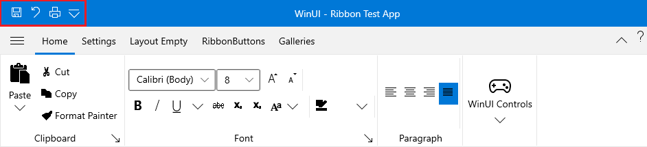
This is the default position of the Quick Access Toolbar. However, it is also possible to position the Quick Access Toolbar below the Ribbon control. An integral part of the Quick Access Toolbar is the Quick Access Menu, which is rendered right next to the Quick Access Toolbar.
The Quick Access Menu can be used by the end-user to choose the place of the Quick Access Toolbar: Above or Below the ribbon, or to Hide the entire ribbon control.
The QuickAccessToolbar control is an Microsoft.UI.Xaml.Controls.ItemsControl. That fact allows you to easily customize it by adding/removing commands.
Check out the rest of this topic, which is entirely dedicated to the QuickAccessToolbar.
Adding QuickAccessToolbar to a RadRibbonView Control
In order to add a quick access toolbar to your RadRibbonView control you need to set the RadRibbonView's QuickAccessToolbar property. The next several code-snippets show you how to do that in XAML, as well as in the code-behind.
Example 1: Adding QuickAccessToolbar
<telerik:RadRibbonView x:Name="radRibbonView" Title="My Title" ApplicationName="My Application">
    <telerik:RadRibbonView.QuickAccessToolBar>
        <telerik:QuickAccessToolBar />
    </telerik:RadRibbonView.QuickAccessToolBar>
</telerik:RadRibbonView>
Adding QuickAccessToolbar Items
When you want to add toolbar items to your RadRibbonView's Quick Access Toolbar, you need to populate the QuickAccessToolbar's Items collection. It is handy to use the RadRibbonButton, RadRibbonSplitButton, and RadRibbonDropDownButton controls.
For more information about the different types of RadRibbonButtons and their properties, take a look at the Ribbon Buttons topic.
The next example demonstrates how to add several buttons as toolbar items to your Quick Access Toolbar.
Example 2: Add items to QuickAccessToolBar
<telerik:RadRibbonView x:Name="radRibbonView">
    <telerik:RadRibbonView.QuickAccessToolBar>
        <telerik:QuickAccessToolBar>
            <telerik:RadRibbonButton Text="Save" Size="Medium"/>
            <telerik:RadRibbonButton Text="Undo" Size="Medium" />
            <telerik:RadRibbonButton Text="Print" Size="Medium"/>
        </telerik:QuickAccessToolBar>
    </telerik:RadRibbonView.QuickAccessToolBar>
</telerik:RadRibbonView>
QuickAccessToolbar Properties
- CustomizationMenuVisibility: A property of type Visibility that gets or sets a value indicating whether the customization menu will be visible or not.
-
Position: An enumeration property of type QuickAccessToolBarPosition that gets or sets the toolbar position. This enumeration property allows the following values:
- NotHosted: The Toolbar will not be displayed.
- AboveRibbon: The Toolbar will be displayed above the Ribbon.
- BelowRibbon: The Toolbar will be displayed below the Ribbon.
- AlternativeForeground: A property of type Brush that gets or sets the alternative foreground brush used for buttons when QAT is hosted below the ribbon.
Changing the QuickAccessToolbar Position
The default position of the QuickAccessToolbar is right next to the Backstage Menu button. However, you can change its position either at design-time or run-time. In order to change the QuickAccessToolbar position at design-time, you need to set the RadRibbonView's QuickAccessToolBarPosition property. Its values are predefined in the QuickAccessToolBarPosition enumeration, which exposes the following fields:
AboveRibbon: The QuickAccessToolbar will be place abo the ribbon.
BelowRibbon: The QuickAccessToolbar will be below the ribbon.
NotHosted: The QuickAccessToolbar will not be hosted. Use this value, when you want to hide the QuickAccessToolbar.
The next example demonstrates how to set the QuickAccessToolBarPosition property.
The default value of the RadRibbonView's QuickAccessToolBarPosition property is QuickAccessToolBarPosition.AboveRibbon.
RadRibbonView has a built-in feature, which allows you to change the QuickAccessToolbar position run-time.
Events
The RadRibbonView class exposes the ToolBarPositionChanged event, which is fired when the QuickAccessToolbar position is changed.
Example 3: Subscribe to ToolBarPositionChanged event
<telerik:RadRibbonView x:Name="radRibbonView" ToolBarPositionChanged="radRibbonView_ToolBarPositionChanged">
Example 4: ToolBarPositionChanged event handler
private void radRibbonView_ToolBarPositionChanged( object sender, Telerik.UI.Xaml.RadRoutedEventArgs e )
{
    RadRibbonView ribbonView = sender as RadRibbonView ;
    QuickAccessToolBarPosition newPosition = ribbonView.QuickAccessToolBarPosition;
    // Do some logic here.
}
You can handle the ToolBarPositionChanged event to get notified when the user changes the ToolBar position.