Ribbon Group
Telerik RadRibbonView provides a simple and consistent way for building interfaces similar to the ribbon control used in Microsoft Office. The RadRibbonView consists of various elements, one of which is the Ribbon Group. This topic discusses concepts fundamental to the Ribbon Group at first and then goes into the usage of the RadRibbonGroup class and its features.
Before proceeding with this tutorial, it is recommended to get familiar with the Visual Structure of the RadRibbonView control.
Fundamentals
You can access the RadRibbonGroup control through an alias pointing to the Telerik.UI.Xaml.Controls namespace:
xmlns:telerik="using:Telerik.UI.Xaml.Controls"
The RadRibbonView helps end-users to quickly find the tools and options they need in order to complete a task. Tools and options are organized in logical groups that are collected together under specific tabs. Or in other words: the Ribbon Group lets you categorize the commands to be displayed for the end-users.
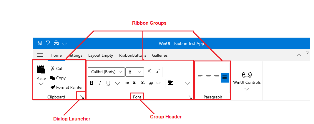
Ribbon Groups are defined into the Ribbon Tab. A single Ribbon Tab usually contains many Ribbon Groups to layout its content. Each Ribbon Group may have a Header and a Dialog Launcher. The Dialog Launcher appears in the bottom right corner of the group.
Adding RadRibbonGroups to the RadRibbonView Control
As it is described in the Fundamentals section, various user commands are organized in logical groups that are collected together under specific RadRibbonTabs. So the first step before declaring the RadRibbonGroups is to add RadRibbonTabs to your ribbon control. For more information about how to add ribbon tabs, take a look at the Ribbon Tab topic.
Adding RadRibbonGroups is done through the RadRibbonTab's Items property. The next example shows how to add several RadRibbonGroups and how to set their Header property.
Example 1: Adding RadRibbonGroups
<telerik:RadRibbonView x:Name="radRibbonView">
    <telerik:RadRibbonTab Header="Home">
        <telerik:RadRibbonGroup Header="Clipboard">
        </telerik:RadRibbonGroup>
        <telerik:RadRibbonGroup Header="Font">
        </telerik:RadRibbonGroup>
        <telerik:RadRibbonGroup Header="Paragraph">
        </telerik:RadRibbonGroup>
        <telerik:RadRibbonGroup Header="Styles">
        </telerik:RadRibbonGroup>
        <telerik:RadRibbonGroup Header="Editing">
        </telerik:RadRibbonGroup>
    </telerik:RadRibbonTab>
</telerik:RadRibbonView>
Adding Content to the RadRibbonGroups
You already learned how to set the Header property. Now it's time to add some content to the RadRibbonGroup. You should do this using the RadRibbonGroup's Items property. The next example shows you how to build the "Clipboard" RadRibbonGroup.
Example 2: Adding Content to RadRibbonGroups
<telerik:RadRibbonView x:Name="radRibbonView">
    <telerik:RadRibbonTab Header="Home">
        <telerik:RadRibbonGroup DialogLauncherVisibility="Visible" Header="Clipboard">
            <telerik:RadRibbonSplitButton   Size="Large"
                                        Text="Paste">
                <telerik:RadRibbonSplitButton.Flyout>
                    <MenuFlyout>
                        <MenuFlyoutItem Text="Paste"  />
                        <MenuFlyoutItem Text="Paste Special..." />
                        <MenuFlyoutItem Text="Paste as Hyperlink."  />
                    </MenuFlyout>
                </telerik:RadRibbonSplitButton.Flyout>
            </telerik:RadRibbonSplitButton>
            <StackPanel>
                <telerik:RadRibbonButton CollapseToSmall="WhenGroupIsMedium"
                                        Text="Cut" />
                <telerik:RadRibbonButton CollapseToSmall="WhenGroupIsMedium"
                                        Text="Copy" />
                <telerik:RadRibbonButton CollapseToSmall="WhenGroupIsMedium"
                                        Text="Format Painter" />
            </StackPanel>
        </telerik:RadRibbonGroup>
    </telerik:RadRibbonTab>
</telerik:RadRibbonView>
Enabling the Dialog Launcher
Any group can have a dialog launcher button which appears in the bottom right corner of the group. By default the dialog launcher is not visible. In order to enable it you should set the RadRibbonGroup's DialogLauncherVisibility property to Visibility.Visible.
Example 3: Enabling DialogLauncher of the RadRibbonGroups
<telerik:RadRibbonView x:Name="radRibbonView">
    <telerik:RadRibbonTab Header="Home">
        <telerik:RadRibbonGroup Header="Clipboard" DialogLauncherVisibility="Visible">
        </telerik:RadRibbonGroup>
        <telerik:RadRibbonGroup Header="Font" DialogLauncherVisibility="Visible">
        </telerik:RadRibbonGroup>
        <telerik:RadRibbonGroup Header="Paragraph" DialogLauncherVisibility="Visible">
        </telerik:RadRibbonGroup>
        <telerik:RadRibbonGroup Header="Styles" DialogLauncherVisibility="Visible">
        </telerik:RadRibbonGroup>
        <telerik:RadRibbonGroup Header="Editing" DialogLauncherVisibility="Visible">
        </telerik:RadRibbonGroup>
    </telerik:RadRibbonTab>
</telerik:RadRibbonView>
The default value of the RadRibbonGroup's DialogLauncherVisibility property is Visibility.Collapsed.
Layout Resizing
One of the most important feature of the RadRibbonGroup is the dynamic resizing. It refers to the ability of the RadRibbonView to optimize its layout depending on how much space is available.
Each RadRibbonGroup in a RadRibbonTab may have four possible sizes (Variants):
- Large: This is the default size (Variant).
The RadRibbonGroups assumes their DefaultVariant (which by default is Large) state whenever they can.
- Medium
- Small
- Collapsed
For more information about the layout resizing mechanism, please refer to the Resizing topic. Check out the rest of the topic which is entirely dedicated to the RadRibbonGroup.
Specifying Group Variants
Each RadRibbonGroup in a RadRibbonTab may have four possible sizes (Variants): Large, Medium, Small and Collapsed. Collapsed groups always look the same - only the Header and an image are shown.
The resizing of the elements is defined per RadRibbonTab. The resizing behavior of the tab is defined by setting the Variant collection to each of its RadRibbonGroups and is based on priorities. By default, if no priorities are set to the Variants of the RibbonGroups, they will be resized from right to left. In order to customize the order by which the groups will be resized, the developer needs to specify a Priority for each of the RibbonGroup Variants.
For more information and explanations about the Variants and Priorities, take a look at the Resizing topic.
RadRibbonGroup Properties
The RadRibbonGroup exposes the following properties that allow you to further customize it:
Variant: A property of type RibbonGroupVariant that specify the current active variant.
DefaultVariant: A property of type RibbonGroupVariant that gets or sets the default variant for that group.
VariantsSource: An IEnumerable
property that specify that virants source of the group Icon: A property of type IconElement that gets or set the icon of the group in collapsed variant.
SeparatorStyle: A property of type Style that gets or sets the separator style.
DialogLauncherVisibility: A property of type Visibility that gets or set the dialog launcher visibility.
DialogLauncherCommand: An ICommand property that gets the command that will be executed when the command source is invoked.
DialogLauncherCommandParameter: A property of type object that represents a user defined data value that can be passed to the command when it is executed.
DialogLauncherCommandTarget: A property of type UIElement that gets or sets the object that the command is being executed on.
Events
Any group can have a dialog launcher button. When you want to handle the click over this button you should attach to the RadRibbonGroup's LaunchDialog event.
Example 4: Subscribing to LaunchDialog Event
<telerik:RadRibbonGroup DialogLauncherVisibility="Visible" Header="Clipboard" LaunchDialog="RadRibbonGroup_LaunchDialog">
 ...
</telerik:RadRibbonGroup>
Example 5: LaunchDialog Event Handler
    private void RadRibbonGroup_LaunchDialog(object sender, Telerik.UI.Xaml.RadRoutedEventArgs e)
    {
     // custom code
    }