Resizing
One of the most important features of the RadRibbonView control is the dynamic layout resizing. It refers to the RadRibbonView's ability to optimize its layout depending on how much space is available. This process can't be automated, however, the RadRibbonView's API gives you the ability to specify how you would like the resizing to occur.
You can access the RadRibbonView control through an alias pointing to the Telerik.UI.Xaml.Controls namespace:
xmlns:telerik="using:Telerik.UI.Xaml.Controls"E The resizing of the elements is defined per RadRibbonTab. The resizing behavior of one tab is independent from the resizing behavior of the rest of the tabs. A RadRibbonTab control can contains many RadRibbonGroups. Each group in your tabs can have four distinct sizes:
- Large: This is the default size.
- Medium
- Small
- Collapsed
DefaultVariant
The RadRibbonGroups assume the size of their DefaultVariant whenever they can. By default the value of this property is Large, but you can easily change it:
Example 1: Change DefaultVariant
<telerik:RadRibbonTab Header="Home">
    <telerik:RadRibbonGroup DefaultVariant="Small"
                            DialogLauncherVisibility="Visible"
                            Header="Clipboard">
        <telerik:RadRibbonSplitButton Size="Large"
                                      Text="Paste">
        </telerik:RadRibbonSplitButton>
        <telerik:RadCollapsiblePanel>
            <telerik:RadRibbonButton CollapseToSmall="WhenGroupIsSmall"
                                     CollapseToMedium="WhenGroupIsMedium"
                                     Text="Cut"/>
            <telerik:RadRibbonButton CollapseToSmall="WhenGroupIsSmall"
                                     CollapseToMedium="WhenGroupIsMedium"
                                     Text="Copy"/>
            <telerik:RadRibbonButton CollapseToSmall="WhenGroupIsSmall"
                                     CollapseToMedium="WhenGroupIsMedium"
                                     Text="Format Painter"/>
        </telerik:RadCollapsiblePanel>
    </telerik:RadRibbonGroup>
</telerik:RadRibbonTab>
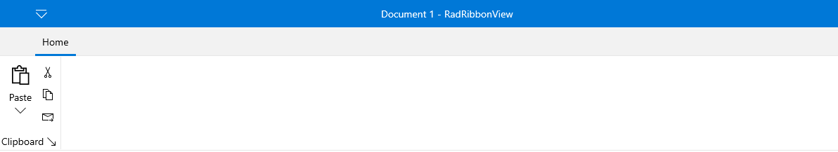
The DefaultVariant is always available and is always with highest priority. For example, if you set DefaultVariant to Small as demonstrated above, the group will be initially in Small state and its state can only change to Collapsed when the width of the RibbonView control gets smaller. Moreover, this RibbonGroup will never enter its Medium or Large states as the DefaultVariant is Small.
Variants
The resizing behavior of RadRibbonGroup is specified through the RadRibbonGroup's Variants collection. The collection is populated with GroupVariant objects.
You can access the GroupVariant control through an alias pointing to the Telerik.UI.Xaml.Controls.RibbonView namespace:
xmlns:ribbonView="using:Telerik.UI.Xaml.Controls.RibbonView"
The GroupVariant object has two important properties:
Variant: Defines the variant in which the group can be. The values for this property are predefined in the RibbonGroupVariant enumeration, which exposes the following fields:
Priority: The priority for the specified Variant.
Although the Variants collection is defined on RadRibbonGroup level, the Priority properties for each GroupVariant are applied throughout the RadRibbonTab as a whole - for all of the groups. And it is important to remember that the Variants are applied based on the value of their Priority following the rule: The highest number is with the highest priority.
By default if no priorities are set for the RadRibbonGroups Variants they will be resized from right to left going through all 4 variants - e.g. when the size of the RadRibbonView is smaller the right-most RibbonGroup will be first set to a smaller size. However, the groups will only go through each of their 4 Variants, if every smaller variant actually takes less space. Otherwise, if for example the groups are empty, they will skip variants and will be resized from Large to Collapsed state directly.
If you want to customize the resizing order, you should specify a Priority for each of the RibbonGroup Variants. Once you do so, the priorities are applied from the top-priority Variant to the least - meaning that when the RibbonView tries to resize, it will try to fit the top-priority variant among all groups. However, a top-priority variant will be applied on a RibbonGroup only if the size of the group in that variant is smaller than the size of the group in the current variant. Usually the variant and the size of a single RadRibbonGroup can be described like so: Collapsed < Small < Medium < Large
If there are multiple Variants with equal priorities among the RibbonGroups of a RibbonTab, the variants are applied from right to left.
You can create a RibbonView definition where only a few RibbonGroups have a predefined Variants collection. In this case those groups that don't have any Variants settings are considered with lowest priority. Therefore the RibbonView will first apply the Variants of the RadRibbonGroups that define a custom variants collection and only then it will change the state of the other RibbonGroups applying each of the 4 variants (from the largest to the smallest) from right to left.
You have the ability to customize the layout of the RibbonGroups when they are in large, medium or small state. In collapsed state, they look the same - only image and text are shown. For more information about the groups' customization, take a look at the Ribbon Group topic.
Example
The next example demonstrates how to set the RadRibbonGroup's Variants collection.
A size variant can only be specified once per group.
Example 2: Specify Variants
<telerik:RadRibbonView>
    <telerik:RadRibbonTab Header="Home">
        <telerik:RadRibbonGroup Header="Clipboard" >
            <telerik:RadRibbonGroup.Icon>
                <controls:SymbolIcon Symbol="Paste"/>
            </telerik:RadRibbonGroup.Icon>
            <telerik:RadRibbonGroup.Variants>
                <ribbonView:GroupVariant Priority="11" Variant="Medium" />
                <ribbonView:GroupVariant Priority="6" Variant="Small" />
                <ribbonView:GroupVariant Priority="1" Variant="Collapsed" />
            </telerik:RadRibbonGroup.Variants>
            <telerik:RadRibbonSplitButton Size="Large" Text="Paste">
                <telerik:RadRibbonSplitButton.SmallIcon>
                    <controls:SymbolIcon Symbol="Paste"/>
                </telerik:RadRibbonSplitButton.SmallIcon>
                <telerik:RadRibbonSplitButton.LargeIcon>
                    <controls:SymbolIcon Symbol="Paste"/>
                </telerik:RadRibbonSplitButton.LargeIcon>
            </telerik:RadRibbonSplitButton>
            <telerik:RadCollapsiblePanel>
                <telerik:RadRibbonButton CollapseToMedium="WhenGroupIsMedium"
                                CollapseToSmall="WhenGroupIsSmall" Text="Cut" >
                    <telerik:RadRibbonButton.SmallIcon>
                        <controls:SymbolIcon Symbol="Cut"/>
                    </telerik:RadRibbonButton.SmallIcon>
                </telerik:RadRibbonButton>
                <telerik:RadRibbonButton CollapseToMedium="WhenGroupIsMedium"
                                CollapseToSmall="WhenGroupIsSmall" Text="Copy" >
                    <telerik:RadRibbonButton.SmallIcon>
                        <controls:SymbolIcon Symbol="Copy"/>
                    </telerik:RadRibbonButton.SmallIcon>
                </telerik:RadRibbonButton>
                <telerik:RadRibbonButton CollapseToMedium="WhenGroupIsMedium"
                                CollapseToSmall="WhenGroupIsSmall" Text="Mail Forward Painter" >
                    <telerik:RadRibbonButton.SmallIcon>
                        <controls:SymbolIcon Symbol="MailForward"/>
                    </telerik:RadRibbonButton.SmallIcon>
                </telerik:RadRibbonButton>
            </telerik:RadCollapsiblePanel>
        </telerik:RadRibbonGroup>
        <telerik:RadRibbonGroup Header="Font">
            <telerik:RadRibbonGroup.Variants>
                <ribbonView:GroupVariant Priority="13" Variant="Medium" />
                <ribbonView:GroupVariant Priority="8" Variant="Small" />
                <ribbonView:GroupVariant Priority="3" Variant="Collapsed" />
            </telerik:RadRibbonGroup.Variants>
            <telerik:RadOrderedWrapPanel CompressedItemsOrder="0,3,2,4,1">
                <telerik:RadButtonGroup>
                    <telerik:RadRibbonButton >
                        <telerik:RadRibbonButton.SmallIcon>
                            <controls:SymbolIcon Symbol="FontIncrease"/>
                        </telerik:RadRibbonButton.SmallIcon>
                    </telerik:RadRibbonButton>
                    <telerik:RadRibbonButton  >
                        <telerik:RadRibbonButton.SmallIcon>
                            <controls:SymbolIcon Symbol="FontDecrease"/>
                        </telerik:RadRibbonButton.SmallIcon>
                    </telerik:RadRibbonButton>
                </telerik:RadButtonGroup>
                <telerik:RadButtonGroup>
                    <telerik:RadRibbonButton Text="Clear Formatting" >
                        <telerik:RadRibbonButton.SmallIcon>
                            <controls:SymbolIcon Symbol="Clear"/>
                        </telerik:RadRibbonButton.SmallIcon>
                    </telerik:RadRibbonButton>
                </telerik:RadButtonGroup>
                <telerik:RadButtonGroup>
                    <telerik:RadRibbonToggleButton >
                        <telerik:RadRibbonToggleButton.SmallIcon>
                            <controls:SymbolIcon Symbol="Bold"/>
                        </telerik:RadRibbonToggleButton.SmallIcon>
                    </telerik:RadRibbonToggleButton>
                    <telerik:RadRibbonToggleButton >
                        <telerik:RadRibbonToggleButton.SmallIcon>
                            <controls:SymbolIcon Symbol="Italic"/>
                        </telerik:RadRibbonToggleButton.SmallIcon>
                    </telerik:RadRibbonToggleButton>
                    <telerik:RadRibbonToggleButton >
                        <telerik:RadRibbonToggleButton.SmallIcon>
                            <controls:SymbolIcon Symbol="Underline"/>
                        </telerik:RadRibbonToggleButton.SmallIcon>
                    </telerik:RadRibbonToggleButton>
                    <telerik:RadRibbonToggleButton >
                        <telerik:RadRibbonToggleButton.SmallIcon>
                            <controls:SymbolIcon Symbol="FullScreen"/>
                        </telerik:RadRibbonToggleButton.SmallIcon>
                    </telerik:RadRibbonToggleButton>
                </telerik:RadButtonGroup>
                <telerik:RadButtonGroup>
                    <telerik:RadRibbonButton Text="Highlight Color" >
                        <telerik:RadRibbonButton.SmallIcon>
                            <controls:SymbolIcon Symbol="Highlight"/>
                        </telerik:RadRibbonButton.SmallIcon>
                    </telerik:RadRibbonButton>
                </telerik:RadButtonGroup>
            </telerik:RadOrderedWrapPanel>
        </telerik:RadRibbonGroup>
        <telerik:RadRibbonGroup Header="Paragraph">
            <telerik:RadRibbonGroup.Variants>
                <ribbonView:GroupVariant Priority="12" Variant="Medium" />
                <ribbonView:GroupVariant Priority="7" Variant="Small" />
                <ribbonView:GroupVariant Priority="2" Variant="Collapsed" />
            </telerik:RadRibbonGroup.Variants>
            <telerik:RadOrderedWrapPanel CompressedItemsOrder="0,2,1">
                <telerik:RadButtonGroup>
                    <telerik:RadRibbonButton >
                        <telerik:RadRibbonButton.SmallIcon>
                            <controls:SymbolIcon Symbol="OutlineStar"/>
                        </telerik:RadRibbonButton.SmallIcon>
                    </telerik:RadRibbonButton>
                    <telerik:RadRibbonButton >
                        <telerik:RadRibbonButton.SmallIcon>
                            <controls:SymbolIcon Symbol="Admin"/>
                        </telerik:RadRibbonButton.SmallIcon>
                    </telerik:RadRibbonButton>
                    <telerik:RadRibbonButton  Text="Sort" >
                        <telerik:RadRibbonButton.SmallIcon>
                            <controls:SymbolIcon Symbol="Sort"/>
                        </telerik:RadRibbonButton.SmallIcon>
                    </telerik:RadRibbonButton>
                    <telerik:RadRibbonButton Text="Zoom" >
                        <telerik:RadRibbonButton.SmallIcon>
                            <controls:SymbolIcon Symbol="Zoom"/>
                        </telerik:RadRibbonButton.SmallIcon>
                    </telerik:RadRibbonButton>
                </telerik:RadButtonGroup>
                <telerik:RadButtonGroup>
                    <telerik:RadRibbonButton Text="Shading" >
                        <telerik:RadRibbonButton.SmallIcon>
                            <controls:SymbolIcon Symbol="FontColor"/>
                        </telerik:RadRibbonButton.SmallIcon>
                    </telerik:RadRibbonButton>
                    <telerik:RadRibbonButton Text="Bookmarks" >
                        <telerik:RadRibbonButton.SmallIcon>
                            <controls:SymbolIcon Symbol="Bookmarks"/>
                        </telerik:RadRibbonButton.SmallIcon>
                    </telerik:RadRibbonButton>
                </telerik:RadButtonGroup>
                <telerik:RadButtonGroup>
                    <telerik:RadRibbonRadioButton IsChecked="True"  />
                    <telerik:RadRibbonRadioButton  />
                    <telerik:RadRibbonRadioButton  />
                    <telerik:RadRibbonRadioButton  />
                    <telerik:RadRibbonButton />
                </telerik:RadButtonGroup>
            </telerik:RadOrderedWrapPanel>
        </telerik:RadRibbonGroup>
        <telerik:RadRibbonGroup Header="Styles">
            <telerik:RadRibbonGroup.Variants>
                <ribbonView:GroupVariant Priority="15" Variant="Medium" />
                <ribbonView:GroupVariant Priority="10" Variant="Small" />
                <ribbonView:GroupVariant Priority="5" Variant="Collapsed" />
            </telerik:RadRibbonGroup.Variants>
            <telerik:RadRibbonGallery x:Name="QuickStyles"
                            Title="Quick Styles" >
                <telerik:RadRibbonGallery.Icon>
                    <controls:SymbolIcon Symbol="OtherUser"/>
                </telerik:RadRibbonGallery.Icon>
                <telerik:RadGalleryItem Name="Normal"
                            IsSelected="True" >
                    <telerik:RadGalleryItem.Icon>
                        <controls:SymbolIcon Symbol="NewFolder"/>
                    </telerik:RadGalleryItem.Icon>
                </telerik:RadGalleryItem>
                <telerik:RadGalleryItem Content="No_Spacing" />
                <telerik:RadGalleryItem Content="Heading1" />
                <telerik:RadGalleryItem Content="Heading2"  />
                <telerik:RadGalleryItem Content="Title"  />
                <telerik:RadGalleryItem Content="Subtitle" />
                <telerik:RadGalleryItem Content="Subtitle_Emphasis"  />
                <telerik:RadGalleryItem Content="Emphasis" />
                <telerik:RadGalleryItem Content="Intense_Emphasis"  />
                <telerik:RadGalleryItem Content="Strong" />
            </telerik:RadRibbonGallery>
            <telerik:RadRibbonButton CollapseToSmall="WhenGroupIsMedium"
                            Size="Large"
                            Text="Change Styles" />
        </telerik:RadRibbonGroup>
        <telerik:RadRibbonGroup Header="Editing">
            <telerik:RadRibbonGroup.Variants>
                <ribbonView:GroupVariant Priority="14" Variant="Medium" />
                <ribbonView:GroupVariant Priority="9" Variant="Small" />
                <ribbonView:GroupVariant Priority="4" Variant="Collapsed" />
            </telerik:RadRibbonGroup.Variants>
            <telerik:RadCollapsiblePanel>
                <telerik:RadRibbonSplitButton CollapseToMedium="WhenGroupIsMedium"
                                    CollapseToSmall="WhenGroupIsSmall"
                                    Size="Large"
                                    Text="Find" />
                <telerik:RadRibbonButton CollapseToMedium="WhenGroupIsMedium"
                                CollapseToSmall="WhenGroupIsSmall"
                                Size="Large"
                                Text="Replace" />
                <telerik:RadRibbonSplitButton CollapseToMedium="WhenGroupIsMedium"
                                    CollapseToSmall="WhenGroupIsSmall"
                                    IsTextInMiddleButton="False"
                                    Size="Large"
                                    Text="Select" />
            </telerik:RadCollapsiblePanel>
        </telerik:RadRibbonGroup>
    </telerik:RadRibbonTab>
</telerik:RadRibbonView>
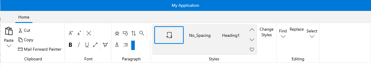
In the previous example the demo would change the size of the groups following the order defined by the Variants collection and the priority of each variant. In our case when the RibbonView Width is decreased the Groups will be resized going through each variant following this order:
- Styles
- Editing
- Font
- Paragraph
- Clipboard
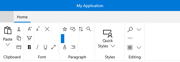
Please keep in mind that when the group changes its Size, the elements inside are automatically resized. And in order to customize the resizing behavior of the elements you can wrap them in the panels that Telerik supports. For more information, take a look at the Ordered Wrap Panel and Collapsible Panel topics. Developers can also choose to create a custom logic for the resizing by using the RadRibbonButtons and by defining how they will behave when the group changes its size. For more information, please take a look at the Ribbon Buttons topic.