Ordered Wrap Panel
RadRibbonView's dynamic layout resizing allows you to optimize the layout depending on the available space.
This feature is enabled with the RadOrderedWrapPanel (described in this article) and the RadCollapsiblePanel.
Read the Resizing topic, which is tightly connected with the RadOrderedWrapPanel behavior.
Fundamentals
You can access the RadOrderedWrapPanel control through an alias pointing to the Telerik.UI.Xaml.Controls namespace:
xmlns:telerik="using:Telerik.UI.Xaml.Controls"
RadOrderedWrapPanel is used together with RadButtonGroup to create a layout known from the Microsoft Office applications. It has two states:
Figure 1: Normal State
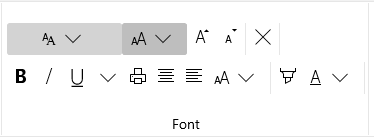
The RadOrderedWrapPanel displays its children along two horizontal lines in the normal state.
When there is enough space, the RadOrderedWrapPanel always tries to layout its children in Normal state.
Figure 2: Compressed State
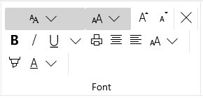
In the compressed state the RadOrderedWrapPanel displays its children along three horizontal lines, thus achieving a more compact and tightly packed structure.
If you refer to the Microsoft Office Word product, you will note that a similar layout behavior is used by the "Font" and "Paragraph" groups.
You have the ability to specify when the Panel should go into the Compressed state by using the RadOrderedWrapPanel's CompressedThreshold property. Its values are predefined in the CollapseThreshold enumeration, which exposes the following fields:
- Never: The panel never goes in Compressed state.
- WhenGroupIsSmall: The panel goes in Compressed state when the group is in Small variant.
- WhenGroupIsMedium: The panel goes in Compressed state when the group is in Medium valiant.
At this point, if you fill your panel with RadControls, you will have a functioning layout that splits itself into two or three lines, depending on the available space. There is another important property: CompressedItemsOrder. It allows you to change the order of the panel's children upon being compressed. This is very useful because when your child controls are split into three lines, you may want to alter their order because some are being used more frequently than others. The CompressedItemsOrder property is a simple Int32 collection, that you are able to set with a comma-delimited list of integers in XAML.
Using RadOrderedWrapPanel
The next example demonstrates how to build a "Font" like RadRibbonGroup using the RadOrderedWrapPanel.
Example 1: Using RadOrderedWrapPanel
<telerik:RadRibbonView x:Name="radRibbonView"
                    Title="My Title"
                    ApplicationName="My Application">
    <telerik:RadRibbonTab Header="Home">
        <telerik:RadRibbonGroup Header="Font">
            <telerik:RadOrderedWrapPanel CompressedItemsOrder="0,3,2,4,1">
                <StackPanel Orientation="Horizontal">
                    <telerik:RadRibbonDropDownButton Width="115" Background="LightGray" telerik:ScreenTip.Title="Font" telerik:ScreenTip.Description="Change the font face.">
                        <telerik:RadRibbonDropDownButton.SmallIcon>
                            <SymbolIcon Symbol="Font"/>
                        </telerik:RadRibbonDropDownButton.SmallIcon>
                    </telerik:RadRibbonDropDownButton>
                    <telerik:RadRibbonDropDownButton Name="comboFontSize" Width="65" Background="LightGray" telerik:ScreenTip.Title="Font Size"  telerik:ScreenTip.Description="Change the font size.">
                        <telerik:RadRibbonDropDownButton.SmallIcon>
                            <SymbolIcon Symbol="FontSize"/>
                        </telerik:RadRibbonDropDownButton.SmallIcon>
                    </telerik:RadRibbonDropDownButton>
                </StackPanel>
                <telerik:RadButtonGroup>
                    <telerik:RadRibbonButton telerik:ScreenTip.Title="Grow Font" >
                        <telerik:RadRibbonButton.SmallIcon>
                            <SymbolIcon Symbol="FontIncrease"/>
                        </telerik:RadRibbonButton.SmallIcon>
                    </telerik:RadRibbonButton>
                    <telerik:RadRibbonButton telerik:ScreenTip.Title="Shrink Font" >
                        <telerik:RadRibbonButton.SmallIcon>
                            <SymbolIcon Symbol="FontDecrease"/>
                        </telerik:RadRibbonButton.SmallIcon>
                    </telerik:RadRibbonButton>
                </telerik:RadButtonGroup>
                <telerik:RadButtonGroup>
                    <telerik:RadRibbonButton  Text="Clear Formatting" telerik:ScreenTip.Title="Clear Formatting" >
                        <telerik:RadRibbonButton.SmallIcon>
                            <SymbolIcon Symbol="Clear"/>
                        </telerik:RadRibbonButton.SmallIcon>
                    </telerik:RadRibbonButton>
                </telerik:RadButtonGroup>
                <telerik:RadButtonGroup>
                    <telerik:RadRibbonToggleButton x:Name="BoldButton" telerik:ScreenTip.Title="Bold" telerik:ScreenTip.Description="Make the selected text bold." >
                        <telerik:RadRibbonToggleButton.SmallIcon>
                            <SymbolIcon Symbol="Bold"/>
                        </telerik:RadRibbonToggleButton.SmallIcon>
                    </telerik:RadRibbonToggleButton>
                    <telerik:RadRibbonToggleButton  x:Name="ItalicButton" telerik:ScreenTip.Title="Italic" telerik:ScreenTip.Description="Italicize the selected text." >
                        <telerik:RadRibbonToggleButton.SmallIcon>
                            <SymbolIcon Symbol="Italic"/>
                        </telerik:RadRibbonToggleButton.SmallIcon>
                    </telerik:RadRibbonToggleButton>
                    <telerik:RadRibbonSplitButton  x:Name="UnderlineButton" telerik:ScreenTip.Title="Underline" telerik:ScreenTip.Description="Underline the selected text.">
                        <telerik:RadRibbonSplitButton.SmallIcon>
                            <SymbolIcon Symbol="Underline"/>
                        </telerik:RadRibbonSplitButton.SmallIcon>
                    </telerik:RadRibbonSplitButton>
                    <telerik:RadRibbonToggleButton telerik:ScreenTip.Title="Print" >
                        <telerik:RadRibbonToggleButton.SmallIcon>
                            <SymbolIcon Symbol="Print"/>
                        </telerik:RadRibbonToggleButton.SmallIcon>
                    </telerik:RadRibbonToggleButton>
                    <telerik:RadRibbonToggleButton telerik:ScreenTip.Title="AlignCenter" >
                        <telerik:RadRibbonToggleButton.SmallIcon>
                            <SymbolIcon Symbol="AlignCenter"/>
                        </telerik:RadRibbonToggleButton.SmallIcon>
                    </telerik:RadRibbonToggleButton>
                    <telerik:RadRibbonToggleButton telerik:ScreenTip.Title="AlignLeft">
                        <telerik:RadRibbonToggleButton.SmallIcon>
                            <SymbolIcon Symbol="AlignLeft"/>
                        </telerik:RadRibbonToggleButton.SmallIcon>
                    </telerik:RadRibbonToggleButton>
                    <telerik:RadRibbonDropDownButton Text="Change Font Size" telerik:ScreenTip.Title="Font Size" telerik:ScreenTip.Description="Change font size.">
                        <telerik:RadRibbonDropDownButton.SmallIcon>
                            <SymbolIcon Symbol="FontSize"/>
                        </telerik:RadRibbonDropDownButton.SmallIcon>
                    </telerik:RadRibbonDropDownButton>
                </telerik:RadButtonGroup>
                <telerik:RadButtonGroup>
                    <telerik:RadRibbonButton Text="Highlight Color" telerik:ScreenTip.Title="Text Highlight Color" telerik:ScreenTip.Description="Make text look like it was marked with a highlighter pen.">
                        <telerik:RadRibbonButton.SmallIcon>
                            <SymbolIcon Symbol="Highlight"/>
                        </telerik:RadRibbonButton.SmallIcon>
                    </telerik:RadRibbonButton>
                    <telerik:RadRibbonDropDownButton  Text="Font Color" telerik:ScreenTip.Title="Font Color" telerik:ScreenTip.Description="Change the text color.">
                        <telerik:RadRibbonDropDownButton.SmallIcon>
                            <SymbolIcon Symbol="FontColor"/>
                        </telerik:RadRibbonDropDownButton.SmallIcon>
                    </telerik:RadRibbonDropDownButton>
                </telerik:RadButtonGroup>
            </telerik:RadOrderedWrapPanel>
        </telerik:RadRibbonGroup>
    </telerik:RadRibbonTab>
</telerik:RadRibbonView>
CompressedThreshold Property
The CompressedThreshold property allows you to specify when the panel goes into Compressed mode. For example, you may set this property to CollapseThreshold.Never.
Example 2: Setting CompressedThreshold Property
<telerik:RadOrderedWrapPanel CompressedThreshold="Never">
CompressedItemsOrder Property
The RadOrderedWrapPanel's CompressedItemsOrder property allows you to change the order of the panel's children upon being compressed. This is very useful because when your child controls are split into three lines, you may want to alter their order because some are being used more frequently than others.
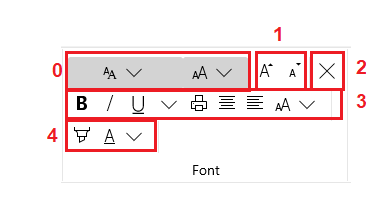
The next snapshot shows you the wrap panel from the first example in compressed state. The CompressedItemsOrder property is not set. The different RadButton groups are marked with indexes from 0 to 4 (there are 5 button groups).
Figure 3: Compressed State With Marked Groups
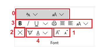
For example, you may wish to change the groups order. In this case you should set the RadOrderedWrapPanel's CompressedItemsOrder property. You can do it in XAML by specifying a comma-delimited list of integers like in the example below.
Example 3: Setting CompressedItemsOrder property
<telerik:RadOrderedWrapPanel CompressedItemsOrder="0,3,2,4,1">
Figure 4: Compressed State With Altered Groups Order