Ribbon Backstage
Telerik RadRibbonView provides a simple and consistent way for building interfaces similar to the ribbon control used in Microsoft Office. The new Ribbon Backstage control allows you to achieve a more native Office look and feel of your application.
Before proceeding with this tutorial, it is recommended to get familiar with the Visual Structure of the RadRibbonView control.
Fundamentals
You can access the RadRibbonBackstage control through an alias pointing to the Telerik.UI.Xaml.Controls namespace:
xmlns:telerik="using:Telerik.UI.Xaml.Controls"
The RibbonBackstage appears when a user clicks the Application Button. It can be used to display controls or perform actions on the entire document, like Save, Print and Send. The RibbonBackstage can also provide a list of recent documents, access to application options for changing user settings and preferences, and application exit.
By default the Backstage isn't opened. In order to control its state you can set the RadRibbonView's IsBackstageOpen property.
Example 1: Set the IsBackstageOpen property
<telerik:RadRibbonView x:Name="radRibbonView" Title="My Title" ApplicationName="My Application" IsBackstageOpen="True">
 ...
</telerik:RadRibbonView>
Adding RadRibbonBackstage and RadRibbonBackstageItems to the RadRibbonView
In order to add a backstage to your RadRibbonView control you need to set the RadRibbonView's Backstage property. The next several code-snippets show you how to do that in XAML, as well as in the code-behind.
Example 2: Declaring RadRibbonBackstage in XAML
<telerik:RadRibbonView x:Name="radRibbonView" Title="My Title" ApplicationName="My Application">
    <telerik:RadRibbonView.Backstage>
        <telerik:RadRibbonBackstage />
    </telerik:RadRibbonView.Backstage>
</telerik:RadRibbonView>
Example 3: Declaring RadRibbonBackstage in code-behind
public MyUserControl()
{
    this.InitializeComponent();
    this.radRibbonView.Backstage = new RadRibbonBackstage();
}
Example 4: Adding RadRibbonBackstageItems
<telerik:RadRibbonView x:Name="radRibbonView"
                        Title="My Title"
                        ApplicationButtonContent="File"
                        ApplicationName="My Application">
    <telerik:RadRibbonView.Backstage>
        <telerik:RadRibbonBackstage>
            <telerik:RadRibbonBackstageItem Header="Save" />
            <telerik:RadRibbonBackstageItem Header="Save As" />
            <telerik:RadRibbonBackstageItem Header="Open" />
            <telerik:RadRibbonBackstageItem Header="Recent" />
            <telerik:RadRibbonBackstageItem Header="New" />
            <telerik:RadRibbonBackstageItem Header="Options" />
            <telerik:RadRibbonBackstageItem Header="Exit" />
        </telerik:RadRibbonBackstage>
    </telerik:RadRibbonView.Backstage>
</telerik:RadRibbonView>
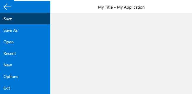
Figure 1: RadRibbonBackstage appearance
RadRibbonBackstageItem Properties
The RadBackstageItem exposes the following properties that allow you to further customize it:
-
IsSelectable: Specifies whether an item can be selected. If you set this property to False, the item will behave like a Button.
If the BackstageItem IsSelectable property is set to False, you will be able to take advantage of the Click() event of the item, as well as its Command property.
-
IsDefault: Specifies whether the item should be selected when the Backstage is opened.
Please note that if you set the IsDefault property of multiple BackstageItems to True, the last one marked as default will be selected.
IsGroupSeparator: Specifies whether an item is a group separator. Such items are used as a heading in order to differentiate a logical group of BackstageItems.
Icon: A property of type IconElement that gets or sets BackstageItem icon.
ShowWindowTitleInContent: A property of type bool that gets or sets a value indicating whether the WindowTitle will be shown in the Content of the backstage item.
-
CloseOnClick: Specifies whether the Backstage will be closed when the item is clicked.
If the BackstageItem is not selectable the CloseOnClick property is set to True by default. However, if the item is selectable, then the CloseOnClick property won't affect its behavior.