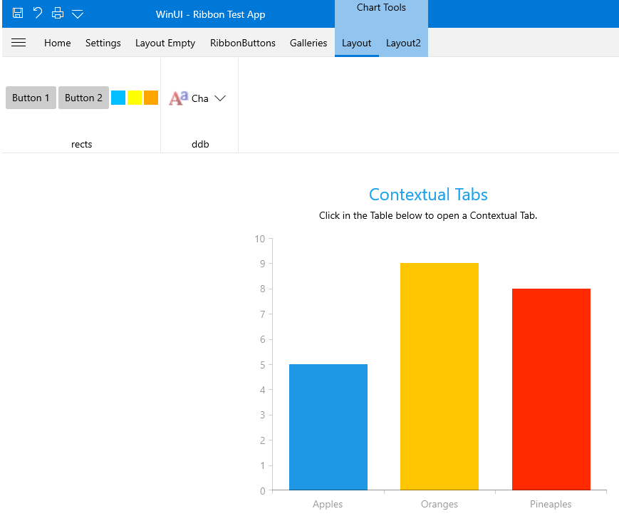
Contextual Tabs
A contextual tab allows you to provide the users with a certain UI when they are in a specific context or they have selected a specific element. The contextual tabs are organized in groups, so that the user can see multiple tabs available for a specific context.

Fundamentals
The contextual groups are used to display tabs with a context-specific functionality. They get displayed only when this functionality is needed. This way the common UI in the RadRibbonView becomes lighter while the specific functionality becomes easier to find as it is grouped and displayed on demand.
You can access the RadRibbonContextualGroup control through an alias pointing to the Telerik.UI.Xaml.Controls namespace:
xmlns:telerik="using:Telerik.UI.Xaml.Controls"
To define contextual tabs in the RadRibbonView control you have to first define their groups. You can do that declaratively, programmatically or by using data-binding through the following properties:
-
ContextualGroups: Gets or sets a collection of RadRibbonContextualGroups used to generate the contextual groups. This collection can be populated declaratively in XAML or programmatically in code-behind.
Example 1: Set the ContextualGroups property
<telerik:RadRibbonView x:Name="radRibbonView"
                       Title="Document1"
                       ApplicationName="Telerik Word">
    <telerik:RadRibbonView.ContextualGroups>
        <telerik:RadRibbonContextualGroup x:Name="ContextualGroup1" Header="Group 1"/>
        <telerik:RadRibbonContextualGroup x:Name="ContextualGroup2" Header="Group 2"/>
    </telerik:RadRibbonView.ContextualGroups>
</telerik:RadRibbonView>
- ContextualGroupsItemsSource: Gets or sets an IEnumerable collection of business items used to generate the contextual groups. You can bind this property to a collection of data items in XAML or populate it in code-behind.
Example 2: Set the ContextualGroups property
<telerik:RadRibbonView  ItemsSource="{Binding Tabs}"
                        ContextualGroupsItemsSource="{Binding ContextualGroups}" />
Adding RadRibbonContextualGroup Declaratively
In order to add contextual tabs, you need to define RadRibbonTabs associated with contextual groups. The RadRibbonTab control exposes a ContextualGroupName property that allows you to associate it with a ContextualGroup.
To activate RadRibbonContextualGroup you have to set its IsActive property to True.
Example 3: Define RadRibbonTabs
<Grid>
    <Grid.RowDefinitions>
        <RowDefinition Height="Auto" />
        <RowDefinition Height="*" />
    </Grid.RowDefinitions>
    <telerik:RadRibbonView x:Name="radRibbonView" >
        <telerik:RadRibbonTab Header="Home" />
        <telerik:RadRibbonTab Header="Insert" />
        <telerik:RadRibbonTab Header="Page Layout" />
        <telerik:RadRibbonTab Header="References" />
        <telerik:RadRibbonTab Header="Mailings" />
        <telerik:RadRibbonTab Header="Review" />
        <telerik:RadRibbonTab Header="View" />
        <telerik:RadRibbonTab ContextualGroupName="ContextualGroup1" Header="ContextualTab 1.1" />
        <telerik:RadRibbonTab ContextualGroupName="ContextualGroup1" Header="ContextualTab 1.2" />
        <telerik:RadRibbonTab ContextualGroupName="ContextualGroup2" Header="ContextualTab 2.1" />
        <telerik:RadRibbonTab ContextualGroupName="ContextualGroup2" Header="ContextualTab 2.2" />
        <telerik:RadRibbonView.ContextualGroups>
            <telerik:RadRibbonContextualGroup x:Name="ContextualGroup1" Header="Group 1" IsActive="True"/>
            <telerik:RadRibbonContextualGroup x:Name="ContextualGroup2" Header="Group 2" IsActive="True"/>
        </telerik:RadRibbonView.ContextualGroups>
    </telerik:RadRibbonView>
</Grid>
RibbonContextualGroup Properties
- HeaderAlignment: An enumeration property of type HorizontalAlignment that gets or sets the header's alignment of the contextual group.
- Header: A property of type object that gets or sets the header of the contextual group.
- HeaderTemplate: A property of type DataTemplate that gets or sets the header's template of the contextual group.
-
Color: A property of type Brush that gets or sets the base color used for the tabs header and content background brush. This color will not only be applied to the group's header, but to the header's of the tabs in this group.
- IsActive: A boolean property that gets or sets whether the group is active (visible) or not. This should be done when a certain requirement is met by the user. This requirement should specify whether the specific functionality in the contextual tab is needed. For example if you have a contextual tab that should manipulate images, you'd want to show this tab only when the user has selected an image.
-
SelectFirstTabOnActivation: A boolean property that gets or sets whether the first contextual tab should be selected on activation of the group.
Mouse Wheel Scrolling of Tabs
By default, scrolling the mouse wheel while the mouse is over the control will change the currently selected tab. You can disable this behavior by setting the IsMouseWheelTabScrollingEnabled property of the RadRibbonView control to False.
Example 6: Disable mouse wheel scrolling in XAML
<telerik:RadRibbonView IsMouseWheelTabScrollingEnabled="False" />
Prevent the Selection of a Contextual Tab When It Is Activated
By default, when a contextual tab is activated, the first tab element inside will be selected. To disable this behavior you can set the SelectFirstTabOnActivation property of the RadRibbonContextualGroup to false.
Example 7: Disable selection of the first tab inside contextual tab
<telerik:RadRibbonContextualGroup x:Name="ContextualGroup1" Header="Group 1" SelectFirstTabOnActivation="False"/>