The
RadListViewcontrol is now obsolete and will be removed in the future. Use the RadCollectionView control instead. TheRadCollectionViewis a complete, ground-up rewrite of the ListView. TheRadCollectionViewoffers improved performance, enhanced features, and a modernized approach to managing lists of data. TheRadCollectionViewincorporates all of the ListView's key features. More about the differences between both components and how to migrate to the newRadCollectionViewis available in the Migrating the Telerik .NET MAUI RadListView to RadCollectionView article.
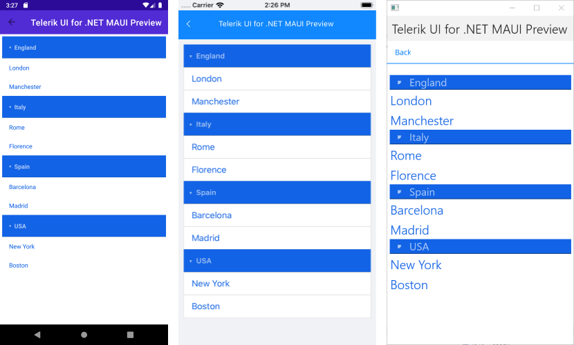
.NET MAUI ListView Group Header Style
In addition to the Item Styles, the ListView enables you to modify the visual appearance of its group headers when grouping is enabled. The feature is implemented through the GroupHeaderStyle property of type ListViewGroupStyle.
The ListViewGroupStyle provides means for customizing the border as well as background and text color of the group headers. Below you can find a list of the available styling options:
-
BackgroundColor(Color)—Sets the background of the group header(s). -
BorderColor(Color)—Sets the color of the border. -
BorderWidth(double)—Defines the width of the borer. -
BorderLocation(Location)—Defines an enumeration describing where the border will be visible. -
TextColor(Color)—Defines the text color of the ListViewGroupHeader.
To learn more about the grouping functionality of the ListView, refer to the Grouping Overview topic.
Example
1. Create a City class:
2. Add a ViewModel class:
RadListView definition with a GroupHeaderStyle applied:
The following image shows the end result:
For a Group Header Style example, go to the SDKBrowser Demo Application and navigate to ListView -> Styling category.