Tooltip
RadChartView provides a tooltip behavior which can be used to visualize arbitrary information related to a data point. The tooltip is enabled by adding ChartToolTipBehavior in the Behaviors collection of RadCartesianChart. To display it you can position the mouse cursor over a data point visual.
By default the tooltips of series are shown for their data points only. Each bar represents a datapoint for Bar series, but for Line, Spline and Area series the datapoints are the points that connect the line segments. You should specify the desired shape, color and size for these points to be visualized using DefaultVisualStyle or PointTemplate. Without it practically you won't see a point and respectively there won't be a tooltip for these series.
The user has control over the visualization of the tooltip information and the provided data context. This is done via the TooltipTemplate property which is exposed both by RadCartesianChart and the corresponding series. This allows you to define a custom template on a chart's level for all series and additionally to define different templates for each series. The TooltipTemplate property of the series has a higher priority than the TooltipTemplate of the chart, thus it will override it on a series level.
Defining Tooltip Behavior
The ChartToolTipBehavior should be added in the Behaviors collection of the chart.
Example 1: Defining a tooltip behavior
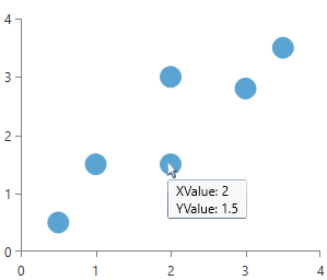
At this point if you hover a data point visual a tooltip with basic information about the data point is displayed.
Figure 1: Default tooltip example
Customizing the Tooltip
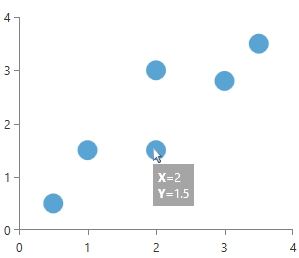
To customize the apperance of the tooltip you can use the TooltipTemplate property. The property can be found both on the RadCartesianChart and the chart series classes.
Example 2: Setting TooltipTemplate of the series
Figure 2: Custom tooltip example
The data context passed to the TooltipTemplate is an object of type DataPoint which can be CategoricalDataPoint, ScatterDataPoint, etc. This means that you may need to use different property paths for the bindings, based on the series type and its DataPoint implementation.
Example
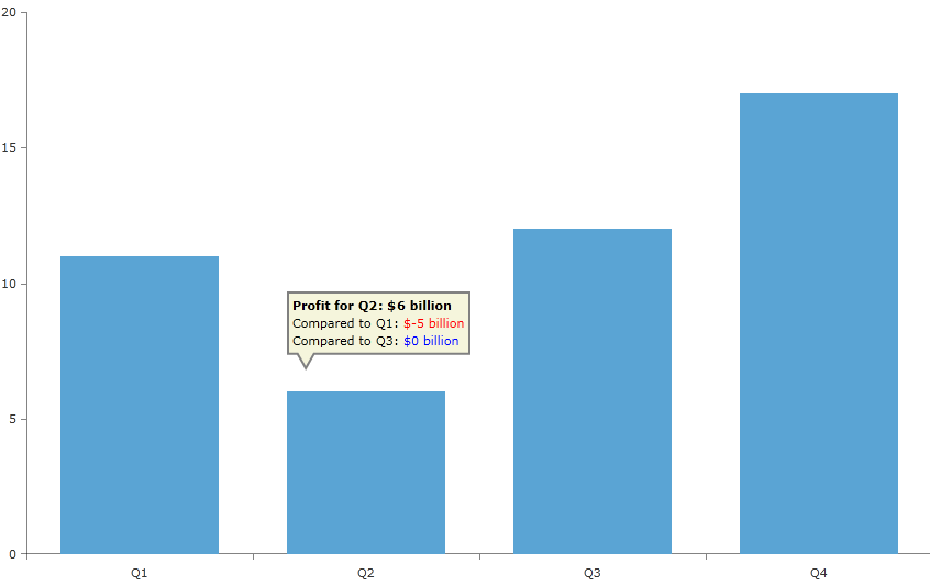
This section demonstrates how to create a custom tooltip that displays the growth or shrinking profits of a fictitious company for each quarter over one year. Even though it will be a bar chart and the bars are more than enough to clearly visualize the relative profits, the example is simple and highlights the usage of RadChartView's tooltip API.
First we will need a chart, which is bound to a collection of custom objects (refer to Create Data-Bound Chart for more details on the binding). The objects in the data source will be used directly as values for the data points as well as content for out tooltips. We create several properties like Quarter, Profit, PreviousQuarter, PreviousDifference, NextQuarter and NextDifference properties for the purpose.
Example 3: Defining the Data Model
We should set data to the values so that it will be able to display information about the currently hovered data point via the TooltipTemplate.
Example 4: Populating and setting the data
Example 5: Defining the view
Now we need to define our tooltip behavior and set its tool tip template. It will display the value of the selected data point and also how this value relates to the previous and next quarters.
Example 6: Defining the tooltip behavior and the tooltip template
The example uses couple of custom binding converters to pretify the visualization. You can find their implementation.
Example 7: Defining converters in the Resources of the chart
Example 8: Converters implementation
Figure 3: Example result