Selection
The chart selection behavior enables interactions with the data point visual elements.
If the feature is enabled, clicking on a data point will select or deselect it, based on the selection mode and the current selection state of the point. There is no default visual feedback for the selection. This article shows how to use the selection behavior, enable the visual feedback and customize it.
To enable the selection, add a ChartSelectionBehavior element in the Behaviors collection of the chart control. The following example shows how to create a sample data binding setup and enable the feature.
Example 1: Define the data point model
public class PlotInfo
{
    public string Category { get; set; }
    public double Value { get; set; }
}
Example 2: Populating with data
private static Random r = new Random();
public MyUserControl()
{
    InitializeComponent();
    var source = new ObservableCollection<PlotInfo>();
    for (int i = 0; i < 10; i++)
    {
        source.Add(new PlotInfo() { Category = "C" + i, Value = r.Next(100, 300) });
    }
    this.DataContext = source;
}
Example 3: Using the ChartSelectionBehavior
<telerik:RadCartesianChart Palette="Windows8" SelectionPalette="VisualStudio2019Selected">
    <telerik:RadCartesianChart.Behaviors>
        <telerik:ChartSelectionBehavior />
    </telerik:RadCartesianChart.Behaviors>
    <telerik:RadCartesianChart.VerticalAxis>
        <telerik:LinearAxis/>
    </telerik:RadCartesianChart.VerticalAxis>
    <telerik:RadCartesianChart.HorizontalAxis>
        <telerik:CategoricalAxis/>
    </telerik:RadCartesianChart.HorizontalAxis>
    <telerik:PointSeries CategoryBinding="Category" ValueBinding="Value" ItemsSource="{Binding}" />
</telerik:RadCartesianChart>
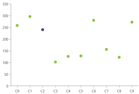
Figure 1: Selected data point
The selected data points can be accessed using the __Selected
Visual Feedback
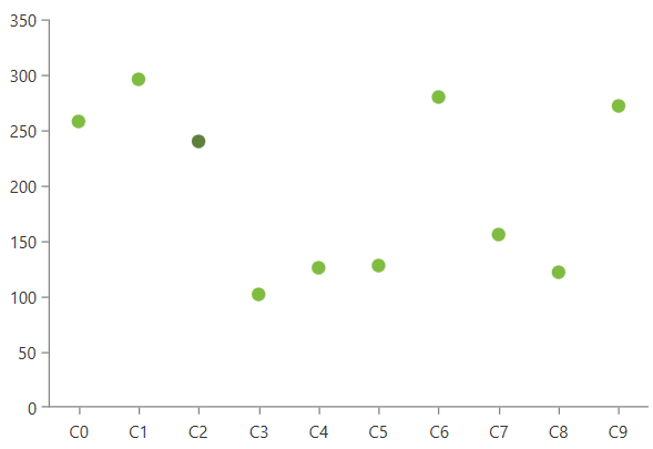
By default selecting a data point doesn't highlight it on the plot area. To enable this, you can use the chart palettes. The Palette property of the chart defines the fill color of the data points. The SelectionPalette property defines the colors of the data points when selected.
Example 4: Setting the selection palette
<telerik:RadCartesianChart Palette="Green" SelectionPalette="GreenSelected">
    <telerik:RadCartesianChart.Behaviors>
        <telerik:ChartSelectionBehavior />
    </telerik:RadCartesianChart.Behaviors>
    <!-- other elements here (see Examples 1 to 3)-->
</telerik:RadCartesianChart>
Figure 2: Palette based selection coloring
To define selection colors different than the ones provided by the predefined palettes, you can create a custom palette and assign it to the SelectionPalette property of the chart. Or alternatively, use the DefaultVisualStyle or PointTemplate of the chart series.
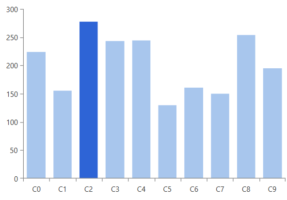
The following example shows one way to change the selected point's background using a PointTemplate. In this case the palette won't be used so there is no need to set the palette propreties.
Example 5: Customizing the data point visual
<telerik:RadCartesianChart>
    <telerik:RadCartesianChart.VerticalAxis>
        <telerik:LinearAxis/>
    </telerik:RadCartesianChart.VerticalAxis>
    <telerik:RadCartesianChart.HorizontalAxis>
        <telerik:CategoricalAxis/>
    </telerik:RadCartesianChart.HorizontalAxis>
    <telerik:RadCartesianChart.Behaviors>
        <telerik:ChartSelectionBehavior />
    </telerik:RadCartesianChart.Behaviors>
    <telerik:BarSeries CategoryBinding="Category" ValueBinding="Value" ItemsSource="{Binding}">
        <telerik:BarSeries.PointTemplate>
            <DataTemplate>
                <Border>
                    <Border.Style>
                        <Style TargetType="Border">
                            <Setter Property="Background" Value="#A8C6ED" />
                            <Style.Triggers>
                                <DataTrigger Binding="{Binding IsSelected}" Value="True">
                                    <Setter Property="Background" Value="#2E64D6" />
                                </DataTrigger>
                            </Style.Triggers>
                        </Style>
                    </Border.Style>
                </Border>
            </DataTemplate>
        </telerik:BarSeries.PointTemplate>
    </telerik:BarSeries>
</telerik:RadCartesianChart>
The data context of the element in the PointTemplate is an object of type DataPoint
Figure 3: PointTemplate based selection coloring
An additional way of customizing the selection's visual feedback is to data bind the color property of the default visual element (via DefaultVisualStyle) or the element in the PointTemplate. Then update the underlying property in case the selection changes, using the SelectionChanged event of the ChartSelectionBehavior.
Selection Mode
ChartSelectionBehavior supports two selection modes - Single (default) and Multiple. Also, there is a None selection mode which disables the selection.
When the Single mode is used, the click on a data point selects it. If a data point was previously selected, it gets deselected.
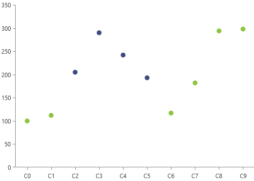
When the Multiple mode is used, the click on a data point includes it in the selection. Multiple data points are selected. A click on a selected data point will deselect it.
The selection mode is controlled with the DataPointSelectionMode property of ChartSelectionBehavior.
Example 6: Setting DataPointSelectionMode
<telerik:RadCartesianChart.Behaviors>
    <telerik:ChartSelectionBehavior DataPointSelectionMode="Multiple"/>
</telerik:RadCartesianChart.Behaviors>
Figure 4: Multiple selection
Hit Test Area
The hit test area is the space in the data point visual where you can click to select it. By default the area matches the layout slot (position and size) of the data point visual.
To change expand the size of the hit test area, set the HitTestMargin property of ChartSelectionBehavior. This is useful when showing small data point visuals that are hard to click.
Example 7: Setting HitTestMargin
<telerik:RadCartesianChart.Behaviors>
    <telerik:ChartSelectionBehavior HitTestMargin="30"/>
</telerik:RadCartesianChart.Behaviors>
Events
ChartSelectionBehavior exposes the SelectionChanged event which is raised when a data point is selected or deselected.
Example 8: Subscribing to SelectionChanged
<telerik:RadCartesianChart.Behaviors>
    <telerik:ChartSelectionBehavior SelectionChanged="ChartSelectionBehavior_SelectionChanged"/>
</telerik:RadCartesianChart.Behaviors>
Example 9: SelectionChanged event handler
private void ChartSelectionBehavior_SelectionChanged(object sender, Telerik.Windows.Controls.ChartView.ChartSelectionChangedEventArgs e)
{
    IList<DataPoint> selectedPoints = e.AddedPoints;
    IList<DataPoint> deselectedPoints = e.RemovedPoints;
}
Programmatic Selection
To get the selected data points, use the SelectedPoints collection of the chart control. The collection is read-only, so it cannot be replaced, data bound or modified.
Example 10: Getting the selected data points
ReadOnlyDataPointCollection currentSelection = this.radCartesianChart.SelectedPoints;
To select or deselect a data point, set the IsSelected property of the corresponding DataPoint object.
Example 11: Selecting a data point from a PointSeries
var chartSeries = (PointSeries)this.radCartesianChart.Series[0];
CategoricalDataPoint dataPoint = chartSeries.DataPoints[0];
dataPoint.IsSelected = true;
See how to implement a custom behavior allowing SelectedPoints data binding in the BindingSelectedItemsToViewModel SDK example.