Customizing CartesianChart Series
This article demonstrates how you can change the default look of the RadCartesianChart series.
- Customizing Data Points Using DefaultVisualStyle
-
Customizing Data Points Using PointTemplate
- Customizing Point Series
- Customizing Line Series
- Customizing Area Series
-
Customizing Bar Series
- Customizing Financial Series
- BoxPlotSeries
-
ErrorBarSeries
Customizing Data Points Using DefaultVisualStyle
The different chart series use different visual elements to display their data points - a bar, an ellipse, etc. You can apply a custom style for those elements via the DefaultVisualStyle property. The property accepts a value of type Style which targets the visual element of the corresponding series. There is an additional DefaultVisualStyleSelector property which can be used to apply different style for the different data point visuals in a series. The selector property is of type StyleSelector.
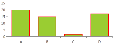
Setting DefaultVisualStyle of BarSeries
<telerik:BarSeries>
    <telerik:BarSeries.DefaultVisualStyle>
        <Style TargetType="Border">
            <Setter Property="Background" Value="#F47748" />
        </Style>
    </telerik:BarSeries.DefaultVisualStyle>
</telerik:BarSeries>
Since Q1 2016, all Cartesian series (excluding RangeSeries) are rendering default visuals using the DefaultVisualStyle property. So, you can use it also with line and area series to display their data point visuals which don't exist by default. Note that when using line or area series you will need to set also the size of the visual. Otherwise it won't be displayed.
Setting DefaultVisualStyle of LineSeries
<telerik:LineSeries>
  <telerik:LineSeries.DefaultVisualStyle>
    <Style TargetType="Path">
        <Setter Property="Width" Value="10" />
        <Setter Property="Height" Value="10" />
        <Setter Property="Fill" Value="#FF5AC3" />
    </Style>
  </telerik:LineSeries.DefaultVisualStyle>
</telerik:LineSeries>
When using a Palette the series' default visual will ignore the color defined in the DefaultVisualStyle and it will use the one provided by the palette.
Customizing Data Points Using PointTemplate
All series supported by the RadCartesianChart expose a PointTemplate property. It is of type DataTemplate and gets or sets the template that describes the visual representation of the data points in a series. There is an additiona PointTemplateSelector property which can be used to apply different visuals for the different data points in a series. The selector property is of type DataTemplateSelector.
Using PointTemplate is recommended only when the DefaultVisualStyle cannot be used.
Setting PointTemplate
<telerik:PointSeries>
  <telerik:PointSeries.PointTemplate>
      <DataTemplate>
          <Ellipse Height="5" Width="11" Fill="Blue"/>
      </DataTemplate>
  </telerik:PointSeries.PointTemplate>
</telerik:PointSeries>
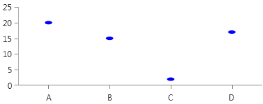
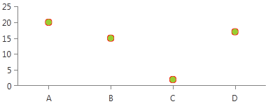
Customizing Point Series
PointSeries
This series expose the DefaultVisualStyle property. It is of type Style and determines the appearance of the Path element used to visualize the PointSeries. Your custom style should target the native Path component.
Setting PointSeries DefaultVisualStyle
<telerik:PointSeries.DefaultVisualStyle>
    <Style TargetType="Path">
          <Setter Property="Fill" Value="YellowGreen"/>
          <Setter Property="Stroke" Value="Red"/>
          <Setter Property="StrokeThickness" Value="1"/>
    </Style>
</telerik:PointSeries.DefaultVisualStyle>
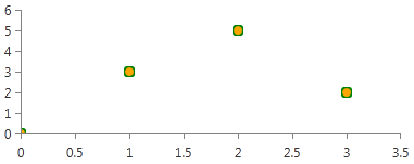
ScatterPointSeries
This series expose the DefaultVisualStyle property. It is of type Style and determines the appearance of the Path element used to visualize the ScatterPointSeries. Your custom style should target the native Path component.
Setting ScatterPointSeries DefaultVisualStyle
<telerik:ScatterPointSeries.DefaultVisualStyle>
    <Style TargetType="Path">
        <Setter Property="Stroke" Value="Green"/>
        <Setter Property="Fill" Value="Orange"/>
        <Setter Property="StrokeThickness" Value="2"/>
    </Style>
</telerik:ScatterPointSeries.DefaultVisualStyle>
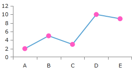
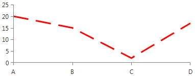
Customizing Line Series
Since R1 2016 the chart's line series have default visual elements for their data points. This means that you can use the DefaultVisualStyle property to customize the data points visuals.
LineSeries
This series expose the StrokeShapeStyle property. It is of type Style and determines the appearance of the Path element used to visualize the LineSeries. Your custom style should target the native Path component.
Setting LineSeries StrokeShapeStyle
<telerik:LineSeries.StrokeShapeStyle>
    <Style TargetType="Path">
        <Setter Property="Stroke" Value="Red"/>
        <Setter Property="StrokeDashArray" Value="10 5"/>
        <Setter Property="StrokeThickness" Value="3"/>
    </Style>
</telerik:LineSeries.StrokeShapeStyle>
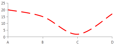
SplineSeries
This series expose the StrokeShapeStyle property. It is of type Style and determines the appearance of the Path element used to visualize the SplineSeries. Your custom style should target the native Path component.
Setting SplineSeries StrokeShapeStyle
<telerik:SplineSeries.StrokeShapeStyle>
    <Style TargetType="Path">
        <Setter Property="Stroke" Value="Red"/>
        <Setter Property="StrokeDashArray" Value="10 5"/>
        <Setter Property="StrokeThickness" Value="3"/>
    </Style>
</telerik:SplineSeries.StrokeShapeStyle>
StepLineSeries
This series expose the StrokeShapeStyle property. It is of type Style and determines the appearance of the Path element used to visualize the StepLineSeries. Your custom style should target the native Path component.
Setting StepLineSeries StrokeShapeStyle
<telerik:StepLineSeries.StrokeShapeStyle>
    <Style TargetType="Path">
        <Setter Property="Stroke" Value="Red"/>
        <Setter Property="StrokeDashArray" Value="10 5"/>
        <Setter Property="StrokeThickness" Value="3"/>
    </Style>
</telerik:StepLineSeries.StrokeShapeStyle>
ScatterLineSeries
This series expose the StrokeShapeStyle property. It is of type Style and determines the appearance of the Path element used to visualize the ScatterLineSeries. Your custom style should target the native Path component.
Setting ScatterLineSeries StrokeShapeStyle
<telerik:ScatterLineSeries.StrokeShapeStyle>
  <Style TargetType="Path">
      <Setter Property="Stroke" Value="Red"/>
      <Setter Property="StrokeDashArray" Value="10 5"/>
      <Setter Property="StrokeThickness" Value="3"/>
  </Style>
</telerik:ScatterLineSeries.StrokeShapeStyle>
ScatterSplineSeries
This series expose the StrokeShapeStyle property. It is of type Style and determines the appearance of the Path element used to visualize the ScatterSplineSeries. Your custom style should target the native Path component.
Setting ScatterSplineSeries StrokeShapeStyle
<telerik:ScatterSplineSeries.StrokeShapeStyle>
    <Style TargetType="Path">
      <Setter Property="Stroke" Value="Red"/>
      <Setter Property="StrokeDashArray" Value="10 5"/>
      <Setter Property="StrokeThickness" Value="3"/>
    </Style>
</telerik:ScatterSplineSeries.StrokeShapeStyle>
Customizing Area Series
AreaSeries
This series expose the following styling properties:
-
StrokeShapeStyle - it is of type Style and determines the appearance of the series. Your custom style should target the native Path component.
Setting AreaSeries StrokeShapeStyle
    <telerik:AreaSeries.StrokeShapeStyle>
        <Style TargetType="Path">
            <Setter Property="Stroke" Value="Red"/>
            <Setter Property="StrokeDashArray" Value="10 5"/>
            <Setter Property="StrokeThickness" Value="3"/>
        </Style>
    </telerik:AreaSeries.StrokeShapeStyle>
-
AreaShapeStyle - it is of type Style and determines the appearance of the area, locked between the axis and the line. Your custom style should target the native Path component.
Setting AreaSeries AreaShapeStyle
    <telerik:AreaSeries.AreaShapeStyle>
        <Style TargetType="Path">
            <Setter Property="Fill" Value="Bisque"/>
        </Style>
    </telerik:AreaSeries.AreaShapeStyle>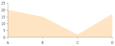
RangeSeries
This series expose the following styling properties:
-
StrokeShapeStyle - it is of type Style and determines the appearance of the series. Your custom style should target the native Path component.
Setting RangeSeries StrokeShapeStyle
    <telerik:RangeSeries.StrokeShapeStyle>
        <Style TargetType="Path">
            <Setter Property="Stroke" Value="Red"/>
            <Setter Property="StrokeDashArray" Value="10 5"/>
            <Setter Property="StrokeThickness" Value="3"/>
        </Style>
    </telerik:RangeSeries.StrokeShapeStyle>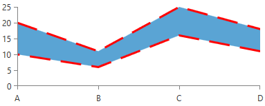
-
StrokeMode - it is Enumeration type and determines how the RangeSeries area outline should be painted or not. By default is set to LowAndHighPoints.
Setting RangeSeries StrokeShapeStyle
    <telerik:RangeSeries  StrokeMode="HighPoints" >
        <telerik:RangeSeries.StrokeShapeStyle>
            <Style TargetType="Path">
                <Setter Property="Stroke" Value="Red"/>
                <Setter Property="StrokeDashArray" Value="10 5"/>
                <Setter Property="StrokeThickness" Value="3"/>
            </Style>
        </telerik:RangeSeries.StrokeShapeStyle>
    </telerik:RangeSeries>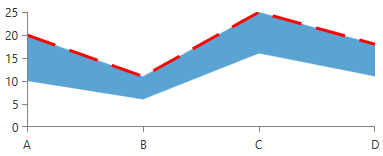
-
AreaShapeStyle - it is of type Style and determines the appearance of the area, locked between the axis and the line. Your custom style should target the native Path component.
Setting RangeSeries AreaShapeStyle
    <telerik:RangeSeries.AreaShapeStyle>
        <Style TargetType="Path">
            <Setter Property="Fill" Value="Bisque"/>
        </Style>
    </telerik:RangeSeries.AreaShapeStyle>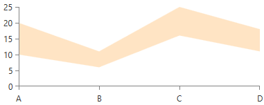
RangeSeries expose several additional properties you can use to style its appearance: Stroke, StrokeThickness, Fill, DashArray.
StepAreaSeries
This series expose the following styling properties:
-
StrokeShapeStyle - it is of type Style and determines the appearance of the series. Your custom style should target the native Path component.
Setting StepAreaSeries StrokeShapeStyle
    <telerik:StepAreaSeries.StrokeShapeStyle>
        <Style TargetType="Path">
            <Setter Property="Stroke" Value="Red"/>
            <Setter Property="StrokeDashArray" Value="10 5"/>
            <Setter Property="StrokeThickness" Value="3"/>
        </Style>
    </telerik:StepAreaSeries.StrokeShapeStyle>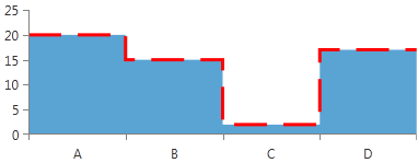
-
AreaShapeStyle - it is of type Style and determines the appearance of the area, locked between the axis and the line. Your custom style should target the native Path component.
Setting StepAreaSeries AreaShapeStyle
    <telerik:StepAreaSeries.AreaShapeStyle>
        <Style TargetType="Path">
            <Setter Property="Fill" Value="Bisque"/>
        </Style>
    </telerik:StepAreaSeries.AreaShapeStyle>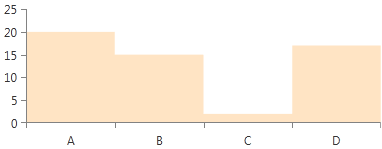
SplineAreaSeries
This series expose the following styling properties:
-
StrokeShapeStyle - it is of type Style and determines the appearance of the series. Your custom style should target the native Path component.
Setting SplineAreaSeries StrokeShapeStyle
    <telerik:SplineAreaSeries.StrokeShapeStyle>
        <Style TargetType="Path">
            <Setter Property="Stroke" Value="Red"/>
            <Setter Property="StrokeDashArray" Value="10 5"/>
            <Setter Property="StrokeThickness" Value="3"/>
        </Style>
    </telerik:SplineAreaSeries.StrokeShapeStyle>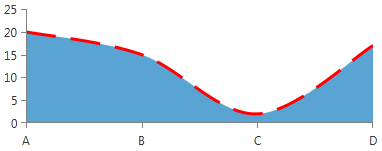
-
AreaShapeStyle - it is of type Style and determines the appearance of the area, locked between the axis and the line. Your custom style should target the native Path component.
Setting SplineAreaSeries AreaShapeStyle
    <telerik:SplineAreaSeries.AreaShapeStyle>
        <Style TargetType="Path">
            <Setter Property="Fill" Value="Bisque"/>
        </Style>
    </telerik:SplineAreaSeries.AreaShapeStyle>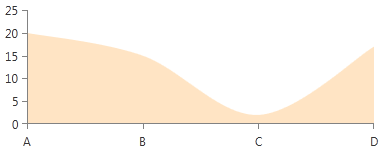
ScatterAreaSeries
This series expose the following styling properties:
-
StrokeShapeStyle - it is of type Style and determines the appearance of the series. Your custom style should target the native Path component.
Setting ScatterAreaSeries StrokeShapeStyle
     <telerik:ScatterAreaSeries.StrokeShapeStyle>
        <Style TargetType="Path">
            <Setter Property="Stroke" Value="Red"/>
            <Setter Property="StrokeDashArray" Value="10 5"/>
            <Setter Property="StrokeThickness" Value="3"/>
        </Style>
    </telerik:ScatterAreaSeries.StrokeShapeStyle>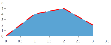
-
AreaShapeStyle - it is of type Style and determines the appearance of the area, locked between the axis and the line. Your custom style should target the native Path component.
Setting ScatterAreaSeries AreaShapeStyle
    <telerik:ScatterAreaSeries.AreaShapeStyle>
        <Style TargetType="Path">
            <Setter Property="Fill" Value="Bisque"/>
        </Style>
    </telerik:ScatterAreaSeries.AreaShapeStyle>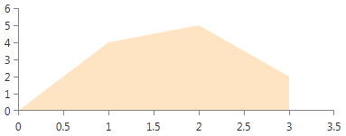
ScatterSplineAreaSeries
This series expose the following styling properties:
-
StrokeShapeStyle - it is of type Style and determines the appearance of the series. Your custom style should target the native Path component.
Setting ScatterSplineAreaSeries StrokeShapeStyle
    <telerik:ScatterSplineAreaSeries.StrokeShapeStyle>
        <Style TargetType="Path">
            <Setter Property="Stroke" Value="Red"/>
            <Setter Property="StrokeDashArray" Value="10 5"/>
            <Setter Property="StrokeThickness" Value="3"/>
        </Style>
    </telerik:ScatterSplineAreaSeries.StrokeShapeStyle>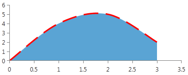
-
AreaShapeStyle - it is of type Style and determines the appearance of the area, locked between the axis and the line. Your custom style should target the native Path component.
Setting ScatterSplineAreaSeries AreaShapeStyle
    <telerik:ScatterSplineAreaSeries.AreaShapeStyle>
        <Style TargetType="Path">
            <Setter Property="Fill" Value="Bisque"/>
        </Style>
    </telerik:ScatterSplineAreaSeries.AreaShapeStyle>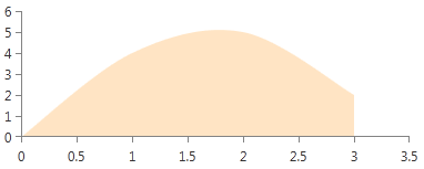
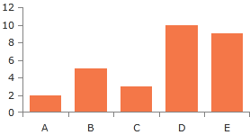
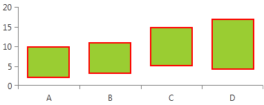
Customizing Bar Series
BarSeries
This series expose the DefaultVisualStyle property. It is of type Style and determines the appearance of the series. Your custom style should target the native Border component.
Setting BarSeries DefaultVisualStyle
<telerik:BarSeries.DefaultVisualStyle>
    <Style TargetType="Border">
        <Setter Property="Background" Value="YellowGreen"/>
        <Setter Property="BorderBrush" Value="Red"/>
        <Setter Property="BorderThickness" Value="2"/>
    </Style>
</telerik:BarSeries.DefaultVisualStyle>
RangeBarSeries
This series expose the DefaultVisualStyle property. It is of type Style and determines the appearance of the series. Your custom style should target the native Border component.
Setting RangeBarSeries DefaultVisualStyle
<telerik:RangeBarSeries.DefaultVisualStyle>
  <Style TargetType="Border">
      <Setter Property="Background" Value="YellowGreen"/>
      <Setter Property="BorderBrush" Value="Red"/>
      <Setter Property="BorderThickness" Value="2"/>
  </Style>
</telerik:RangeBarSeries.DefaultVisualStyle>
ScatterRangeBarSeries
This series expose the DefaultVisualStyle property. It is of type Style and determines the appearance of the series. Your custom style should target the native Border component.
Setting ScatterRangeBarSeries DefaultVisualStyle
<telerik:ScatterRangeBarSeries.DefaultVisualStyle>
  <Style TargetType="Border">
      <Setter Property="Background" Value="#B4FF8080"/>
      <Setter Property="BorderBrush" Value="Black"/>
      <Setter Property="BorderThickness" Value="1"/>
  </Style>
</telerik:ScatterRangeBarSeries.DefaultVisualStyle>
Customizing Financial Series
OhlcSeries
This series expose the DefaultVisualStyle property. It is of type Style and determines the appearance of the series. Your custom style should target the native OhlcStick component.
Setting OhlcSeries DefaultVisualStyle
<telerik:OhlcSeries.DefaultVisualStyle>
  <Style TargetType="telerikChartView:OhlcStick">
      <Setter Property="MinHeight" Value="1"/>
      <Setter Property="StrokeThickness" Value="1"/>
      <Setter Property="UpStroke" Value="GreenYellow"/>
      <Setter Property="DownStroke" Value="Red"/>
  </Style>
</telerik:OhlcSeries.DefaultVisualStyle>
CandlestickSeries
This series expose the DefaultVisualStyle property. It is of type Style and determines the appearance of the series. Your custom style should target the native Candlestick component.
Setting CandlestickSeries DefaultVisualStyle
<telerik:CandlestickSeries.DefaultVisualStyle>
    <Style TargetType="telerikChartView:Candlestick">
        <Setter Property="MinHeight" Value="1"/>
        <Setter Property="StrokeThickness" Value="1"/>
        <Setter Property="UpStroke" Value="GreenYellow"/>
        <Setter Property="DownStroke" Value="Red"/>
    </Style>
</telerik:CandlestickSeries.DefaultVisualStyle>
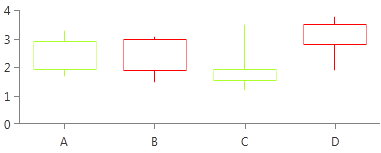
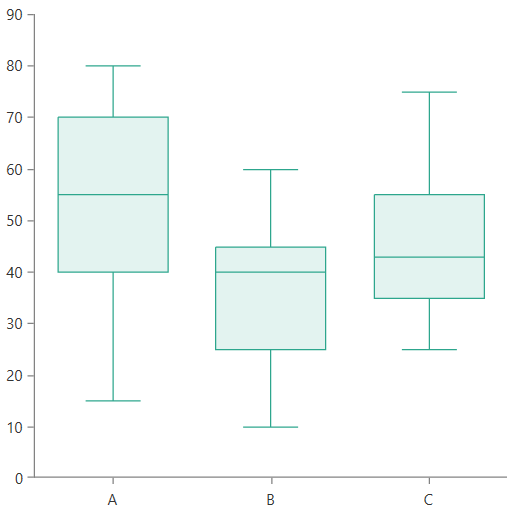
Customizing Box Plot Series
The BoxPlotSeries exposes a DefaultVisualStyle property that allows you to customize the visual elements representing the data points. The property accepts a Style targeting the BoxPlotShape element. The style can be used to change the stroke and fill of the visual element.
Setting BoxPlotSeries DefaultVisualStyle
<telerik:BoxPlotSeries.DefaultVisualStyle>
    <Style TargetType="telerik:BoxPlotShape">
        <Setter Property="Fill" Value="#222DA68D" />
        <Setter Property="Stroke" Value="#2DA68D" />
        <Setter Property="StrokeThickness" Value="1" />
    </Style>
</telerik:BoxPlotSeries.DefaultVisualStyle>
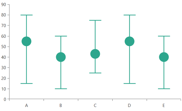
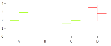
Customizing Error Bar Series
The ErrorBarSeries exposes a DefaultVisualStyle property that allows you to customize the visual elements representing the data points. The property accepts a Style targeting the ErrorBarShape element. The style can be used to change the colors of the visual and also its caps size, marker visibility, and marker size.
Setting ErrorBarSeries DefaultVisualStyle
<telerik:ErrorBarSeries.DefaultVisualStyle>
    <Style TargetType="telerik:ErrorBarShape">
        <Setter Property="Fill" Value="#2DA68D" />
        <Setter Property="Stroke" Value="#2DA68D" />
        <Setter Property="StrokeThickness" Value="2" />
        <Setter Property="ShowMarker" Value="True"/>
        <Setter Property="CapLength" Value="0.5" />
        <Setter Property="MarkerSize" Value="25, 25"/>
    </Style>
</telerik:ErrorBarSeries.DefaultVisualStyle>
The CapLength property controls the size of the caps shown at both ends of the error bar. The property works with relative units between 0 and 1.
The MarkerSize property determines the size of the marker. The property works with absolute value, which means that the marker has fixed size. If the MarkerSize is set to null, the marker will resize according to the cap length.