Ribbon Gallery
Telerik RadRibbonView provides a simple and consistent way for building interfaces similar to the ribbon control used in Microsoft Office. The RadRibbonView may consist of various elements, one of which is the Ribbon Gallery. This topic discusses concepts fundamental to the Ribbon Gallery at first and then goes into the usage of the RadRibbonGallery class and its features.
Before proceeding with this tutorial, it is recommended to get familiar with the Visual Structure of the RadRibbonView control.
Fundamentals
You can access the RadGallery/RadRibbonGallery control through an alias pointing to the Telerik.UI.Xaml.Controls namespace:
xmlns:telerik="using:Telerik.UI.Xaml.Controls"
Galleries are simple, but a very powerful and flexible user interface concept. They are basically a scrollable list of items and the idea behind them is that each item shows the result of clicking it visually, rather than a static icon which points its purpose.
The gallery is always rendered in two ways:
Figure 1: As a Popup inside a RadRibbonDropDownButton or in RadRibbonSplitButton
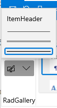
Figure 2: Directly into a Ribbon Group
](images/RibbonView_Gallery_group.png)
When you want to declare a ribbon gallery inside a RadRibbonDropDownButton/RadRibbonSplitButton use the RadGallery class.
When you want to declare a ribbon gallery directly into a Ribbon Group use the RadRibbonGallery class.
The RadRibbonGallery is a special type of gallery (it derives from RadGallery class), that is designed to be hosted directly in a RadRibbonControl. The difference here is that the viewport is constrained to the size of the ribbon itself.
RadGallery and RadRibbonGallery Properies
RadGallery
- ItemHeight: A property of type double that gets or sets the height of the gallery items.
- ItemWidth: A property of type double that gets or sets the width of the gallery items.
- ViewportWidth: A property of type double that gets or sets the width of the viewport.
RadRibbonGallery
- PopupContent: A property of type object that gets or sets the content to be shown when the Gallery popup is opened.
- IsOpen: A boolean property that gets or sets if the popup content is open or not.
- CompressedThreshold: An enumeration property of type CollapseThreshold the gets or sets the compressed threshold.
- Icon: A property of type object that gets or sets icon of the gallery.
- PopupLaunchButtonVisibility: A property of type Visibility that gets or sets visibility of the popup launch button.
- IsCompressed: A boolean property that gets a value indicating whether this instance is compressed.
- PopupMenuItems: A collection property that gets or sets the popup menu items.
- PopupViewportWidth: A property of type double that gets or sets the width of the popup viewport.
- Title: A property of type string that gets or sets the title of the gallery.
- MoreButtonTitle: A property of type string that gets or sets the title of the MoreButton.
- UpDownButtonTitle: A property of type string that gets or sets the UpDownButton title.
- PopupViewportHeight: A property of type double that gets or sets the height of the popup.
Adding Ribbon Galleries to a RadRibbonView Control
Ribbon gallery can be always rendered in two ways - inside a RadRibbonDropDownButton/RadRibbonSplitButton or directly into a Ribbon Group.
Adding RadGallery Inside a RadRibbonDropDownButton/RadRibbonSplitButton
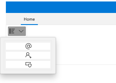
When you want to declare a Ribbon Gallery as popup inside a RadRibbonDropDownButton/RadRibbonSplitButton, you should use the RadGallery class. The next example demonstrates how to do that.
Example 1: Adding RadGallery
<telerik:RadRibbonView x:Name="radRibbonView" Margin="20">
<telerik:RadRibbonTab Header="Home">
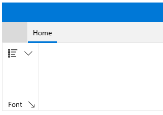
<telerik:RadRibbonGroup Header="Font" DialogLauncherVisibility="Visible">
<StackPanel>
<telerik:RadRibbonSplitButton>
<telerik:RadRibbonSplitButton.SmallIcon>
<SymbolIcon Symbol="AllApps"/>
</telerik:RadRibbonSplitButton.SmallIcon>
<telerik:RadRibbonSplitButton.Flyout>
<Flyout>
<telerik:RadGallery ViewportWidth="157" ItemWidth="156"
ItemHeight="26">
<telerik:RadGalleryItem >
<telerik:RadGalleryItem.Icon>
<SymbolIcon Symbol="Account"/>
</telerik:RadGalleryItem.Icon>
</telerik:RadGalleryItem>
<telerik:RadGalleryItem >
<telerik:RadGalleryItem.Icon>
<SymbolIcon Symbol="AddFriend"/>
</telerik:RadGalleryItem.Icon>
</telerik:RadGalleryItem>
<telerik:RadGalleryItem >
<telerik:RadGalleryItem.Icon>
<SymbolIcon Symbol="Admin"/>
</telerik:RadGalleryItem.Icon>
</telerik:RadGalleryItem>
</telerik:RadGallery>
</Flyout>
</telerik:RadRibbonSplitButton.Flyout>
</telerik:RadRibbonSplitButton>
</StackPanel>
</telerik:RadRibbonGroup>
</telerik:RadRibbonTab>
</telerik:RadRibbonView>
When you press the popup launch button, the gallery is shown:
Adding RadRibbonGallery Directly Into a Ribbon Group
When you want to declare a Ribbon Gallery directly into a Ribbon Group, you should use the RadRibbonGallery class. Consider again the previous example, add an additional RadRibbonGroup and declare a RadRibbonGallery like in the example below.
Example 2: Adding RadGallery
<telerik:RadRibbonView x:Name="radRibbonView">
    <telerik:RadRibbonTab Header="Home">
        <telerik:RadRibbonGroup Header="Font" DialogLauncherVisibility="Visible">
            <StackPanel>
                <telerik:RadRibbonSplitButton>
                    <telerik:RadRibbonSplitButton.Flyout>
                        <Flyout>
                            <telerik:RadGallery ViewportWidth="157"  ItemWidth="156"
                                ItemHeight="26">
                                <telerik:RadGalleryItem />
                                <telerik:RadGalleryItem />
                                <telerik:RadGalleryItem />
                            </telerik:RadGallery>
                        </Flyout>
                    </telerik:RadRibbonSplitButton.Flyout>
                </telerik:RadRibbonSplitButton>
            </StackPanel>
        </telerik:RadRibbonGroup>
        <telerik:RadRibbonGroup Header="Styles" DialogLauncherVisibility="Visible">
            <telerik:RadRibbonGallery Title="Quick Styles" x:Name="QuickStyles" ItemWidth="72" ItemHeight="56">
                <telerik:RadGalleryItem IsSelected="True">
                    <telerik:RadGalleryItem.Icon>
                        <controls:SymbolIcon Symbol="Page"/>
                    </telerik:RadGalleryItem.Icon>
                </telerik:RadGalleryItem>
                <telerik:RadGalleryItem Name="MusicInfo">
                    <telerik:RadGalleryItem.Icon>
                        <controls:SymbolIcon Symbol="MusicInfo"/>
                    </telerik:RadGalleryItem.Icon>
                </telerik:RadGalleryItem>
                <telerik:RadGalleryItem Name="Help">
                    <telerik:RadGalleryItem.Icon>
                        <controls:SymbolIcon Symbol="Help"/>
                    </telerik:RadGalleryItem.Icon>
                </telerik:RadGalleryItem>
                <telerik:RadGalleryItem Name="OtherUser">
                    <telerik:RadGalleryItem.Icon>
                        <controls:SymbolIcon Symbol="OtherUser"/>
                    </telerik:RadGalleryItem.Icon>
                </telerik:RadGalleryItem>
                <telerik:RadGalleryItem Name="Admin">
                    <telerik:RadGalleryItem.Icon>
                        <controls:SymbolIcon Symbol="Admin"/>
                    </telerik:RadGalleryItem.Icon>
                </telerik:RadGalleryItem>
                <telerik:RadGalleryItem Name="ShowResults">
                    <telerik:RadGalleryItem.Icon>
                        <controls:SymbolIcon Symbol="ShowResults"/>
                    </telerik:RadGalleryItem.Icon>
                </telerik:RadGalleryItem>
                <telerik:RadGalleryItem Name="Emoji">
                    <telerik:RadGalleryItem.Icon>
                        <controls:SymbolIcon Symbol="Emoji"/>
                    </telerik:RadGalleryItem.Icon>
                </telerik:RadGalleryItem>
                <telerik:RadGalleryItem Name="Emoji2">
                    <telerik:RadGalleryItem.Icon>
                        <controls:SymbolIcon Symbol="Emoji2"/>
                    </telerik:RadGalleryItem.Icon>
                </telerik:RadGalleryItem>
                <telerik:RadGalleryItem Name="Intense_Emphasis">
                    <telerik:RadGalleryItem.Icon>
                        <controls:SymbolIcon Symbol="Link"/>
                    </telerik:RadGalleryItem.Icon>
                </telerik:RadGalleryItem>
                <telerik:RadGalleryItem Name="Street">
                    <telerik:RadGalleryItem.Icon>
                        <controls:SymbolIcon Symbol="Street"/>
                    </telerik:RadGalleryItem.Icon>
                </telerik:RadGalleryItem>
            </telerik:RadRibbonGallery>
        </telerik:RadRibbonGroup>
    </telerik:RadRibbonTab>
</telerik:RadRibbonView>
While the items are hosted in the ribbon, you could page up/down smoothly using the buttons beside the gallery.
Adding Additional Content to RadGallery
The RadGallery allows you to place in the popup additional menu options regarding the gallery. For that purpose you could use the ListView control.
The next code snippet demonstrates how to add additional menu items.
Example 3: Adding Content to RadGallery
<telerik:RadRibbonView x:Name="radRibbonView">
    <telerik:RadRibbonTab Header="Home">
        <telerik:RadRibbonGroup Header="Font" DialogLauncherVisibility="Visible">
            <StackPanel>
                <telerik:RadRibbonSplitButton>
                    <telerik:RadRibbonSplitButton.Flyout>
                        <Flyout>
                            <StackPanel>
                                <telerik:RadGallery ViewportWidth="157" ItemWidth="156" ItemHeight="28">
                                    <telerik:RadGalleryItem IsSelected="True" Content="Spacing" />
                                    <telerik:RadGalleryItem Content="No_Spacing" />
                                    <telerik:RadGalleryItem Content="Heading1" />
                                    <telerik:RadGalleryItem Content="Heading2"/>
                                </telerik:RadGallery>
                                <ListView>
                                    <ListViewItem Content="Paste"  />
                                    <ListViewItem Content="Paste Special..."  />
                                    <ListViewItem Content="Paste as Hyperlink." />
                                </ListView>
                            </StackPanel>
                        </Flyout>
                    </telerik:RadRibbonSplitButton.Flyout>
                </telerik:RadRibbonSplitButton>
            </StackPanel>
        </telerik:RadRibbonGroup>
    </telerik:RadRibbonTab>
</telerik:RadRibbonView>
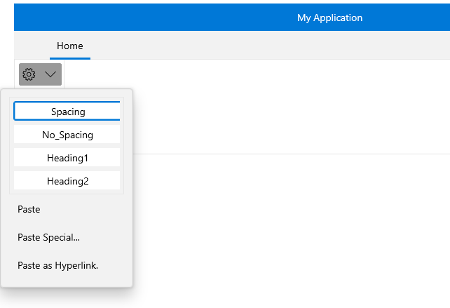
Adding Additional Content to the RadRibbonGallery
You could also associate additional menu options with the RadRibbonGallery popup. In contrast to the RadGallery class, here the RadRibbonGallery exposes a special property for that purpose: PopupMenuItems.
In the next example several RadMenuItem objects are added to the RadRibbonGallery's PopupMenuItems collection.
Example 4: Adding Content to RadRibbonGallery
<telerik:RadRibbonView x:Name="radRibbonView">
    <telerik:RadRibbonTab Header="Home">
        <telerik:RadRibbonGroup Header="Styles" DialogLauncherVisibility="Visible">
            <telerik:RadRibbonGallery Title="Quick Styles" x:Name="QuickStyles" ItemWidth="72" ItemHeight="56">
                <telerik:RadRibbonGallery.PopupMenuItems>
                    <ListViewItem Content="Paste"  />
                    <ListViewItem Content="Paste Special..."  />
                    <ListViewItem Content="Paste as Hyperlink." />
                </telerik:RadRibbonGallery.PopupMenuItems>
                <telerik:RadGalleryItem IsSelected="True" Name="Normal" />
                <telerik:RadGalleryItem Content="No_Spacing" />
                <telerik:RadGalleryItem Content="Heading1" />
                <telerik:RadGalleryItem Content="Heading2"/>
                <telerik:RadGalleryItem Content="Title" />
                <telerik:RadGalleryItem Content="Subtitle"/>
                <telerik:RadGalleryItem Content="Subtitle_Emphasis"/>
                <telerik:RadGalleryItem Content="Emphasis" />
                <telerik:RadGalleryItem Content="Intense_Emphasis" />
                <telerik:RadGalleryItem Content="Strong"/>
            </telerik:RadRibbonGallery>
        </telerik:RadRibbonGroup>
    </telerik:RadRibbonTab>
</telerik:RadRibbonView>
Group RadRibbonGalleryItems
You can visually group the RadRibbonGallery items when the gallery is in open state. You can do that by defining some of the RadRibbonGalleryItems as headers through the IsHeader bool property.
However, in order to properly display header items in the RadRibbonGallery, you need to change its default ItemsPanel to a RibbonGalleryPanel:
You can access the RibbonGalleryPanel control through an alias pointing to the Telerik.UI.Xaml.Controls namespace:
xmlns:telerikRibbonViewPrimitives="using:Telerik.UI.Xaml.Controls.RibbonView.Primitives"
Example 5: Group RadRibbonGalleryItems
<telerik:RadRibbonGallery>
    <telerik:RadRibbonGallery.ItemsPanel>
        <ItemsPanelTemplate>
            <telerikRibbonViewPrimitives:RibbonGalleryPanel />
        </ItemsPanelTemplate>
    </telerik:RadRibbonGallery.ItemsPanel>
    <telerik:RadGalleryItem Content="Header1" IsHeader="True" />
    <telerik:RadGalleryItem Content="Item 1.1" />
    <telerik:RadGalleryItem Content="Item 1.2" />
    <telerik:RadGalleryItem Content="Item 1.3" />
    <telerik:RadGalleryItem Content="Header2" IsHeader="True" />
    <telerik:RadGalleryItem Content="Item 2.1" />
    <telerik:RadGalleryItem Content="Item 2.2" />
    <telerik:RadGalleryItem Content="Item 2.3" />
    <telerik:RadGalleryItem Content="Header3" IsHeader="True" />
    <telerik:RadGalleryItem Content="Item 3.1" />
    <telerik:RadGalleryItem Content="Item 3.2" />
</telerik:RadRibbonGallery>
Setting RadRibbonGallery's PopupLaunchButtonVisibility
The RadRibbonGallery class allows you to set the visibility of the launch popup button. The next example shows you how to set the RadRibbonGallery's PopupLaunchButtonVisibility property to Visibility.Collapsed.
Example 6: Setting PopupLaunchButtonVisibility Property
<telerik:RadRibbonGallery Title="Quick Styles" x:Name="QuickStyles" ItemWidth="72" ItemHeight="56" PopupLaunchButtonVisibility="Collapsed">
 ...
</telerik:RadRibbonGallery>
Events
The RadGallery class exposes two events: ActivatePreview and DeactivatePreview.
-
ActivatePreview: This event is raised when the mouse cursor is over the gallery item.
-
DeactivatePreview: This event is raised when the mouse cursor leaves the gallery item.
Since the RadRibbonGallery inherits the RadGallery class, you can handle the ActivatePreview and DeactivatePreview events in the RadRibbonGallery control as well.
For a full list of the exposed by the RadRibbonView events, take a look at the Events - Overview topic.