Ribbon DropDownButton
The RadRibbonDropDownButton represents an extension of the RadDropDownButton. It provides an easier interaction with the RadRibbonView control. What is special about the RadRibbonDropDownButton is that upon activation it can display a flyout area. Content of any kind can be nested inside the flyout area.
You can access the RadRibbonDropDownButton control through an alias pointing to the Telerik.UI.Xaml.Controls namespace:
xmlns:telerik="using:Telerik.UI.Xaml.Controls"
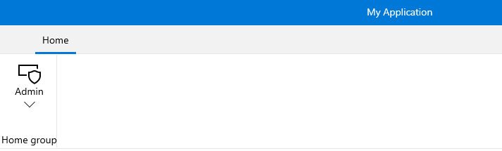
Here is a sample definition of a RadRibbonDropDownButton without having any drop down content defined:
Example 1: Simple definition of RibbonDropDownButton
<telerik:RadRibbonView>
    <telerik:RadRibbonTab Header="Home">
        <telerik:RadRibbonGroup Header="Home group"  >
            <telerik:RadRibbonGroup.Variants>
                <ribbonView:GroupVariant Variant="Small"/>
                <ribbonView:GroupVariant Variant="Medium"/>
                <ribbonView:GroupVariant Variant="Large"/>
            </telerik:RadRibbonGroup.Variants>
            <telerik:RadRibbonDropDownButton CollapseToSmall="WhenGroupIsSmall"
                                CollapseToMedium="WhenGroupIsMedium"
                                IsAutoSize="True"
                                Size="Large"
                                Text="Admin" >
                <telerik:RadRibbonDropDownButton.SmallIcon>
                    <SymbolIcon Symbol="Admin"/>
                </telerik:RadRibbonDropDownButton.SmallIcon>
                <telerik:RadRibbonDropDownButton.LargeIcon>
                    <SymbolIcon Symbol="Admin"/>
                </telerik:RadRibbonDropDownButton.LargeIcon>
            </telerik:RadRibbonDropDownButton>
        </telerik:RadRibbonGroup>
    </telerik:RadRibbonTab>
</telerik:RadRibbonView>
As all buttons in the RadRibbonView's set slightly expose the same functionality, take a look at the Overview topic.
Setting the Flyout Content
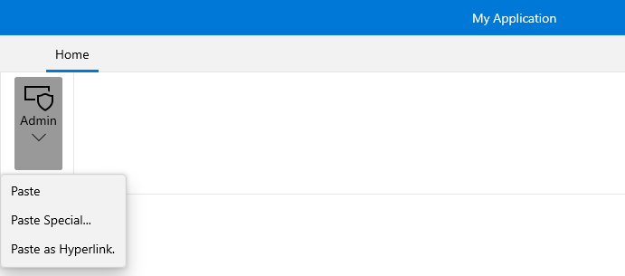
To set the popup content you have to simply set the Flyout property of the button. Here is an example of a RadRibbonDropDownButton with three menu items inside its drop down.
Example 2: Setting the Flyout Content
<telerik:RadRibbonView>
    <telerik:RadRibbonTab Header="Home">
        <telerik:RadRibbonGroup Header="Home group"  >
            <telerik:RadRibbonGroup.Variants>
                <ribbonView:GroupVariant Variant="Small"/>
                <ribbonView:GroupVariant Variant="Medium"/>
                <ribbonView:GroupVariant Variant="Large"/>
            </telerik:RadRibbonGroup.Variants>
            <telerik:RadRibbonDropDownButton CollapseToSmall="WhenGroupIsSmall"
                                CollapseToMedium="WhenGroupIsMedium"
                                IsAutoSize="True"
                                Size="Large"
                                Text="Admin" >
                <telerik:RadRibbonDropDownButton.SmallIcon>
                    <SymbolIcon Symbol="Admin"/>
                </telerik:RadRibbonDropDownButton.SmallIcon>
                <telerik:RadRibbonDropDownButton.LargeIcon>
                    <SymbolIcon Symbol="Admin"/>
                </telerik:RadRibbonDropDownButton.LargeIcon>
                <telerik:RadRibbonDropDownButton.Flyout>
                    <MenuFlyout>
                        <MenuFlyoutItem Text="Paste"  />
                        <MenuFlyoutItem Text="Paste Special..." />
                        <MenuFlyoutItem Text="Paste as Hyperlink."  />
                    </MenuFlyout>
                </telerik:RadRibbonDropDownButton.Flyout>
            </telerik:RadRibbonDropDownButton>
        </telerik:RadRibbonGroup>
    </telerik:RadRibbonTab>
</telerik:RadRibbonView>