Ribbon SplitButton
The RadRibbonSplitButton represents an extension of the RadSplitButton. It provides an easier interaction with the RadRibbonView control. What is special about the RadRibbonSplitButton is that it is separated into two areas. The first one exposes a default action for the button while the second one pops up the drop down content like the RadRibbonDropDownButton does. This means that the user does not need to open the popup area every time he needs to select an action, he can just select the one exposed directly by the button.
You can access the RadRibbonSplitButton control through an alias pointing to the Telerik.UI.Xaml.Controls namespace:
xmlns:telerik="using:Telerik.UI.Xaml.Controls"
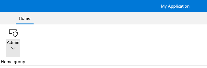
Here is a sample definition of a RadRibbonSplitButton without having any drop down content defined:
Example 1: Simple definition of RibbonSplitButton
<telerik:RadRibbonView>
    <telerik:RadRibbonTab Header="Home">
        <telerik:RadRibbonGroup Header="Home group"  >
            <telerik:RadRibbonGroup.Variants>
                <ribbonView:GroupVariant Variant="Small"/>
                <ribbonView:GroupVariant Variant="Medium"/>
                <ribbonView:GroupVariant Variant="Large"/>
            </telerik:RadRibbonGroup.Variants>
                <telerik:RadRibbonSplitButton CollapseToSmall="WhenGroupIsSmall"
                                CollapseToMedium="WhenGroupIsMedium"
                                IsAutoSize="True"
                                Size="Large"
                                Text="Admin" >
                <telerik:RadRibbonSplitButton.SmallIcon>
                    <SymbolIcon Symbol="Admin"/>
                </telerik:RadRibbonSplitButton.SmallIcon>
                <telerik:RadRibbonSplitButton.LargeIcon>
                        <SymbolIcon Symbol="Admin"/>
                </telerik:RadRibbonSplitButton.LargeIcon>
            </telerik:RadRibbonSplitButton>
        </telerik:RadRibbonGroup>
    </telerik:RadRibbonTab>
</telerik:RadRibbonView>
Please note that the Text value of the button is displayed in its button part. If you want to modify that behavior and display the Text in the DropDownPart of the button, then you can use the IsTextInMiddleButton property. If set to False, this property will make sure the button displays its Text in the DropDownPart of the RibbonSplitButon.
Setting Flyout Content
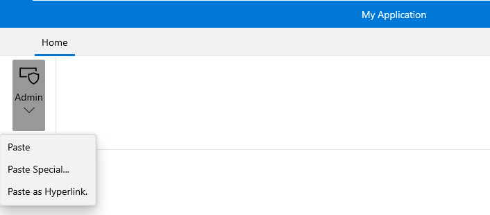
To set the popup content you have to simply set the Flyout property of the button. Here is an example of a RadRibbonSplitButton with three menu items inside its drop down.
Example 2: Setting Flyout Content
<telerik:RadRibbonView>
    <telerik:RadRibbonTab Header="Home">
        <telerik:RadRibbonGroup Header="Home group"  >
            <telerik:RadRibbonGroup.Variants>
                <ribbonView:GroupVariant Variant="Small"/>
                <ribbonView:GroupVariant Variant="Medium"/>
                <ribbonView:GroupVariant Variant="Large"/>
            </telerik:RadRibbonGroup.Variants>
                    <telerik:RadRibbonSplitButton CollapseToSmall="WhenGroupIsSmall"
                                CollapseToMedium="WhenGroupIsMedium"
                                IsAutoSize="True"
                                Size="Large"
                                Text="Admin" >
                <telerik:RadRibbonSplitButton.SmallIcon>
                    <SymbolIcon Symbol="Admin"/>
                </telerik:RadRibbonSplitButton.SmallIcon>
                <telerik:RadRibbonSplitButton.LargeIcon>
                    <SymbolIcon Symbol="Admin"/>
                </telerik:RadRibbonSplitButton.LargeIcon>
                <telerik:RadRibbonSplitButton.Flyout>
                    <MenuFlyout>
                        <MenuFlyoutItem Text="Paste"  />
                        <MenuFlyoutItem Text="Paste Special..." />
                        <MenuFlyoutItem Text="Paste as Hyperlink."  />
                    </MenuFlyout>
                </telerik:RadRibbonSplitButton.Flyout>
            </telerik:RadRibbonSplitButton>
        </telerik:RadRibbonGroup>
    </telerik:RadRibbonTab>
</telerik:RadRibbonView>