New to Telerik UI for .NET MAUI? Start a free 30-day trial

.NET MAUI Slider Ticks Styling

The Slider for .NET MAUI provides the following styling options and a style selector for the ticks (to let you apply additional styles):

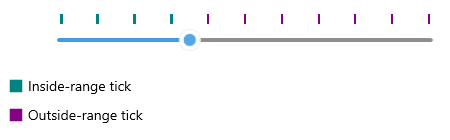
  • InRangeTickColor(Color)—Defines the color of the ticks shown along the range track (between OriginValue and Value).
  • OutOfRangeTickColor(Color)—Defines the color of the ticks shown outside of the range track.
  • TickThickness(double)—Defines the width of the ticks.
  • InRangeTickStyle(Style)—Defines a custom style for the ticks shown along the range track.
  • OutOfRangeTickStyle(Style)—Defines a custom style for the ticks shown outside of the range track.
  • TickLength(double)—Defines the custom length of the ticks.
  • TicksStyleSelector(Telerik.Maui.Controls.IStyleSelector)—Defines a selector that can apply different styles to ticks according to custom logic.

Tick Styles Example

The following example demonstrates how to use the described styling properties to style the Slider's ticks:

1. Add a custom style with TargetType set to RadBorder to the page's resources:

<Style x:Key="CustomInRangeTickStyle" TargetType="telerik:RadBorder">
    <Setter Property="BackgroundColor" Value="#018383" />
    <Setter Property="WidthRequest" Value="3" />
    <Setter Property="HeightRequest" Value="10" />
</Style>
<Style x:Key="CustomOutOfRangeTickStyle" TargetType="telerik:RadBorder">
    <Setter Property="BackgroundColor" Value="#830183" />
    <Setter Property="WidthRequest" Value="2" />
    <Setter Property="HeightRequest" Value="10" />
</Style>

2. Apply the custom styles to the Slider:

<telerik:RadSlider Minimum="0"
                   Maximum="100"
                   Value="35"
                   TicksPlacement="Start"
                   TickStep="10"
                   InRangeTickStyle="{StaticResource CustomInRangeTickStyle}"
                   OutOfRangeTickStyle="{StaticResource CustomOutOfRangeTickStyle}" />

Telerik Slider for .NET MAUI Ticks Styling

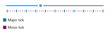
TickStyleSelector Example

The following example demonstrates how to use the TicksStyleSelector to set two different styles for the major and minor ticks:

1. Create a custom style selector class that inherits from Telerik.Maui.Controls.IStyleSelector:

public class CustomTickStyleSelector : IStyleSelector
{
    public Style MajorTickStyle { get; set; }
    public Style MinorTickStyle { get; set; }

    public Style SelectStyle(object item, BindableObject bindable)
    {
        double value = (double)item;
        return value % 10 == 0 ? this.MajorTickStyle : this.MinorTickStyle;
    }
}

Telerik.Maui.Controls.IStyleSelector provides a mechanism to select a Microsoft.Maui.Controls.Style based on custom logic.

2. Add the style selector to the page's resources:

<local:CustomTickStyleSelector x:Key="CustomTickStyleSelector">
    <local:CustomTickStyleSelector.MajorTickStyle>
        <Style TargetType="telerik:RadBorder">
            <Setter Property="BackgroundColor" Value="#018383" />
            <Setter Property="WidthRequest" Value="3" />
            <Setter Property="HeightRequest" Value="10" />
        </Style>
    </local:CustomTickStyleSelector.MajorTickStyle>
    <local:CustomTickStyleSelector.MinorTickStyle>
        <Style TargetType="telerik:RadBorder">
            <Setter Property="BackgroundColor" Value="#830183" />
            <Setter Property="WidthRequest" Value="1" />
            <Setter Property="HeightRequest" Value="6" />
        </Style>
    </local:CustomTickStyleSelector.MinorTickStyle>
</local:CustomTickStyleSelector>

3. Apply the style selector to the Slider:

<telerik:RadSlider Minimum="0"
                   Maximum="100"
                   Value="35"
                   TicksPlacement="End"
                   TickStep="2"
                   TickStyleSelector="{StaticResource CustomTickStyleSelector}" />

Check the result below:

Telerik Slider for .NET MAUI Ticks Styling

See Also

In this article