.NET MAUI Slider Thumb Styling
The Slider for .NET MAUI provides the following styling options for the value thumb:
-
ThumbFill(Color)—Defines the fill color of the Slider's thumb. -
ThumbStyle(Style)—Defines a custom style for the Slider's thumb.
In addition, you can modify the look and feel of the range track, so it matches the style of the thumb. Range track refers to that part of the backtrack from the Slider's OriginValue along to the position of the value thumb.
-
RangeTrackFill(Color)—Defines the fill color of the Slider's range track. -
RangeTrackStyle(Style)—Defines a custom style for the Slider's range track.
The following example demonstrates how to use the described styling properties to style the Slider's thumb and range track:
1. Add the styles to the page resources:
<Style x:Key="CustomRangeTrackStyle" TargetType="telerik:SliderRangeTrack">
    <Setter Property="TrackThickness" Value="8" />
    <Setter Property="Fill" Value="#80CBC4" />
    <Setter Property="Stroke" Value="#B2DFDB" />
    <Setter Property="StrokeThickness" Value="1" />
</Style>
<Style x:Key="CustomThumbStyle" TargetType="telerik:SliderThumb">
    <Setter Property="Fill" Value="#009688" />
    <Setter Property="Stroke" Value="#00897B" />
    <Setter Property="StrokeThickness" Value="2" />
</Style>
2. Apply them to the Slider:
<telerik:RadSlider Minimum="0"
                   Maximum="100"
                   Value="35"
                   RangeTrackStyle="{StaticResource CustomRangeTrackStyle}"
                   ThumbStyle="{StaticResource CustomThumbStyle}" />
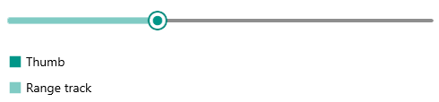
Check the result below: