Group Header Styling for .NET MAUI DataGrid
The Telerik UI for .NET MAUI DataGrid provides a GroupHeaderStyle property which defines the appearance of the group headers when the data is grouped.
To learn more about the grouping functionality of the DataGrid, see the Grouping Overview topic.
Group Header Properties
The GroupHeaderStyle property is of type Style and targets the DataGridGroupHeaderAppearance class. The DataGridGroupHeaderAppearance provides the following styling properties:
-
TextColor(Color)—Defines the color for the text part of the group header. -
SearchMatchTextColor(Color)—Defines the color that is used for the parts of the group header's text that are search matches. For more details on this, see the Search as You Type topic. -
AggregatesTextColor(Color)—Defines the color for the aggregates part of the group header. For more details on this, see the Aggregates topic. -
BackgroundColor(Color)—Defines the color that fills the area within the header of the DataGrid group header. -
SearchMatchBackgroundColor(Color)—Defines the color that fills the area within the border when the cell contains a search-match. For more details on this, see the Search as You Type topic. -
GroupLevelIndentation(double)—Defines the indentation that accumulates for each group level. -
BorderColor(Color)—Defines the color that fills the border region of the group header. -
BorderThickness(Thickness)—Defines the thickness of the border. -
TextMargin(Thickness)—Defines the margin for the text part of the group header. -
VerticalTextAlignment(TextAlignment)—Defines the vertical text alignment. -
HorizontalTextAlignment(TextAlignment)—Defines the horizontal text alignment. -
TextFontattributes(FontAttributes)—Defines the font attributes of the group header's text part. -
TextFontFamily(string)—Defines the font family of the group header's text part. -
TextFontSize(double)—Define the font size of the group header's text part. -
AggregatesTextMargin(Thickness)—Defnes the margin for the aggregates part of the group header. For more details on this, see the Aggregates topic. -
AggregatesTextFontAttributes(FontAttributes)—Defines the font attributes for the aggregates part of the group header. -
AggregatesTextFontFamily(string)—Defines the font family for the aggregates part of the group header. -
AggregatesTextFontSize(double)—Define the font size for the aggregates part of the group header.
Group Header Button Properties
By default, the Button of the group header uses an internal symbol font family. To render text instead of a symbol when the button is expanded or collapsed, set a font family to the ButtonFontFamily property and add the text to the ExpandButtonText and CollapseButtonText properties.
-
ButtonFontAttributes(FontAttributes)—;Defines the font attributes of the expand and collapse symbol. -
ButtonFontFamily(string)—Defines the font family of the expand and collapse symbol. -
ButtonFontSize(double) options—Defines the font size of the expand and collapse symbol. -
ButtonMargin(Thickness)—Defines the margin of the expand and collapse symbol. -
ButtonTextColor(Color)—Defines the text color of the expand and collapse symbol. -
CollapseButtonText(string)—Defines the text for the collapse state of the group header. -
ExpandButtonText(string)—Defines the text for the expand state of the group header.
The following example demonstrates how to apply a sample GroupHeaderStyle to the DataGrid:
1. Add a sample Style with TargetType set to DataGridGroupHeaderAppearance to the page's resources:
2. Add the DataGrid definition to the page with its GroupHeaderStyle applied:
3. Add the ViewModel class:
4. Add the data item used for binding the DataGrid:
5. Set the binding context of the DataGrid to the ViewModel class:
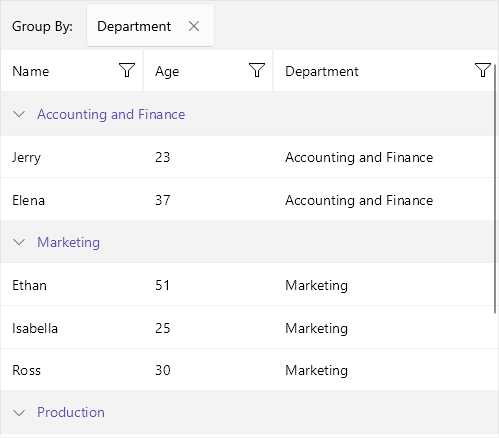
Check the result at the image below: