.NET MAUI DataGrid Style Selectors
The DataGrid component exposes a conditional styling feature. It allows users to apply different styles on a cell or per group header depending on a specific condition.
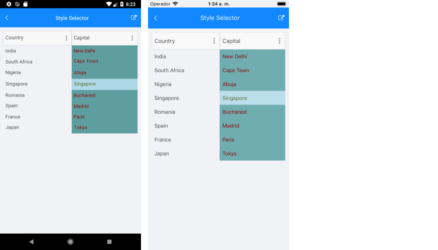
You can set a different style on a specific cell from a specific column based on custom selection logic with the following properties:
-
CellContentStyleSelector
—Styles the content of the cell by using the text alignment options (TextMargin
,HorizontalTextAlignment
,VerticalTextAlignment
), the font options (FontAttributes
,FontFamily
,FontSize
) and theTextColor
property. -
CellDecorationStyleSelector
—Styles the decoration of a cell.
Different styles can be applied on a per-group header once the DataGrid control is grouped through GroupHeaderStyleSelector
property.
Different styles can be applied on a per-group footer once the DataGrid control is grouped through GroupFooterStyleSelector
property.
To display the group footer, set the
ShowGroupFooters
property toTrue
.
The CellContentStyleSelector
, CellDecorationStyleSelector
, and GroupStyleSelector
use the SelectStyle
method to change the style.
Example
The following example will demonstrate how to apply the style selectors in the DataGrid control:
Let’s add the DataGrid and set the CellContentStyleSelector
as a static resource of type MyCellContentStyleSelector
, CellDecorationStyleSelector
as a static resource of type MyCellDecorationStyleSelector
, and GroupStyleSelector
as a static resource of type MyGroupStyleSelector
.
-
DataGrid
definition in XAML:<telerik:RadDataGrid x:Name="datagrid" AutoGenerateColumns="False" IsVisible="True" GroupHeaderStyleSelector="{StaticResource MyGroupSelector}" UserEditMode="Cell"> <telerik:RadDataGrid.Columns> <telerik:DataGridTextColumn PropertyName="Country" /> <telerik:DataGridTextColumn PropertyName="Capital" CellContentStyleSelector="{StaticResource MyCellContentStyleSelector}" CellDecorationStyleSelector="{StaticResource MyCellDecorationSelector}"> </telerik:DataGridTextColumn> </telerik:RadDataGrid.Columns> </telerik:RadDataGrid>
-
Create a simple data for the DataGrid:
public class Data { public Data(string country, string capital) { this.Country = country; this.Capital = capital; } public string Country { get; set; } public string Capital { get; set; } }
-
Set the
ItemsSource
of theDataGrid
class:var source = new ObservableCollection<Data>(); source.Add(new Data("India", "New Delhi")); source.Add(new Data("South Africa", "Cape Town")); source.Add(new Data("Nigeria", "Abuja")); source.Add(new Data("Singapore", "Singapore")); source.Add(new Data("Romania", "Bucharest")); source.Add(new Data("Spain", "Madrid")); source.Add(new Data("France", "Paris")); source.Add(new Data("Japan", "Tokyo"));
this.datagrid.ItemsSource = source;
-
Add
MyCellContentStyleSelector
,MyCellDecorationStyleSelector
, andMyGroupStyleSelector
as resources in the Resource page of the application:<local:MyGroupSelector x:Key="MyGroupSelector"> <local:MyGroupSelector.CountryTemplate1> <telerik:DataGridGroupHeaderStyle BackgroundColor="LightYellow" TextColor="Black"/> </local:MyGroupSelector.CountryTemplate1> <local:MyGroupSelector.CountryTemplate2> <telerik:DataGridGroupHeaderStyle BackgroundColor="LightSkyBlue" TextColor="Red"/> </local:MyGroupSelector.CountryTemplate2> </local:MyGroupSelector> <local:MyCellContentSelector x:Key="MyCellContentStyleSelector"> <local:MyCellContentSelector.CellTemplate1> <telerik:DataGridTextCellStyle TextColor="DarkOliveGreen"/> </local:MyCellContentSelector.CellTemplate1> <local:MyCellContentSelector.CellTemplate2> <telerik:DataGridTextCellStyle TextColor="DarkRed"/> </local:MyCellContentSelector.CellTemplate2> </local:MyCellContentSelector> <local:MyCellDecorationSelector x:Key="MyCellDecorationSelector"> <local:MyCellDecorationSelector.CellTemplate1> <telerik:DataGridBorderStyle BackgroundColor="LightBlue"/> </local:MyCellDecorationSelector.CellTemplate1> <local:MyCellDecorationSelector.CellTemplate2> <telerik:DataGridBorderStyle BackgroundColor="CadetBlue"/> </local:MyCellDecorationSelector.CellTemplate2> </local:MyCellDecorationSelector>
- Create a custom class for each selector. This class derives from
DataGridStyleSelector
and overrides itsSelectStyle
method.
The
MyCellContentStyleSelector
class implementation is as follows:The implementation of theclass MyCellContentSelector : DataGridStyleSelector { public DataGridStyle CellTemplate1 { get; set; } public DataGridStyle CellTemplate2 { get; set; } public override DataGridStyle SelectStyle(object item, BindableObject container) { DataGridCellInfo cellInfo = item as DataGridCellInfo; if (cellInfo != null) { if ((cellInfo.Item as Data).Capital == "Singapore") { return CellTemplate1; } else { return CellTemplate2; } } return base.SelectStyle(item, container); } }
MyCellDecorationStyleSelector
class is shown below:class MyCellDecorationSelector : DataGridStyleSelector { public DataGridStyle CellTemplate1 { get; set; } public DataGridStyle CellTemplate2 { get; set; } public override DataGridStyle SelectStyle(object item, BindableObject container) { DataGridCellInfo cellInfo = item as DataGridCellInfo; if (cellInfo != null) { if ((cellInfo.Item as Data).Capital == "Singapore") { return CellTemplate1; } else { return CellTemplate2; } } return base.SelectStyle(item, container); } }
You can implement
MyGroupStyleSelector
as follows:class MyGroupSelector : DataGridStyleSelector { public DataGridStyle CountryTemplate1 { get; set; } public DataGridStyle CountryTemplate2 { get; set; } public override DataGridStyle SelectStyle(object item, BindableObject container) { GroupHeaderContext header = item as GroupHeaderContext; if (header != null) { if (header.Group.Key == "India") { return CountryTemplate1; } else { return CountryTemplate2; } } return null; } }
This is how the DataGrid control will look when
CellContentStyleSelector
is applied.See Also
-