New to Telerik UI for .NET MAUI? Start a free 30-day trial

Group Header Template for .NET MAUI DataGrid

The .NET MAUI DataGrid features fully customizable group headers that allow you to tweak the appearance and behavior of the headers used to group data within the grid. You can achieve this customization by using the GroupHeaderTemplate property of the DataGrid, which allows you to set a custom DataTemplate to the group headers.

The BindingContext of the GroupHeaderTemplate is a GroupHeaderContext object and it includes the following properties:

  • Descriptor: Specifies the descriptor used for the grouping.
  • Group: Gets details on the group such as:
    • Items: Gets the child items of the group.
    • Key: Gets the key specific for the group.
  • IsExpanded: Defines a value indicating whether the group is currently expanded (has its child items visible).
  • Level: Gets the zero-based level (or the depth) of the group.

The following example demonstrates how to apply a sample GroupHeaderTemplate to the DataGrid:

1. Add the DataGrid definition to the page with a sample GroupHeaderTemplate:

<telerik:RadDataGrid x:Name="dataGrid"
                     ItemsSource="{Binding People}">
    <telerik:RadDataGrid.GroupHeaderTemplate>
        <DataTemplate>
            <HorizontalStackLayout Margin="5,0,0,0" 
                                   VerticalOptions="Center"
                                   Spacing="5">
                <Label Text="{Binding Group.Key, StringFormat='Department: {0}'}"
                       TextColor="#674BB2" />
                <Label Text="{Binding Group.Items.Count, StringFormat='({0} employees)'}"
                       TextColor="#674BB2" /> 
            </HorizontalStackLayout>
        </DataTemplate>
    </telerik:RadDataGrid.GroupHeaderTemplate>
    <telerik:RadDataGrid.GroupDescriptors>
        <telerik:PropertyGroupDescriptor PropertyName="Department" />
    </telerik:RadDataGrid.GroupDescriptors>
</telerik:RadDataGrid>

2. Add the ViewModel class:

public class ViewModel
{      
    public ViewModel()
    {
        this.People = new ObservableCollection<Person>()
        {
            new Person { Name = "Kiko", Age = 23, Department = "Production" },
            new Person { Name = "Jerry", Age = 23, Department = "Accounting and Finance"},
            new Person { Name = "Ethan", Age = 51, Department = "Marketing" },
            new Person { Name = "Isabella", Age = 25, Department = "Marketing" },
            new Person { Name = "Joshua", Age = 45, Department = "Production" },
            new Person { Name = "Logan", Age = 26, Department = "Production"},
            new Person { Name = "Aaron", Age = 32, Department = "Production" },
            new Person { Name = "Elena", Age = 37, Department = "Accounting and Finance"},
            new Person { Name = "Ross", Age = 30, Department = "Marketing" },
        };
    }

    public ObservableCollection<Person> People { get; set; }
}

3. Add the data item used for binding the DataGrid:

public class Person
{
    public string Name { get; set; }
    public int Age { get; set; }
    public string Department { get; set; }
}

4. Set the binding context of the DataGrid to the ViewModel class:

this.BindingContext = new ViewModel();

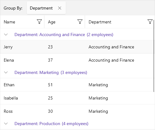
Check the result at the image below:

Telerik .NET MAUI DataGrid Group Header Template

See Also

In this article