.NET MAUI DataForm Validation Styling
You can customize the validation look using the following styling properties:
-
ValidationSummaryStyle(of typeStylewith target typeDataFormValidationSummaryView)—Defines the style of the validation summary view. -
ValidationSummaryLabelStyle(of typeStylewith target typeLabel)—Defines the validation summary label style. -
ValidationSummaryImageStyle(of typeStylewith target typeImage)—Defines the validation summary image style.
Example
The following examples demonstrate how to style the DataForm validation summary.
1. Define the RadDataForm:
Note that local in the snippet above points to the namespace where the EditorsViewModel is defined.
2. Define the ValidationSummaryStyle:
3. Define the ValidationLabelStyle:
4. Add the following namespace:
5. Define the ViewModel used as a BindingContext for the RadDataForm:
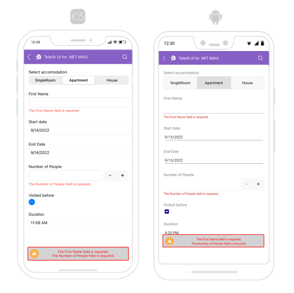
The following image shows what the DataForm control looks like when the styles described above are applied:
For a runnable example with the DataForm Validation Styling scenario, see the SDKBrowser Demo Application and go to DataForm > Styling category.