.NET MAUI DataForm Header Styling
The DatePicker control for .NET MAUI provides styling options for customizing the appearance of the header label or image above each editor.
The style of the Header message can be set individually for each editor or directly to the DataForm control using the following styling properties:
-
HeaderImageSource
(ImageSource
)—Specifies theImageSource
of the image displayed in the header. -
HeaderImageStyle
(of typeStyle
with target typeImage
)—Defines the header image style. -
HeaderLabelStyle
(of typeStyle
with target typeLabel
)—Defines the header label style.
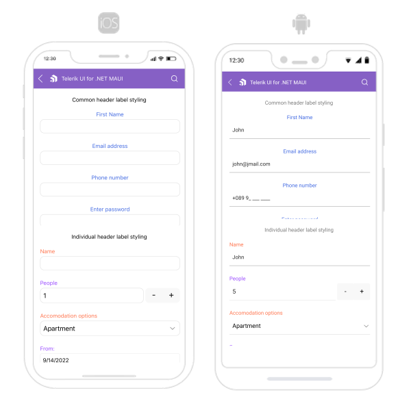
Common Header Styling
- Define a common
HeaderLabelStyle
<Style x:Key="CommonHeaderLabelStyle" TargetType="Label">
<Setter Property="TextColor" Value="RoyalBlue" />
<Setter Property="VerticalOptions" Value="Center" />
<Setter Property="HorizontalOptions" Value="Center" />
</Style>
- Apply the common
HeaderLabelStyle
to all editors in the DataForm
<telerik:RadDataForm x:Name="dataForm"
Grid.Row="1"
HeaderLabelStyle="{StaticResource CommonHeaderLabelStyle}">
<telerik:RadDataForm.BindingContext>
<local:DataTypeEditorsModel/>
</telerik:RadDataForm.BindingContext>
</telerik:RadDataForm>
Individual Header Styling
- Define two different
HeaderLabelStyle
<Style x:Key="HeaderLabelStyle" TargetType="Label">
<Setter Property="TextColor" Value="#FF734C" />
<Setter Property="VerticalOptions" Value="Center" />
<Setter Property="HorizontalOptions" Value="Start" />
</Style>
<Style x:Key="HeaderLabelStyleAlternative" TargetType="Label">
<Setter Property="TextColor" Value="#9A4CFF" />
<Setter Property="VerticalOptions" Value="Center" />
<Setter Property="HorizontalOptions" Value="Start" />
</Style>
- Apply a style to each editor in the DataForm individually
<telerik:RadDataForm x:Name="dataForm2"
AutoGenerateItems="False"
Grid.Row="3">
<telerik:DataFormRadEntryEditor PropertyName="FirstName"
HeaderText="Name"
HeaderLabelStyle="{StaticResource HeaderLabelStyle}" />
<telerik:DataFormRadNumericEditor PropertyName="People"
HeaderText="People"
Minimum="1"
HeaderLabelStyle="{StaticResource HeaderLabelStyleAlternative}" />
<telerik:DataFormRadComboBoxEditor PropertyName="Accommodation"
HeaderText="Accomodation options"
HeaderLabelStyle="{StaticResource HeaderLabelStyle}" />
<telerik:DataFormDatePickerEditor PropertyName="StartDate"
HeaderText="From:"
HeaderLabelStyle="{StaticResource HeaderLabelStyleAlternative}" />
<telerik:DataFormRadTimeSpanPickerEditor PropertyName="Duration"
HeaderText="Duration"
HeaderLabelStyle="{StaticResource HeaderLabelStyle}" />
<telerik:DataFormRadCheckBoxEditor PropertyName="Visited"
HeaderText="Visited before"
HeaderLabelStyle="{StaticResource HeaderLabelStyleAlternative}" />
<telerik:RadDataForm.BindingContext>
<local:DataTypeEditorsModel />
</telerik:RadDataForm.BindingContext>
</telerik:RadDataForm>
-
Add the following namespace:
xmlns:telerik="http://schemas.telerik.com/2022/xaml/maui"
The following image shows what the DataForm control looks like when the styles described above are applied: