.NET MAUI DataForm Headers
DataForm has headers for the Editors and for the Groups.
Header in Editors
You can use the following properties for header configuration:
-
HeaderText(string)—Specifies the text of the header. -
HeaderLength(Microsoft.Maui.GridLength?)—Specifies the length of the header view in the editor. This property has an effect only when theTelerik.Maui.Controls.DataFormEditor.HeaderPositionproperty isBeside. You can specify absolute values in pixels or weighted values followed by the asterisk symbol*. For instance, the value of0.5*specifies that the header length have to be 50% from the length of the corresponding editor. The special valueAutospecifies that the header length have to be computed automatically for the header view, based on the header size requirements. -
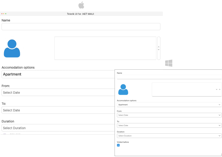
HeaderImageSource(Microsoft.Maui.Controls.ImageSource)—Specifies the image in the header. -
HeaderPosition(Telerik.Maui.Control.DataFormHeaderPosition?)—Specifies the position of the header.-
Above—The header label is placed above the input component in the Editor. -
Beside—The header label is placed beside the input component in the Editor.
-
-
HeaderDisplayOptions(Telerik.Maui.Controls.DataFormHeaderDisplayOptions)—Specifies the display options of the header. The available options are:-
None—Header image and text are not visualized. -
Text—Visualizes the header text. For this optionHeaderTexthas to be defined. -
Image—Visualizes the image in the header. For this optionHeaderImageSourcehas to be defined.
-
You can combine the Text and the Image in the HeaderDisplayOptions:
-
HeaderTemplate(Microsoft.Maui.Controls.ControlTemplate)—Specifies the template of the header view.
All Header properties for the Editors can be applied directly in the DataForm control and they will be common for all editors.
Styling
For all styling options applied to the headers in the DataForm Editors review the DataForm Header Styling article.
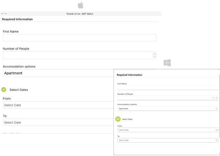
Header for Groups
Each group has a header. Here are the properties you can use to configure the group header:
-
HeaderText(string)—Specifies the text of the header. -
HeaderImageSource(Microsoft.Maui.Controls.ImageSource)—Specifies the image in the header. -
HeaderDisplayOptions(Telerik.Maui.Controls.DataFormHeaderDisplayOptions)—Specifies the display options of the header. The available options are:-
None—Header image and text are not visualized. -
Text—Visualizes the header text. For this optionHeaderTexthas to be defined. -
Image—Visualizes the image in the header. For this optionHeaderImageSourcehas to be defined.
-
You can combine the Text and the Image in the HeaderDisplayOption:
-
HeaderTemplate(Microsoft.Maui.Controls.ControlTemplate)—Specifies the template of the header view.
Styling
For all styling options applied to the headers in the DataForm Groups review the DataForm Header Styling article.