.NET MAUI DataForm Validation
.NET MAUI DataForm provides built-in validation, which gives you full control over the data collected through the control.
The next sections list all DataForm members related to validation.
Validation Modes
The selected mode is applied through ValidationMode (of typeTelerik.Maui.Controls.DataFormValidationMode) property of the DataForm control. You can choose between three validation modes:
-
Explicit—The changes are validated explicitly by invoking theValidateCommandor calling theValidateChangesmethod of the DataForm. -
LostFocus—The changes are validated after the editor loses focus. -
PropertyChanged—The changes in the editor are validated immediately on each property change (when the property value changes).
When
ValidationModeisLostFocus, you have to setCommitModetoLostFocusorExplicit.
The ValidationMode must be applied globally to the RadDataForm:
Validation Properties
-
HasValidationErrors(bool)—Gets a value indicating whether it has validation errors.
Events
DataForm exposes the following events for validation:
-
ValidationCompleted—Raised when the DataForm validation completes. TheValidationCompletedevent handler receives two parameters:-
senderargument which is of type object, but can be cast to theRadDataFormtype. -
DataFormObjectValidationCompletedEventArgswhich provides additional information for the validatedDataObject, theValidationErros(IReadOnlyListofDataFormValidationError) and whether it has validation errorsHasValidationErrors(bool).
-
-
EditorValidationCompleted—Raised when the validation of an editor has completed. TheEditorValidationCompletedevent handler receives two parameters:-
senderargument which is of type object, but can be cast to theRadDataFormtype. -
DataFormEditorValidationCompletedEventArgswhich provides additional information for the validatedPropertyName, the original value ff the validated propertyPropertyValue(object) in the model and the modified value of the validated property in the editor -EditorValue(object).
-
Manual Validation with Methods
DataForm exposes a ValidateChanges method with two overloads:
-
ValidateChanges()—Executes the validation logic associated with the DataForm control. This method is useful when theValidationModeisExplicit. The method returnstrueif the validation passes, otherwisefalse.
-
ValidateChanges(string propertyName)—Validates the pending changes in the editor for the specified property. This method is useful when the DataFormValidationModeproperty isExplicit.Trueif the validation passes,falseotherwise.
For a runnable example with the DataForm Validation scenario, see the SDKBrowser Demo Application and go to DataForm > Validation category.
Commands
-
ValidateCommand(ICommand)—Gets a command to execute the validation logic of theRadDataForm. This command is useful when the DataFormValidationModeproperty isExplicit.
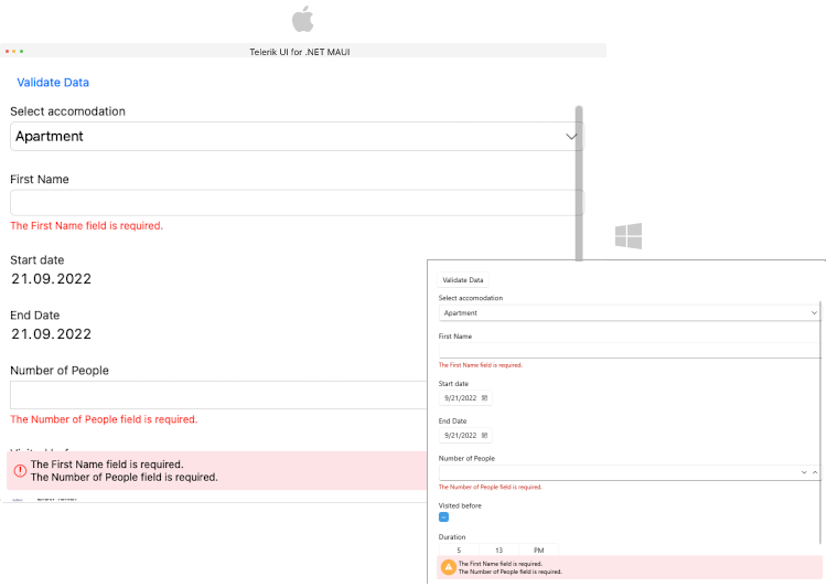
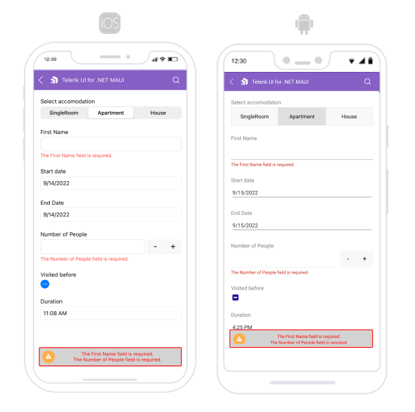
Validation Summary - Styling and Customization
The ValidationSummaryMessage displays all validation messages for the editors. You can visualize/hide the validation summary message by setting the IsValidationSummaryVisible(bool) property to True/False.
You can use the following properties for validation styling and customization:
-
ValidationSummaryImageSource(ImageSource)—Specifies theImageSourceof the image displayed in the validation summary. -
ValidationSummaryImageStyle(Style)—Specifies the style applied to the image of the validation summary. The target type of this style is the .NET MAUIImagecontrol. -
ValidationSummaryStyle(Style)—Specifies the style applied to the validation summary. The target type of this style is theTelerik.Maui.Controls.DataFormValidationSummaryView.
-
ValidationSummaryLabelStyle(Style)—Specifies the style applied to the labels of the validation summary. The target type of this style is the .NET MAUILabelcontrol.
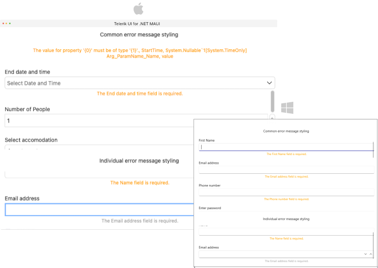
Error Message - Styling and Customization
You can use the following properties for error message styling and customization:
-
ErrorImageSource(ImageSource)—Specifies theImageSourceof the image displayed in the error message. -
ErrorImageStyle(Style)—Specifies the style applied to the image of the error message. The target type of this style is the .NET MAUIImagecontrol. -
ErrorLabelStyle(Style)—Specifies the style applied to the labels of the error message. The target type of this style is the .NET MAUILabelcontrol.
Runtime Validation
If you want to add the validation runtime, when editors are generated, then you have to use the EditorsGenerated event. Inside the event you can define the validation.
The following table lists the available DataForm validations:
| DataForm Validation Rule | Definition |
|---|---|
(DataForm level) DataFormObjectValidationRule
|
Represents a custom validation rule of the DataForm control. |
DataFormEditorCustomValidationRule |
Represents a custom validation rule for the editor. The validation rule can execute a custom validation logic on the underlying business object. |
DataFormEditorLengthValidationRule |
Validates that the string length of the current value is between the specified minimum and maximum length. |
DataFormEditorRangeValidationRule |
Validates that the current value is between the specified minimum and maximum value. |
DataFormEditorRegexValidationRule |
Executes a custom regular expression to validate the current string value. |
DataFormEditorRequiredValidationRule |
Validates that the current value is not null or an empty string. |
When using both runtime validation and
ViewModelvalidation (via data annotations)—the validation defined in theViewModelwill be applied instead of the runtime validation. The Data Annotation Validation has the higher priority.
Here is an example for runtime validation using the EditorGenerated event: