.NET MAUI DataForm Group Styling
The DataForm control for .NET MAUI provides styling options for customizing the appearance of its group headers. You can apply a style to the whole header, or only to the header label.
The DataFormGroup class exposes the following Style properties:
-
HeaderStyle(of typeStylewith target typeDataFormGroupHeaderView)—Defines the header view style. -
HeaderLabelStyle(of typeStylewith target typeLabel)—Defines the header label style.
HeaderStyle
To style the DataFormGroupHeaderView use the following properties:
-
BackgroundColor—Defines the background color of the header. -
BorderColor—Defines the border color of the header. -
BorderThickness—Specifies the border thickness of the header. -
HeaderLabelStyle(of typeStylewith target typeLabel)—Defines the header label style.
Example
The following examples demonstrate how to use the styling properties of the DataFormGroup.
1. Define the RadDataForm and the groups:
Note that local in the snippet above points to the namespace where the DataTypeEditorsModel is defined.
2. Define the HeaderStyle:
3. Define the HeaderLabelStyle of the first DataForm group:
4. Define the HeaderLabelStyle of the second DataForm group:
5. Add the following namespace:
6. Define the ViewModel used as a BindingContext for the RadDataForm:
Note that local in the snippet above points to the namespace where the DataTypeEditorsModel is defined.
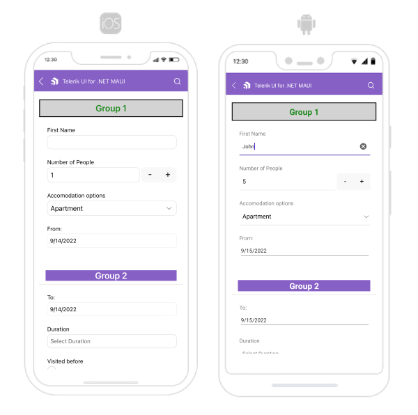
The following image shows what the DataForm control looks like when the styles described above are applied:
For a runnable example with the DataForm Group Styling scenario, see the SDKBrowser Demo Application and go to DataForm > Styling category.