.NET MAUI DataForm Header Styling
The DatePicker control for .NET MAUI provides styling options for customizing the appearance of the header label or image above each editor.
The style of the Header message can be set individually for each editor or directly to the DataForm control using the following styling properties:
-
HeaderImageSource(ImageSource)—Specifies theImageSourceof the image displayed in the header. -
HeaderImageStyle(of typeStylewith target typeImage)—Defines the header image style. -
HeaderLabelStyle(of typeStylewith target typeLabel)—Defines the header label style.
Common Header Styling
1. Define a common HeaderLabelStyle:
<Style x:Key="CommonHeaderLabelStyle" TargetType="Label">
    <Setter Property="TextColor" Value="RoyalBlue" />
    <Setter Property="VerticalOptions" Value="Center" />
    <Setter Property="HorizontalOptions" Value="Center" />
</Style>
2. Apply the common HeaderLabelStyle to all editors in the DataForm:
<telerik:RadDataForm x:Name="dataForm"
                     Grid.Row="1"
                     HeaderLabelStyle="{StaticResource CommonHeaderLabelStyle}">
    <telerik:RadDataForm.BindingContext>
        <local:DataTypeEditorsModel/>
    </telerik:RadDataForm.BindingContext>
</telerik:RadDataForm>
Individual Header Styling
1. Define two different HeaderLabelStyle:
<Style x:Key="HeaderLabelStyle" TargetType="Label">
    <Setter Property="TextColor" Value="#FF734C" />
    <Setter Property="VerticalOptions" Value="Center" />
    <Setter Property="HorizontalOptions" Value="Start" />
</Style>
<Style x:Key="HeaderLabelStyleAlternative" TargetType="Label">
    <Setter Property="TextColor" Value="#9A4CFF" />
    <Setter Property="VerticalOptions" Value="Center" />
    <Setter Property="HorizontalOptions" Value="Start" />
</Style>
2. Apply a style to each editor in the DataForm individually:
<telerik:RadDataForm x:Name="dataForm2"
                     AutoGenerateItems="False"
                     Grid.Row="3">
    <telerik:DataFormRadEntryEditor PropertyName="FirstName"
                                HeaderText="Name"
                                HeaderLabelStyle="{StaticResource HeaderLabelStyle}" />
    <telerik:DataFormRadNumericEditor PropertyName="People"
                                   HeaderText="People"
                                   Minimum="1"
                                   HeaderLabelStyle="{StaticResource HeaderLabelStyleAlternative}" />
    <telerik:DataFormRadComboBoxEditor PropertyName="Accommodation"
                                    HeaderText="Accomodation options"
                                    HeaderLabelStyle="{StaticResource HeaderLabelStyle}" />
    <telerik:DataFormDatePickerEditor PropertyName="StartDate"
                                      HeaderText="From:"
                                      HeaderLabelStyle="{StaticResource HeaderLabelStyleAlternative}" />
    <telerik:DataFormRadTimeSpanPickerEditor PropertyName="Duration"
                                          HeaderText="Duration"
                                          HeaderLabelStyle="{StaticResource HeaderLabelStyle}" />
    <telerik:DataFormRadCheckBoxEditor PropertyName="Visited"
                                    HeaderText="Visited before"
                                    HeaderLabelStyle="{StaticResource HeaderLabelStyleAlternative}" />
    <telerik:RadDataForm.BindingContext>
        <local:DataTypeEditorsModel />
    </telerik:RadDataForm.BindingContext>
</telerik:RadDataForm>
Note that local in the snippet above points to the namespace where the DataTypeEditorsModel is defined.
3. Add the following namespace:
xmlns:telerik="http://schemas.telerik.com/2022/xaml/maui"
4. Define the ViewModel used as a BindingContext for the RadDataForm:
public class DataTypeEditorsModel : NotifyPropertyChangedBase
{
    private string name;
    private DateOnly? startDate;
    private TimeOnly? startTime;
    private DateTime? endDateTime;
    private double? people = 1;
    private bool visited;
    private string phoneNumber;
    private string email;
    private string password;
    private string? url;
    private decimal? cost;
    private string? notes;
    private TimeSpan? duration;
    private EnumValue accommodation = EnumValue.Apartment;
    public enum EnumValue
    {
        SingleRoom,
        Apartment,
        House
    }

    [Required]
    [Display(Name = "First Name")]
    [DataType(DataType.Text)]
    public string FirstName
    {
        get => this.name;
        set => this.UpdateValue(ref this.name, value);
    }

    [Required]
    [Display(Name = "Email address")]
    [DataType(DataType.EmailAddress)]
    [RegularExpression("^([\\w\\.\\-]+)@([\\w\\-]+)((\\.(\\w){2,3})+)$", ErrorMessage = "Please enter valid email address.")]
    public string Email
    {
        get => this.email;
        set => this.UpdateValue(ref this.email, value);
    }

    [Required]
    [Display(Name = "Phone number")]
    [DataType(DataType.PhoneNumber)]
    [RegularExpression("^(?!0+$)(\\+\\d{1,3}[- ]?)?(?!0+$)\\d{10,15}$", ErrorMessage = "Please enter valid phone number.")]
    public string PhoneNumber
    {
        get => this.phoneNumber;
        set => this.UpdateValue(ref this.phoneNumber, value);
    }

    [Required]
    [Display(Name = "Enter password")]
    [RegularExpression("^(?=.*?[A-Z])(?=.*?[a-z])(?=.*?[0-9])(?=.*?[#?!@$%^&*-]).{8,}", ErrorMessage = "Password must contain: -at least one upper case, " +
        "at least one lower case, at least one digit, at least one special character and to be at least 8 symbols")]
    [DataType(DataType.Password)]
    public string Password
    {
        get => this.password;
        set => this.UpdateValue(ref this.password, value);
    }

    [Required]
    [Display(Name = "Star date")]
    [DataType(DataType.Date)]
    public DateOnly? StartDate
    {
        get => this.startDate;
        set => this.UpdateValue(ref this.startDate, value);
    }

    [Required]
    [Display(Name = "Start time")]
    [DataType(DataType.Time)]
    public TimeOnly? StartTime
    {
        get => this.startTime;
        set => this.UpdateValue(ref this.startTime, value);
    }

    [Required]
    [Display(Name = "End date and time")]
    [DataType(DataType.DateTime)]
    public DateTime? EndDateTime
    {
        get => this.endDateTime;
        set => this.UpdateValue(ref this.endDateTime, value);
    }

    [Display(Name = "Number of People")]
    public double? People
    {
        get => this.people;
        set => this.UpdateValue(ref this.people, value);
    }

    [Display(Name = "Select accomodation")]
    public EnumValue Accommodation
    {
        get
        {
            return this.accommodation;
        }
        set
        {
            if (this.accommodation != value)
            {
                this.accommodation = value;
                this.OnPropertyChanged();
            }
        }
    }

    [Display(Name = "Visited before")]
    public bool Visited
    {
        get => this.visited;
        set => this.UpdateValue(ref this.visited, value);
    }

    [Display(Name = "Duration")]
    public TimeSpan? Duration
    {
        get => this.duration;
        set => this.UpdateValue(ref this.duration, value);
    }

    [Display(Name = "Web address")]
    [DataType(DataType.Url)]
    [RegularExpression("^(http:\\/\\/www\\.|https:\\/\\/www\\.|http:\\/\\/|https:\\/\\/)?[a-z0-9]+([\\-\\.]{1}[a-z0-9]+)*\\.[a-z]{2,5}(:[0-9]{1,5})?(\\/.*)?$", ErrorMessage = "Please enter valid url.")]
    public string? URL
    {
        get => this.url;
        set => this.UpdateValue(ref this.url, value);
    }

    [Display(Name = "Total cost")]
    [DataType(DataType.Currency)]
    [DisplayFormat(DataFormatString = "C")]
    public decimal? Cost
    {
        get => this.cost;
        set => this.UpdateValue(ref this.cost, value);
    }

    [Display(Name = "Notes")]
    [DataType(DataType.MultilineText)]
    public string? Notes
    {
        get => this.notes;
        set => this.UpdateValue(ref this.notes, value);
    }
}
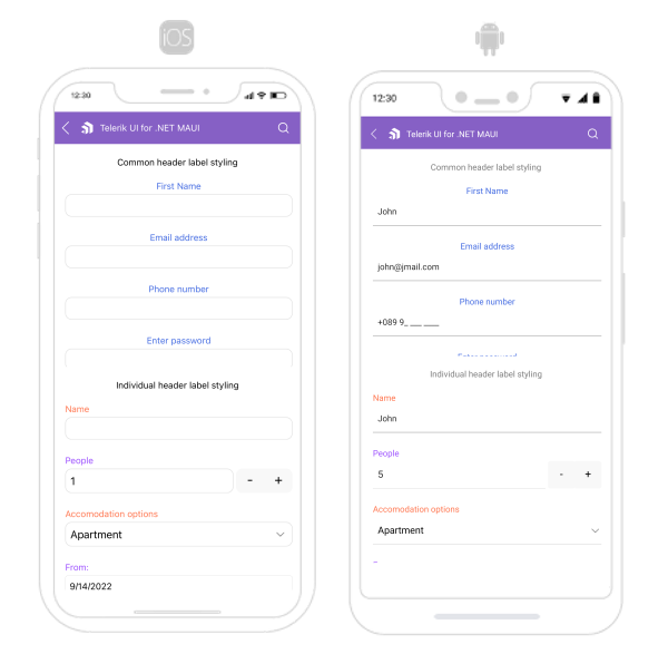
The following image shows what the DataForm control looks like when the styles described above are applied:
For a runnable example with the DataForm Header Styling scenario, see the SDKBrowser Demo Application and go to DataForm > Styling category.