.NET MAUI DataForm Group Styling
The DataForm control for .NET MAUI provides styling options for customizing the appearance of its group headers. You can apply a style to the whole header, or only to the header label.
The DataFormGroup class exposes the following Style properties:
-
HeaderStyle(of typeStylewith target typeDataFormGroupHeaderView)—Defines the header view style. -
HeaderLabelStyle(of typeStylewith target typeLabel)—Defines the header label style.
HeaderStyle
To style the DataFormGroupHeaderView use the following properties:
-
BackgroundColor—Defines the background color of the header. -
BorderColor—Defines the border color of the header. -
BorderThickness—Specifies the border thickness of the header. -
HeaderLabelStyle(of typeStylewith target typeLabel)—Defines the header label style.
Example
The following examples demonstrate how to use the styling properties of the DataFormGroup.
1. Define the RadDataForm and the groups:
<telerik:RadDataForm x:Name="dataForm"
                     AutoGenerateItems="False"
                     Grid.Column="1">
    <telerik:RadDataForm.BindingContext>
        <local:DataTypeEditorsModel/>
    </telerik:RadDataForm.BindingContext>
    <telerik:RadDataForm.Items>
        <telerik:DataFormGroup HeaderText="Group 1"
                               HeaderLabelStyle="{StaticResource GroupHeaderLabelStyle}"
                               HeaderStyle="{StaticResource GroupHeaderViewStyle}">
            <telerik:DataFormRadEntryEditor PropertyName="FirstName" />
            <telerik:DataFormRadNumericEditor PropertyName="People"
                                              Minimum="1" />
            <telerik:DataFormRadComboBoxEditor PropertyName="Accommodation"
                                            HeaderText="Accomodation options" />
            <telerik:DataFormDatePickerEditor PropertyName="StartDate"
                                              HeaderText="From:" />
        </telerik:DataFormGroup>
        <telerik:DataFormGroup HeaderText="Group 2"
                               HeaderLabelStyle="{StaticResource GroupHeaderLabelStyleAlt}">
            <telerik:DataFormDatePickerEditor PropertyName="EndDate"
                                              HeaderText="To:" />
            <telerik:DataFormRadTimeSpanPickerEditor PropertyName="Duration"
                                                  HeaderText="Duration" />
            <telerik:DataFormRadCheckBoxEditor PropertyName="Visited"
                                            HeaderText="Visited before"
                                            IsThreeState="True" />
        </telerik:DataFormGroup>
    </telerik:RadDataForm.Items>
</telerik:RadDataForm>
Note that local in the snippet above points to the namespace where the DataTypeEditorsModel is defined.
2. Define the HeaderStyle:
<Style x:Key="GroupHeaderViewStyle" TargetType="telerik:DataFormGroupHeaderView">
    <Setter Property="BorderColor" Value="Black" />
    <Setter Property="BorderThickness" Value="2" />
    <Setter Property="BackgroundColor" Value="LightGray" />
</Style>
3. Define the HeaderLabelStyle of the first DataForm group:
<Style x:Key="GroupHeaderLabelStyle" TargetType="Label">
    <Setter Property="TextColor" Value="ForestGreen" />
    <Setter Property="FontSize" Value="22" />
    <Setter Property="VerticalTextAlignment" Value="Center" />
    <Setter Property="HorizontalTextAlignment" Value="Center" />
</Style>
4. Define the HeaderLabelStyle of the second DataForm group:
<Style x:Key="GroupHeaderLabelStyleAlt" TargetType="Label">
    <Setter Property="TextColor" Value="White" />
    <Setter Property="FontSize" Value="22" />
    <Setter Property="BackgroundColor" Value="#8660C5" />
    <Setter Property="VerticalTextAlignment" Value="Center" />
    <Setter Property="HorizontalTextAlignment" Value="Center" />
</Style>
5. Add the following namespace:
xmlns:telerik="http://schemas.telerik.com/2022/xaml/maui"
6. Define the ViewModel used as a BindingContext for the RadDataForm:
public class DataTypeEditorsModel : NotifyPropertyChangedBase
{
    private string name;
    private DateOnly? startDate;
    private TimeOnly? startTime;
    private DateTime? endDateTime;
    private double? people = 1;
    private bool visited;
    private string phoneNumber;
    private string email;
    private string password;
    private string? url;
    private decimal? cost;
    private string? notes;
    private TimeSpan? duration;
    private EnumValue accommodation = EnumValue.Apartment;
    public enum EnumValue
    {
        SingleRoom,
        Apartment,
        House
    }

    [Required]
    [Display(Name = "First Name")]
    [DataType(DataType.Text)]
    public string FirstName
    {
        get => this.name;
        set => this.UpdateValue(ref this.name, value);
    }

    [Required]
    [Display(Name = "Email address")]
    [DataType(DataType.EmailAddress)]
    [RegularExpression("^([\\w\\.\\-]+)@([\\w\\-]+)((\\.(\\w){2,3})+)$", ErrorMessage = "Please enter valid email address.")]
    public string Email
    {
        get => this.email;
        set => this.UpdateValue(ref this.email, value);
    }

    [Required]
    [Display(Name = "Phone number")]
    [DataType(DataType.PhoneNumber)]
    [RegularExpression("^(?!0+$)(\\+\\d{1,3}[- ]?)?(?!0+$)\\d{10,15}$", ErrorMessage = "Please enter valid phone number.")]
    public string PhoneNumber
    {
        get => this.phoneNumber;
        set => this.UpdateValue(ref this.phoneNumber, value);
    }

    [Required]
    [Display(Name = "Enter password")]
    [RegularExpression("^(?=.*?[A-Z])(?=.*?[a-z])(?=.*?[0-9])(?=.*?[#?!@$%^&*-]).{8,}", ErrorMessage = "Password must contain: -at least one upper case, " +
        "at least one lower case, at least one digit, at least one special character and to be at least 8 symbols")]
    [DataType(DataType.Password)]
    public string Password
    {
        get => this.password;
        set => this.UpdateValue(ref this.password, value);
    }

    [Required]
    [Display(Name = "Star date")]
    [DataType(DataType.Date)]
    public DateOnly? StartDate
    {
        get => this.startDate;
        set => this.UpdateValue(ref this.startDate, value);
    }

    [Required]
    [Display(Name = "Start time")]
    [DataType(DataType.Time)]
    public TimeOnly? StartTime
    {
        get => this.startTime;
        set => this.UpdateValue(ref this.startTime, value);
    }

    [Required]
    [Display(Name = "End date and time")]
    [DataType(DataType.DateTime)]
    public DateTime? EndDateTime
    {
        get => this.endDateTime;
        set => this.UpdateValue(ref this.endDateTime, value);
    }

    [Display(Name = "Number of People")]
    public double? People
    {
        get => this.people;
        set => this.UpdateValue(ref this.people, value);
    }

    [Display(Name = "Select accomodation")]
    public EnumValue Accommodation
    {
        get
        {
            return this.accommodation;
        }
        set
        {
            if (this.accommodation != value)
            {
                this.accommodation = value;
                this.OnPropertyChanged();
            }
        }
    }

    [Display(Name = "Visited before")]
    public bool Visited
    {
        get => this.visited;
        set => this.UpdateValue(ref this.visited, value);
    }

    [Display(Name = "Duration")]
    public TimeSpan? Duration
    {
        get => this.duration;
        set => this.UpdateValue(ref this.duration, value);
    }

    [Display(Name = "Web address")]
    [DataType(DataType.Url)]
    [RegularExpression("^(http:\\/\\/www\\.|https:\\/\\/www\\.|http:\\/\\/|https:\\/\\/)?[a-z0-9]+([\\-\\.]{1}[a-z0-9]+)*\\.[a-z]{2,5}(:[0-9]{1,5})?(\\/.*)?$", ErrorMessage = "Please enter valid url.")]
    public string? URL
    {
        get => this.url;
        set => this.UpdateValue(ref this.url, value);
    }

    [Display(Name = "Total cost")]
    [DataType(DataType.Currency)]
    [DisplayFormat(DataFormatString = "C")]
    public decimal? Cost
    {
        get => this.cost;
        set => this.UpdateValue(ref this.cost, value);
    }

    [Display(Name = "Notes")]
    [DataType(DataType.MultilineText)]
    public string? Notes
    {
        get => this.notes;
        set => this.UpdateValue(ref this.notes, value);
    }
}
Note that local in the snippet above points to the namespace where the DataTypeEditorsModel is defined.
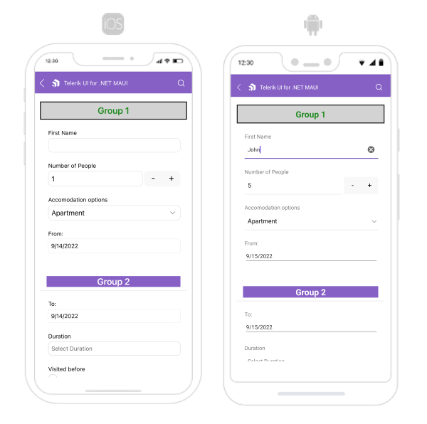
The following image shows what the DataForm control looks like when the styles described above are applied:
For a runnable example with the DataForm Group Styling scenario, see the SDKBrowser Demo Application and go to DataForm > Styling category.