New to Telerik UI for .NET MAUI? Start a free 30-day trial

.NET MAUI ComboBox Visual States

This article describes the visual states provided by the ComboBox control. You can use these visual states to change the appearance of the control based on its state—such as when it’s disabled, focused, hovered, and more.

The ComboBox provides the following CommonStates visual states:

Visual State Description
Normal Applies when the ComboBox is in its normal state.
Focused Applied when the ComboBox receives focus (when it's editable).
MouseOver (Windows-only) Applied when the mouse cursor is hovering over the ComboBox.
PointerOver (MacCatalyst-only) Applied when the mouse cursor is hovering over the ComboBox.
Disabled Applied when the ComboBox's IsEnabled is False.

Using the Visual States

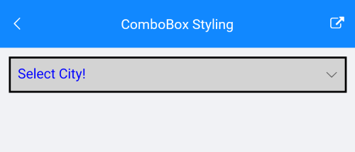
The example below demonstrates some of the styling capabilities of the ComboBox, such as custom ClearButtonStyle, TextInputStyle, TextColor, PlaceholderColor, and others. It also shows how to switch its appearance through the .NET MAUI Visual State Manager.

The example uses the same ViewModel and City classes as the Getting Started topic.

1. Add a Style that targets the RadComboBox to your page's resources and apply all the needed styling properties and the visual states:

<Style TargetType="telerik:RadTextInput" x:Key="TextInputStyle">
    <Setter Property="CharacterSpacing" Value="4" />
    <Setter Property="HorizontalTextAlignment" Value="Center" />
</Style>

<Style TargetType="telerik:RadTemplatedButton" x:Key="ClearButtonStyle">
    <Setter Property="FontFamily" Value="{x:Static telerik:TelerikFont.Name}" />
    <Setter Property="FontSize" Value="16" />
    <Setter Property="Content" Value="&#xe851;" />
    <Setter Property="TextColor" Value="#A30111"/>
    <Setter Property="VisualStateManager.VisualStateGroups">
        <VisualStateGroupList>
            <VisualStateGroup Name="CommonStates">
                <VisualState Name="Normal" />
                <VisualState Name="PointerOver">
                    <VisualState.Setters>
                        <Setter Property="telerik:RadTemplatedButton.TextColor" Value="#B53340" />
                    </VisualState.Setters>
                </VisualState>
                <VisualState Name="Pressed">
                    <VisualState.Setters>
                        <Setter Property="telerik:RadTemplatedButton.TextColor" Value="#C76670" />
                    </VisualState.Setters>
                </VisualState>
                <VisualState Name="Disabled" />
            </VisualStateGroup>
        </VisualStateGroupList>
    </Setter>
</Style>

<Style TargetType="telerik:RadComboBox" x:Key="ComboBoxStyle">
    <Setter Property="TextColor" Value="#00897B" />
    <Setter Property="BorderThickness" Value="1" />
    <Setter Property="BorderBrush" Value="#00897B" />
    <Setter Property="PlaceholderColor" Value="#00A392" />
    <Setter Property="BackgroundColor" Value="#FFFFFF" />
    <Setter Property="ClearButtonStyle" Value="{StaticResource ClearButtonStyle}" />
    <Setter Property="TextInputStyle" Value="{StaticResource TextInputStyle}" />
    <Setter Property="VisualStateManager.VisualStateGroups">
        <VisualStateGroupList>
            <VisualStateGroup Name="CommonStates">
                <VisualState Name="Normal" />
                <VisualState Name="Focused">
                    <VisualState.Setters>
                        <Setter Property="telerik:RadComboBox.BorderBrush" Value="#00BCA9" />
                        <Setter Property="telerik:RadComboBox.BorderThickness" Value="1" />
                    </VisualState.Setters>
                </VisualState>
                <VisualState Name="MouseOver">
                    <VisualState.Setters>
                        <Setter Property="telerik:RadComboBox.BackgroundColor" Value="#F9F9F9" />
                    </VisualState.Setters>
                </VisualState>
                <VisualState Name="Disabled">
                    <VisualState.Setters>
                        <Setter Property="Opacity" Value="0.6" />
                    </VisualState.Setters>
                </VisualState>
            </VisualStateGroup>
        </VisualStateGroupList>
    </Setter>
</Style>

2. Define the ComboBox in XAML:

<telerik:RadComboBox ItemsSource="{Binding Items}" 
                     Placeholder="Select a city"
                     DisplayMemberPath="Name"
                     Style="{StaticResource ComboBoxStyle}"
                     AutomationId="comboBox">
    <telerik:RadComboBox.BindingContext>
        <local:ViewModel/>
    </telerik:RadComboBox.BindingContext>
</telerik:RadComboBox>

Here is how the ComboBox looks when styling is applied:

.NET MAUI ComboBox Styling

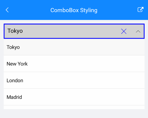
Here is how the styling is applied when the control is focused and item is selected:

.NET MAUI ComboBox Styling on Selected Item

For the ComboBox Visual States example, go to the SDKBrowser Demo Application and navigate to the ComboBox > Styling category.