.NET MAUI ComboBox Templates
If the default templates of the control do not suit your needs, you can define custom ones. The available templates for customizing are:
-
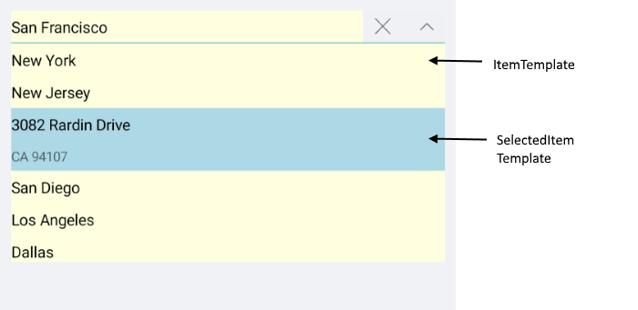
ItemTemplate(DataTemplate)—Defines the template of the items that are visualized in the dropdown list. -
SelectedItemTemplate(DataTemplate)—Defines the template of the selected items that are visualized in the dropdown list. -
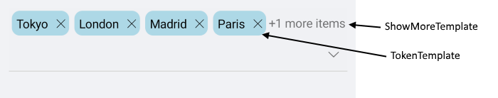
TokenTemplate(DataTemplate)—Defines the template of the tokens that are visualized when multiple selection is performed. -
ShowMoreTemplate(DataTemplate)—Defines the Template of the Show More UI that gets visualized when the control is not focused and the space is not enough to show all tokens when using the Multiple selection mode. -
SelectionBoxTemplate(DataTemplate)—Defines the template of the selected item in the box section of the control. This property is only available when theRadComboBoxis non-editable (IsEditableset tofalse).
To customize the content inside the input area when an item is selected and the DisplayMemberPath property is not set, use the SelectionBoxTemplate. The SelectionBoxTemplate applies when the SelectionMode is Single and the control's IsEditable property is set to false.
To enable the keyboard navigation support when the drop-down is opened and when setting the custom item and selected item templates in ComboBox for .NET MAUI, wrap the content of the templates in a RadComboBoxItem. Define the necessary visual states of the RadComboBoxItem, specifically MouseOver and Highlighted.
Example with ItemTemplate and SelectedItemTemplate
1. Define the .NET MAUI ComboBox in XAML:
2. Add the telerik namespace:
3. Add a sample business model:
4. Add the ViewModel:
The final result on WinUI:
For the ComboBox Item and SelectedItem Templates example, go to the SDKBrowser Demo Application and navigate to ComboBox -> Templates category.
Example with TokenTemplate and ShowMoreTemplate
1. Define the ComboBox in XAML:
2. Add a sample business model:
3. Add the ViewModel:
when the default TokenTemplate is overridden, you will need to implement custom logic for removing the tokens from the ComboBox:
Here is a sample logic removing the token when adding TapGestureRecognizer to the Label:
Here is the how the Token and ShowMore Templates look on WinUI:
For the ComboBox TokenTemplate and ShowMoreTemplate example, go to the SDKBrowser Demo Application and navigate to ComboBox -> Templates category.