.NET MAUI ComboBox Styling
The Telerik UI for .NET MAUI ComboBox provides the following Style properties for customizing its look:
-
PlaceholderColor(Color)—Defines the color for the placeholder text. -
TextColor(Color)—Defines the following colors:- The color of the text when the control is editable.
- The color of the selected item when the control is not editable and the selection mode is single.
-
HighlightTextColor(Color)—Specifies the color of the text that will be highlighted when searching (IsEditablemust beTrue). -
BackgroundColor(Color)—Defines the background color of the control. -
BorderColor(Color)—Defines the color of the border. -
BorderThickness(Thickness)—Defines the thickness of the border. -
ClearButtonStyle(of typeStylewith target typeTelerik.Maui.Controls.RadTemplatedButton)—Defines the style for the clear button. -
Font Options(FontAttributes,FontFamily,FontSize)—Defines the font options for the text of the ComboBox. It's applied to the Placeholder and Selected Text (for single selection) and when the control is in Editable Mode.
The ComboBox control uses the RadTextInput control internally when the ComboBox IsEditable property is set to True. To style the input control (RadTextInput), use the TextInputStyle (of type Style with target type Telerik.Maui.Controls.RadTextInput).
In addition to the available styling properties, you can apply specific Visual States to the ComboBox control.
Example for ComboBox Styling
The example below demonstrates some of the styling capabilities of the ComboBox, such as custom ClearButtonStyle, TextInputStyle, TextColor, PlaceholderColor, and others. It also shows how to switch its appearance through the .NET MAUI Visual State Manager.
The example uses the same ViewModel and City classes as the Getting Started topic.
1. Add a Style that targets the RadComboBox to your page's resources and apply all the needed styling properties and the visual states:
2. Define the ComboBox in XAML:
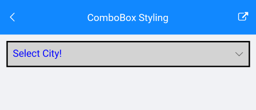
Here is how the ComboBox looks when styling is applied:
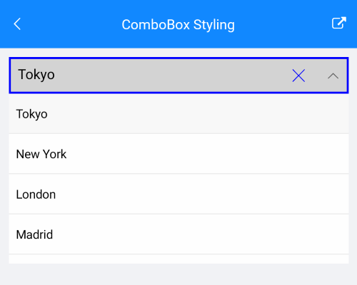
Here is how the styling is applied when the control is focused and item is selected:
For the ComboBox Styling example, go to the SDKBrowser Demo Application and navigate to the ComboBox > Styling category.
DropDown Styling
The following properties style the ComboBox DropDown:
-
DropDownBorderColor(Color)—Defines the color of the border that surrounds the DropDown part of the control. -
DropDownBorderThickness(Thickness)—Defines the thickness of the border that surrounds the DropDown part of the control. -
DropDownBorderCornerRadius(Thickness)—Defines the corner radius of the border that surrounds the DropDownn part of the control. -
DropDownBackgroundColor(Color)—Defines the background color of the DropDown part of the control. -
DropDownButtonStyle(of typeStylewith target typeTelerik.Maui.Controls.RadTemplatedButton)—Defines the style for the DropDown button.
Example for DropDown Styling
1. Define the DropDown Button Style in the page's resources:
2. Define the ComboBox in XAML:
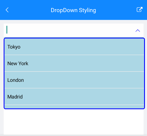
Here is how the Drop Down Styling looks:
For the ComboBox DropDown Styling example, go to the SDKBrowser Demo Application and navigate to ComboBox -> Styling category.